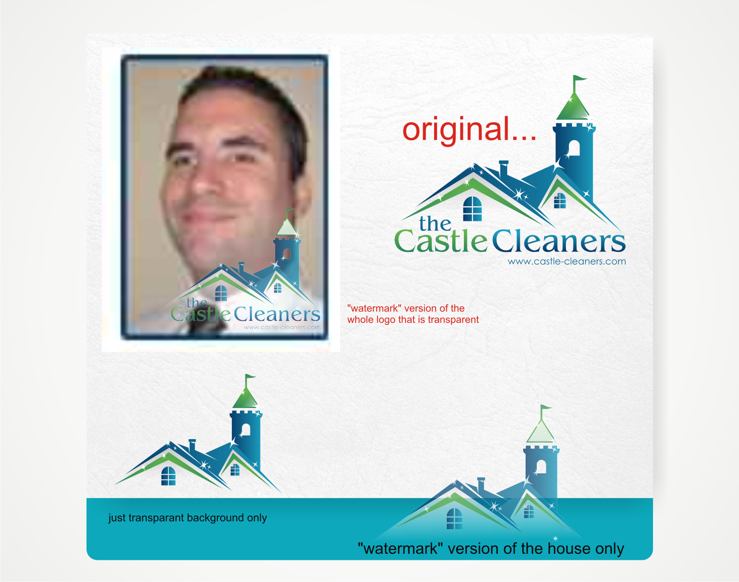
LOGO RE-DESIGN FOR RESIDENTIAL CLEANING BUSINESS

¿Quieres ganar un trabajo como este?
Este cliente recibió 67 diseños de logo de 18 diseñadores. Eligieron este diseño de logo de Savana como el diseño ganador.
Únete gratis Encuentra trabajos de diseño- Garantía
Resumen de Diseño de Logo
Greetings!
We are a very small residential cleaning company in need of an overhaul of our logo. Basically we want something which takes better advantage of the fun theme of our business, which is a medieval theme - "Clean your Castle without the Hassle!"
Visit our website to get a feel for what we do: www.castle-cleaners.com
1) I want to change from "CastleCleaners" to "The Castle Cleaners"
2) I very much like the font we are currently using but we will definitely keep an open mind to new ideas.
3) As with our current logo, we want a "hybrid modern house/castle". Like if a castle and a modern (relatively attractive upscale) home were to morph together and/or give birth to offspring, what would the result be? We like the house we are currently using but we think it doesn't look quite enough like a castle, or evoke the medieval theme quite enough. We definitely want there to be a cone/flag at the very top - we like that a lot. We would just like some fresh concepts of how the house should look. Of course the castle-house will have "The Castle Cleaners" text incorporated somehow. Other than that, we are wide open on how the house would look, how colorful, how simple vs complex, etc.
4) Colors should be pretty much what they are now, or some very close variations of them. Our colors will remain blue and green.
5) The castle/house should be shining, gleaming, sparkling to show that it is CLEAN and looking glorious and perhaps majestic. But again, should have elements of a modern home at the same time. It should be obvious that it's a hybrid castle/house.
6) Although it's a somewhat playful theme, we'd like it to be as professional as possible, instilling a fun, friendly feeling at the same time. Bright, happy, upbeat, fun, and professional is what we're aiming for.
Actualizaciones
I'd like to re-emphasize that what we are mainly looking for is an upgrade to the CASTLE/HOUSE. So far we are favoring designs with a bit more complexity. The logo which strikes that balance between HOUSE and CASTLE best is the one we will decide to use.
Added Tuesday, December 10, 2013
We've decided we'd like to use our current font, BENGUIAT, in our new logo. "Castle" text should be green and "Cleaners" should be blue, or vice-versa.
Added Thursday, December 12, 2013
Objetivo del mercado(s)
Homeowners, property owners, property managers, realtors and real estate professionals.
Tipo de industria / entidad
Residential
Texto del logo
the Castle Cleaners
Estilos de logo de interés
Logo con personaje
Logo con ilustración o personaje
Colores
Colores seleccionados por el cliente para ser utilizados en el diseño del logotipo:
Mira y siente
Cada control deslizante ilustra las características de la marca del cliente y el estilo que debe comunicar el diseño de tu logotipo.
Elegante
Atrevido
Juguetón
Serio
Tradicional
Moderno
Atractivo
Profesional
Femenino
Masculino
Vistoso
Conservador
Económico
De Alta Gama
Requisitos
Agradable de tener
- 1) I'd like to experiment with either stacking the text or not. In other words, "The" on top of "Castle" on top of "Cleaners" - we're open to this change if someone can make it look right.
2) Any possible bells and whistles which might reinforce the medieval theme.