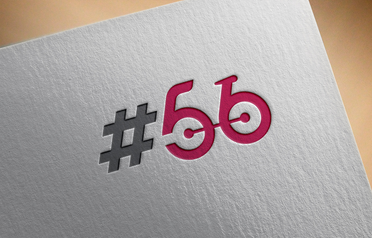
Logo for a cyclist coffee cafe called: Rule No 56. Logo is used for signage, web and social.

¿Quieres ganar un trabajo como este?
Este cliente recibió 127 diseños de logo de 63 diseñadores. Eligieron este diseño de logo de Logoplain como el diseño ganador.
Únete gratis Encuentra trabajos de diseño- Garantía
Resumen de Diseño de Logo
A logo design for a coffee cafe. The cafe targets mainly cyclists. Rule no 56 has a meaning to cyclists. Rule 56: When wearing cycling kit and enjoying a pre or post ride coffee, it is only appropriate to drink espresso or macchiato. If the word soy/skim latte is heard to be used by a member wearing cycling apparel, then that person must be ceremonially beaten with Co2 canisters or mini pumps by others within the community.
The idea behind the coffee shop is to be a home for cyclists after their rides or just to hang out with other cyclists and share stories. It needs to feel like their second home.
The cafe will be located in the central business district of Singapore. Besides coffee, the cafe will also have a mechanic and a lot of cycling memorabilia.
For the logo, we're thinking of a cycling jersey or an abstract cyclist (with bicycle). The logo will be used for signage, business cards, social media and the website. Later down the line we'll also introduce merchandise (such as jerseys, socks and t-shirts).
Objetivo del mercado(s)
Cyclists and cycling enthousiasts
Tipo de industria / entidad
Cafe
Texto del logo
#56
Estilos de logo de interés
Logo pictórico / combinado
Un objeto del mundo real (texto opcional)
Logo abstracto
Conceptual / simbólico (texto opcional)
Logo con siglas
Acrónimo o logo tipográfico (solo texto)
Mira y siente
Cada control deslizante ilustra las características de la marca del cliente y el estilo que debe comunicar el diseño de tu logotipo.
Elegante
Atrevido
Juguetón
Serio
Tradicional
Moderno
Atractivo
Profesional
Femenino
Masculino
Vistoso
Conservador
Económico
De Alta Gama
Requisitos
Debes tener
- The logo must either have a jersey or bicycle. Preferred abstract logo which is easy to use and recognize on merchandise.
Agradable de tener
- DIfferent color variations.
No debería tener
- Too much color or over-designed features. Simple and abstract is key.