

 Refresh
ESM Australia Logo refresh - or complete overhaul
¿Quieres ganar un trabajo como este?
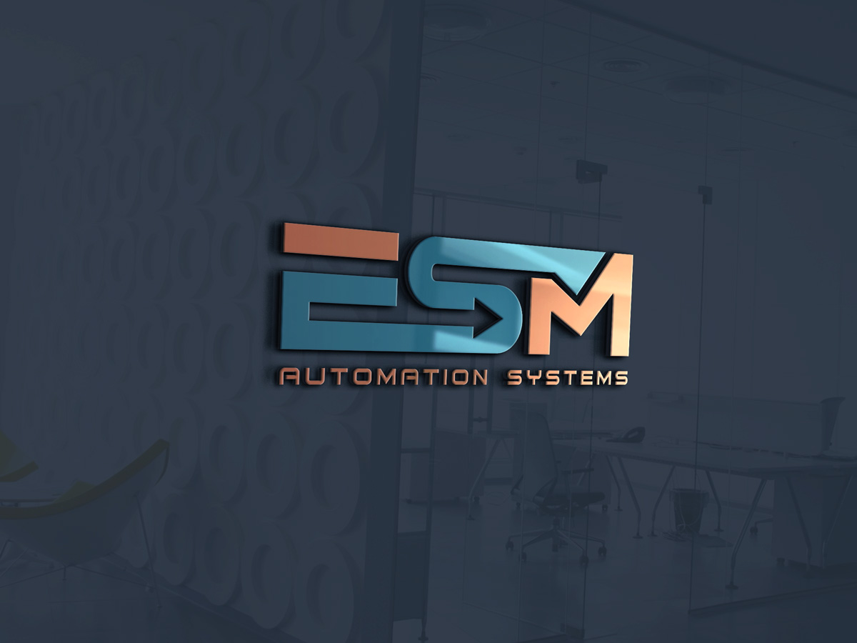
Este cliente recibió 97 diseños de logo de 42 diseñadores. Eligieron este diseño de logo de Joseph Affran como el diseño ganador.
Únete gratis Encuentra trabajos de diseño
-
 A$220
A$220
-
 97 diseños
-
 42 diseñadores
Resumen de Diseño de Logo
ESM would like to refresh our logo to better fit our increasing success in the emerging fields of IIoT, MES (Manufacturing Execution Systems) and advanced factory & process automation. We like a crisp, clean logo. Don't need to have the "Australia" in it. No serif fonts, colours such as the blue found in the current crescents, and on our website (www.esm.com.au) are a great guide. We are looking for something that will make a solid impact, yet elegant in its simplicity. Iterations of the logo through 20 years are in the image attached.
Objetivo del mercado(s)
Small - Medium manufacturers looking to leverage the best current technologies to improve production efficiencies
Texto del logo
ESM
Estilos de logo de interés
Logo pictórico / combinado
Un objeto del mundo real (texto opcional)



Logo con siglas
Acrónimo o logo tipográfico (solo texto)



Estilos de fuente para usar

Colores
Colores seleccionados por el cliente para ser utilizados en el diseño del logotipo:
Mira y siente
Cada control deslizante ilustra las características de la marca del cliente y el estilo que debe comunicar el diseño de tu logotipo.
Elegante
Atrevido
Juguetón
Serio
Tradicional
Moderno
Atractivo
Profesional
Femenino
Masculino
Vistoso
Conservador
Económico
De Alta Gama
Requisitos
Debes tener
- Clean, crisp, elegantly simple. Logo needs to pop on a web site, and be capable of being embroidered on apparel without losing significant effect.
Agradable de tener
- Non essential, but highly desirable are to integrate the Automation and / or efficiency concepts into a logo. Similar concepts to those adopted by Fedex, (the arrow between E & X, and Amazon's A->Z. Clever & elegantly simple.
No debería tener
- Cursive or serif font. Fades. Colours selected are a guide only. Want to keep away from Reds , Yellows, and Greens. There is no need to hang on to concepts of older iterations as per the attachment. Of all these that logo in use since 2008 is the one we have liked best. The Magistral 3 file is an effort that's been kicking around the office. Hope this is helpful.


