

 Refresh
Environmental non-profit needs logo
¿Quieres ganar un trabajo como este?
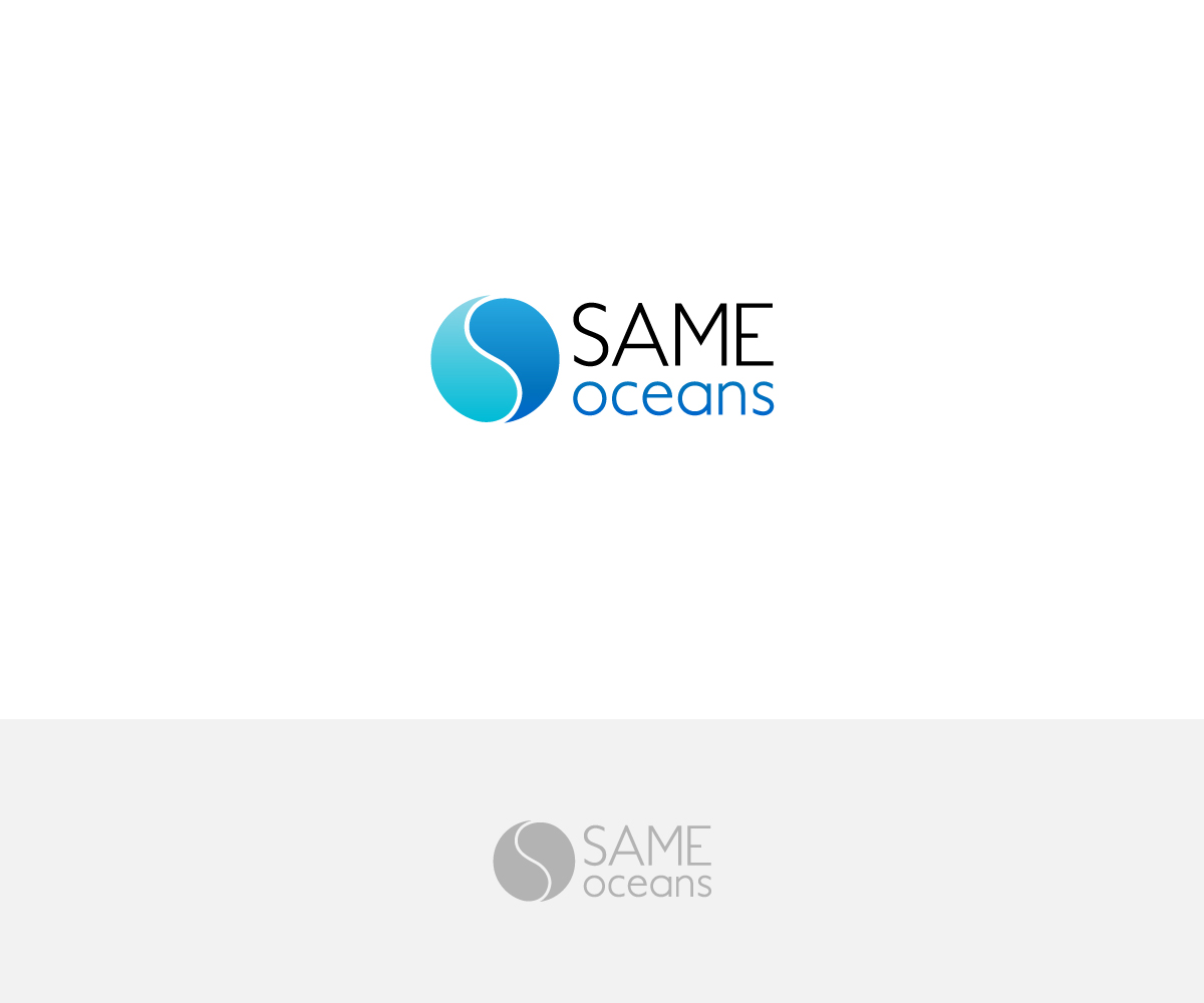
Este cliente recibió 137 diseños de logo de 58 diseñadores. Eligieron este diseño de logo de aglaronde23 como el diseño ganador.
Únete gratis Encuentra trabajos de diseño
-
 €160
€160
-
 137 diseños
-
 58 diseñadores
Resumen de Diseño de Logo
We need a logo for a non-profit company called 'SAME oceans'. We want to run projects in different countries to educate and raise awareness about the plastic pollution, and help save the oceans from plastic death. SAME stands for 'So All May Enjoy', so it would be great if this could be part of the logo (for example in small letter under SAME). I already thought about using the first two letters of our name (S and O) and merge them together, to a child of yin and yang sign. This could be styled as water, or - even better - waves. You can see the idea in the picture below. However, the S should be up straight, not in the picture where it leans to the left. The S should therefore be formed out of the same font as used for the word SAME, so it should be a font that melts into a circle and that creates the look of water / waves in the logo. The logo should be modern, clean and not too playful, so it can be easily reproduced on all sorts of material. I would prefer the colors of the ocean, a deep blue, maybe lighter blue or even a touch of turquoise would be possible. It would be great if I could use the logo so without the name, so a seperation of logo design and name design would be preferable.

Actualizaciones
Mehr Feedback sammeln
Texto del logo
SAME oceans
Estilos de fuente para usar

Colores
Colores seleccionados por el cliente para ser utilizados en el diseño del logotipo:
Mira y siente
Cada control deslizante ilustra las características de la marca del cliente y el estilo que debe comunicar el diseño de tu logotipo.
Elegante
Atrevido
Juguetón
Serio
Tradicional
Moderno
Atractivo
Profesional
Femenino
Masculino
Vistoso
Conservador
Económico
De Alta Gama
Requisitos
Debes tener
- Yin and yang sign (without the dots), styled as water or waves. The S from SAME should be used as the seperation between the tho halves, so the font should fit into the circle-logo perfectly, creating a look of water / waves. 'So All May Enjoy' (the acronym for SAME) should be added to the logo. SAME itself, or writing it around the circle if possible. Any other idea is so welcome.
Agradable de tener
- Clean, simple and modern.


