Logo design for soSIMPLE Software branding
¿Quieres ganar un trabajo como este?
Este cliente recibió 124 diseños de logo de 70 diseñadores. Eligieron este diseño de logo de ideaz2050 como el diseño ganador.
Únete gratis Encuentra trabajos de diseño-
 US$150
-
 124 diseños
-
 70 diseñadores
Resumen de Diseño de Logo
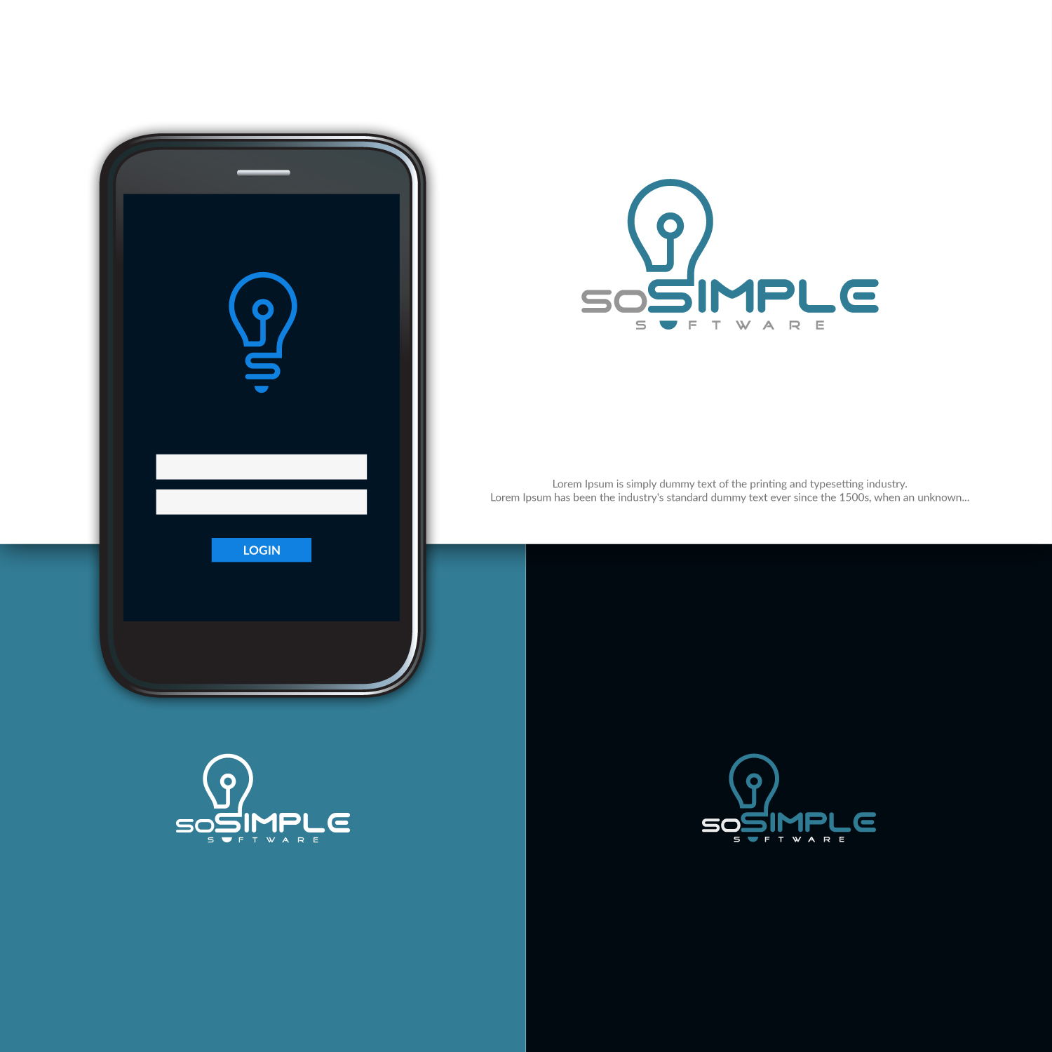
Designing new logo for a brand we've been using for years. We've previously just used lettering, or in combination with our company logo.
Some of the values we're looking to portray: Clean, simple, quality software. modern, forward-thinking, innovators.
We've been playing around with the lightbulb idea. But some of the reaction has been that while it captures the "simple" part, it doesn't capture the "modern" part. I think if we could stylize or modernize the light bulb it might work better.
Not necessary, but if we gracefully include elements of our company logo, that would be nice. That's why we chose teal as the color.
Actualizaciones
Need extra days to review
Objetivo del mercado(s)
FileMaker Pro developers and power-users.
Tipo de industria / entidad
Business Software
Texto del logo
soSIMPLE Software
Estilos de logo de interés
Logo pictórico / combinado
Un objeto del mundo real (texto opcional)
Mira y siente
Cada control deslizante ilustra las características de la marca del cliente y el estilo que debe comunicar el diseño de tu logotipo.
Elegante
Atrevido
Juguetón
Serio
Tradicional
Moderno
Atractivo
Profesional
Femenino
Masculino
Vistoso
Conservador
Económico
De Alta Gama
Requisitos
Debes tener
- Color teal from company logo.
Agradable de tener
- Project description says most of it. I'm liking the lightbulb idea, but needs to be more modern. I also like that the lightbulb has the letter "S" in the stem. But it looks a little old-fashioned, and we need modern.