Kickarse Corporate Rebrand for Sydney Real Estate Agency
¿Quieres ganar un trabajo como este?
Este cliente recibió 48 diseños de logo de 16 diseñadores. Eligieron este diseño de logo de ninisdesign como el diseño ganador.
Únete gratis Encuentra trabajos de diseño-
 A$400
A$400
-
 48 diseños
-
 16 diseñadores
Resumen de Diseño de Logo
We are an independent real estate agency in Sydney's Eastern Suburbs looking for a simple new logo that can be used across a variety of mediums - digital, print, brochures, signboards, letterhead, business cards, corporate stationery etc.
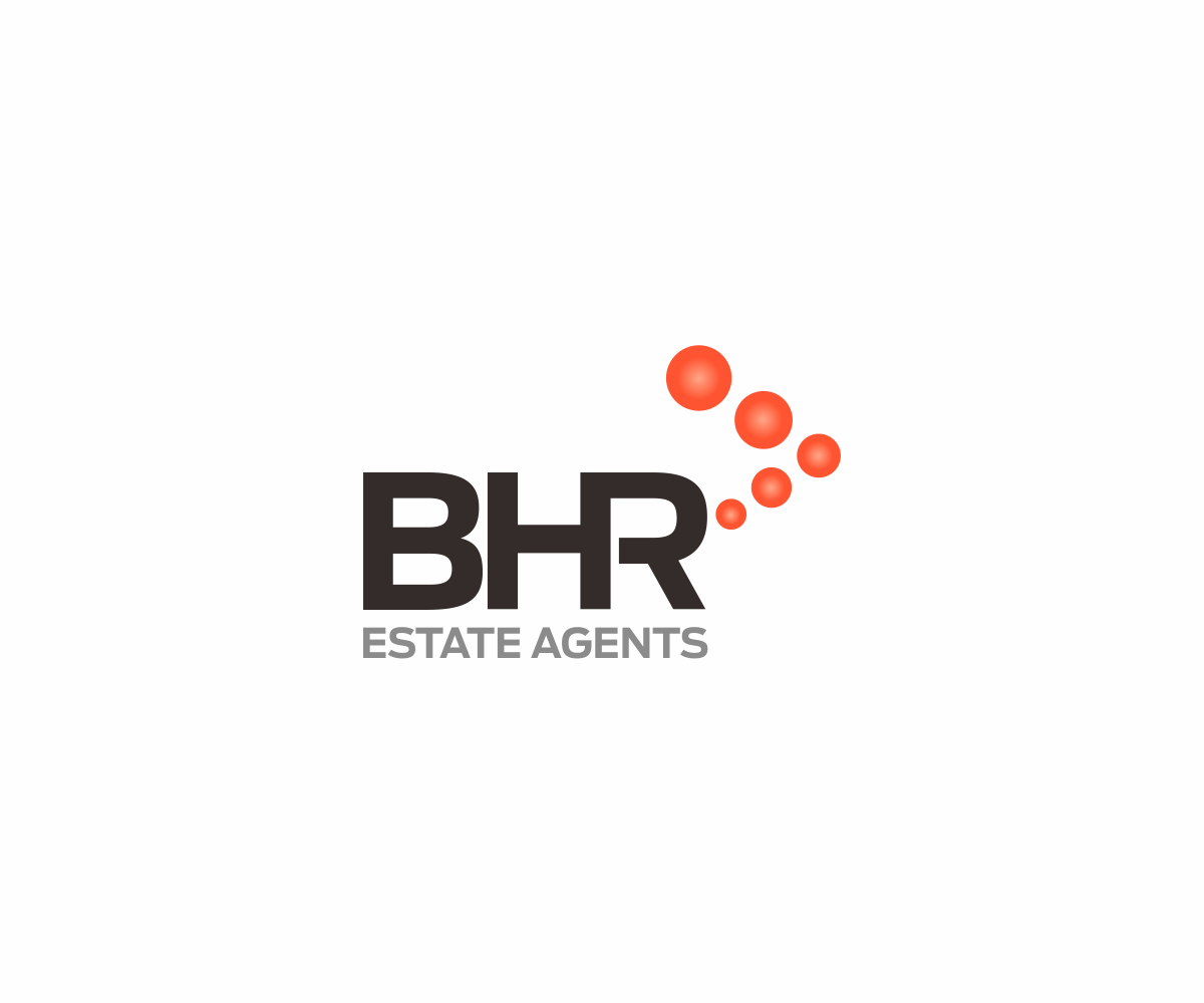
While our brand is BHR Estate Agents, we are often known simply as BHR so it important that the BHR part of the logo can be separated and work alone in thing such as an iPhone App button.
BHR is an acronym for one of our predecessor firms but we now want to people to recognise it as representing Boutique Homes & Residences (although we don't want the words used in the logo)
We want something chic, fresh and modern that can take us in to the next exciting stage of our business but still pay some heritage to earlier brands think VW, Apple, Nike etc., even DesignCrowd logo
Our website is mybhr.com which will give you an idea of where our brand is currently.
We pride ourselves on our innovations in marketing and ensuring that our clients always have a great experience dealing with BHR
I draw a synergy with Volkswagen - not a mass market brand but a strong boutique brand that has a strong association with its clients and has transformed into a brand recognised for safety style and being cool.
Our corporate slogan is 'Every property demands its own strategy' and when clients ask Why BHR? We respond with we offer knowledge, negotiation skills, time, energy. overall expertise and a strategy.
We operate in Sydney's trendiest and most affluent area and want the logo to represent something great.
Colour, font & design is up to you. Our current colour are black and sage green - all in all a mssculine look. We would love to go silver but recognise this is an issue with print reproduction especially in newsprint. Whatever colour it has to work on a simple white background. If you asked what typifies our local area it would be the blues of Sydney Harbour and the surf and the golden sands of our beaches.
It is really important that the logo can reproduce simply in print advertisements and outdoor (signboard) executions so shading and colours need to work on newsprint as well as on screen,
This is the start of our new corporate identity and the winning entrant will be engaged to bring it all together across the various mediums.
Actualizaciones
Thank you all for your submissions. We have now selected a design from Nimi in Indonesia and have closed the job.
Added Sunday, December 22, 2013
Objetivo del mercado(s)
30plus Home Owners
I draw a synergy with VW or Volkswagen - not a mass market brand but a strong boutique brand that has a strong association with its clients and has transformed into a brand recognised for safety style and being cool.
Tipo de industria / entidad
Real Estate
Texto del logo
BHR ESTATE AGENTS
Estilos de logo de interés
Logo con siglas
Acrónimo o logo tipográfico (solo texto)
Estilos de fuente para usar
Colores
Colores seleccionados por el cliente para ser utilizados en el diseño del logotipo:
Mira y siente
Cada control deslizante ilustra las características de la marca del cliente y el estilo que debe comunicar el diseño de tu logotipo.
Elegante
Atrevido
Juguetón
Serio
Tradicional
Moderno
Atractivo
Profesional
Femenino
Masculino
Vistoso
Conservador
Económico
De Alta Gama
Requisitos
Debes tener
- The words BHR ESTATE AGENTS
While our brand is BHR Estate Agents, we are often known simply as BHR so it important that the BHR part of the logo can be separated and work alone in thing such as an iPhone App button.
Chic, fresh and modern - this is the logo that could be on a large signboard out the front of a multimillion dollar home.
Logo must work in landscape application - e.g. signboard logo space is generally 30cm high x 1200mm wide
Agradable de tener
- We see the B becoming a major focus of the logo and spinning off in tag lines B Boutique etc. - similar to www.buxton.com.au
I really like the arrow device used by www.klemich.com.au but would like to see the arrow point to the right for our brand - signifies moving ahead and the dots signify dot points of a plan or strategy (5 dots also correlates with the 5 directors that own the business) - the Klemich look and feel is good - you can see its various uses throughout the site.
Would really like to see the logo limited to 3 colours - say black, grey and orange
Needs to be able to develop a colour palette for the business off the logo.
Colour palette needs to be upmarket and contemporary.
Company slogan is Every property demands its own strategy
No debería tener
- No houses or surfers or anything tacky. We have beaches in our area but also Sydney's most expensive real estate - we compete against brands like Sotheby's International but we want our logo to be fresh and engaging