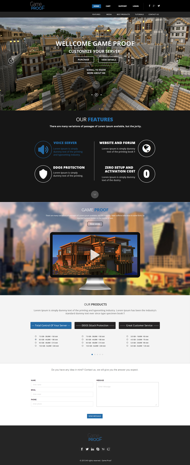
Help us redesign GameProof.net ! 550$ of prizes and job position!

¿Quieres ganar un trabajo como este?
Este cliente recibió 51 diseños web de 9 diseñadores. Eligieron este diseño web de OM como el diseño ganador.
Únete gratis Encuentra trabajos de diseño- Garantía
Resumen de Diseño Web
Dear Designers,
Gameproof.net is part of a bigger startup which spent the last 5 years doing research & developement.
We built a full software stack for the hosting market, starting from our own virtualization technology to the ecommerce software.
Everything was made either with open source software or with software wrote by us.
We made a HUGE investment to build a great platform which we’re now releasing to the public
Thanks to our flexibility we have an unprecedented number of features that allow us to meet every market demands at an unbelievable price point.
We offer EVERYTHING that a multiplayer server needs in a comprehensive package at a competitive price, without hidden fees or activation costs.
Example of features included for free in each of our products are:
- Preconfigured servers of multiple games;
- Ability to run multiple services and servers at once;
- Voice server;
- Web site with forum and store, ready to be used;
- Databases;
- AntiDDoS Firewall, with hacker protection;
and much much more... Our competition charges extras for such services because they need to license third party software, but we can offer them for free since we built them, and we have full control over the source.
We think we will REVOLUTIONIZE the market, but we also think that our current site design ( http://gameproof.net/ )is not up to the task.
-
We already partnered with an agency to remake the layout of our site, and we picked this layout:
http://bliccathemes.com/mukam/parallax.html
This is a general indication of how we want the layout of the new home page to be.
We will have a first splash screen, to welcome our users, and then a sticky menu to help navigate in a long, parallax home page.
The menu must be on 2 levels, first level to navigate the site, and second level to navigate inside the page.
What we are asking you is to rethink the graphic, to interpret it in a multiplayer way.
You can make as many changes as you want, but we don't want a complete overhaul, rather to adapt the design to our needs.
-
Prizes:
Winner: 300$
2 part time or a full time position as designer for us
Merit prizes: 1x. 20$
Best Creative Design: 55$ of products
Best Colorful Design: 55$ of products
Best Minimal Design: 55$ of products
Most Sales-Driving Design: 55$ of products
Most Inspired Design: 55$ of products
Jury Award: 55$ of products
Worst Design: 15$ of products
Actualizaciones
Project Deadline Extended
Reason: Dear Designers,
we decided to extend the deadline by 10 days to help you submit your final designs, and help us organize a big event where our users will pick up a winner.
Keep up your good work :)
Added Saturday, January 04, 2014
Objetivo del mercado(s)
Our target market are 14-24 years old. 75% are male students. They like videogames and would like to take their passion to the next level.
Tipo de industria / entidad
Investment
Estilos de fuente para usar
Colores
Diseñador para elegir los colores que se utilizarán en el diseño.
Mira y siente
Cada control deslizante ilustra las características de la marca del cliente y el estilo que debe comunicar el diseño de tu logotipo.
Elegante
Atrevido
Juguetón
Serio
Tradicional
Moderno
Atractivo
Profesional
Femenino
Masculino
Vistoso
Conservador
Económico
De Alta Gama
Requisitos
Debes tener
- It should be a redesign/interpretation of our site in a new theme:
http://gameproof.net/
http://bliccathemes.com/mukam/parallax.html
We want the parallax design and the general layout of the new design.
We want an easy way to integrate youtube videos in the layout.
You must rethink the graphic to adapt it to our market (multiplayer servers, mostly minecraft)
We need to explain our products, in a easy and clear way.
Agradable de tener
- It would be nice to see different types of social content in the page, like facebook posts, twitter feed, youtube feeds, etc
No debería tener
- It should not be too bloated, too flashy, too complicated. The idea is to make it lighter and simpler. These are a nice example of how this type of design can be interpret in a minimal way:
http://www.resoluut.com/
http://winners.webbyawards.com
Please avoid infringing any copyright.