UPDATED !! How it works/problem to benefit infographic for Shaving balm
¿Quieres ganar un trabajo como este?
Este cliente recibió 13 diseños gráficos de 5 diseñadores. Eligieron este diseño gráfico de Cut and Glue como el diseño ganador.
Únete gratis Encuentra trabajos de diseño-
 £130
£130
-
 13 diseños
-
 5 diseñadores
Resumen de Diseño Gráfico
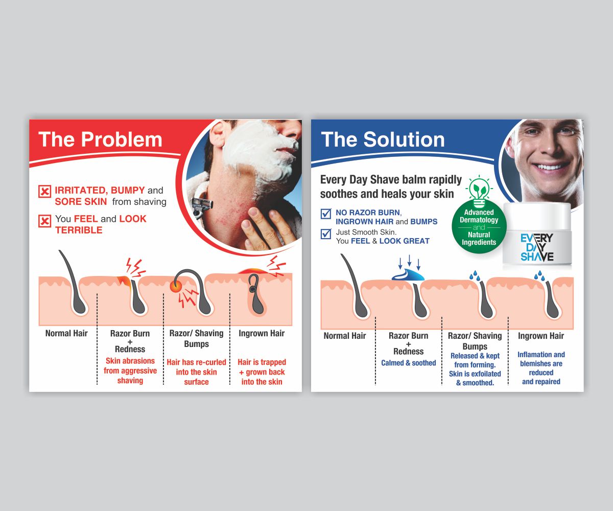
I need a talented designer to design a “How it Works” infographic for my product to fit on one row/section of my webpage. I have created a two part mood board for your inspiration. So I need two separate infographics that can fit on a two column webpage section. Please use your creativity to get the message across. I have just simply cut out bits from other sites to give you an impression of what I want.
My product is a post-shave balm that helps prevent, treat and fix razor burn/irritation and shaving bumps/Ingrown hair. I want the infographic to demonstrate the various stages of use of the product. Going from highlighting the problem, applying the solution and finally the result and benefits. There are some great examples used in the acne prevention treatments world. All these are in the attached file
Part one "The Problem" emphasises the pain point, so use red colouring on the skin diagrams
Part two "The Solution" should emphasise the relief. So use soothing colouring on the skin diagrams
I need it all to be of a consistent style, also masculine looking.
Please let me know if you want any more details.
Kind regards
Steve
Actualizaciones
I haven't received many designs for this project and would like a few more. There is one I like but i'm waiting for them to update based on my feedback.
Objetivo del mercado(s)
Men who shave
Colores
Colores seleccionados por el cliente para ser utilizados en el diseño del logotipo:
Mira y siente
Cada control deslizante ilustra las características de la marca del cliente y el estilo que debe comunicar el diseño de tu logotipo.
Elegante
Atrevido
Juguetón
Serio
Tradicional
Moderno
Atractivo
Profesional
Femenino
Masculino
Vistoso
Conservador
Económico
De Alta Gama
Requisitos
Debes tener
- Needs to look masculine. So please reflect this in the colour scheme and look and feel. Need to clearly get across the pain point and the solution visually. So if somebody just looked at it briefly, they know what the product is.
No debería tener
- Shouldn't look feminine are too cartoony