Better U Fitness is the name of the company, and those words must be included in the project
¿Quieres ganar un trabajo como este?
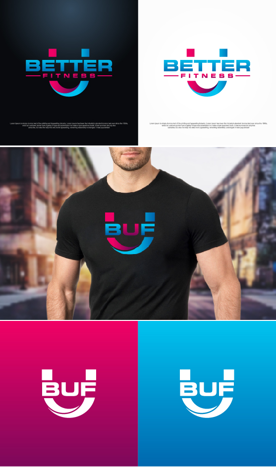
Este cliente recibió 196 diseños de logo de 51 diseñadores. Eligieron este diseño de logo de sushsharma99 como el diseño ganador.
Únete gratis Encuentra trabajos de diseño- Garantía
- Proyecto agrupado 1
-
 US$300
-
 196 diseños
-
 51 diseñadores
Resumen de Diseño de Logo
Looking to build a brand off of our concept. We are a co-ed group fitness boot camp that includes personal training. The "U" stands for university with the double entendre of improving yourself daily through fitness. I really want this to be a brand, not just a logo. I like the idea of bold font to catch the eye. My intent in the long run as we franchise is to use area codes with the acronym of BUF overlayed (ie BUF 209 over each other on apparel, etc). I don't have a pre-determined color scheme, but I am partial to black or blue. The gym itself will be very modern industrial with a lot of metal, rivets, pipes, etc in addition to fitness equipment that will be all black
Objetivo del mercado(s)
30-60 year old fit minded people with discretionary income. Fitness enthusiasts, spartan and cross fit athletes.
Tipo de industria / entidad
Fitness
Información de contacto para la tarjeta del negocio
Would like to emboss the cards to make them pop. Maybe foil or something similar.
Texto del logo
Better U Fitness
Estilos de logo de interés
Logo con emblema
Logo contenido dentro una forma / figura
Logo pictórico / combinado
Un objeto del mundo real (texto opcional)
Logo abstracto
Conceptual / simbólico (texto opcional)
Estilos de fuente para usar
Colores
Diseñador para elegir los colores que se utilizarán en el diseño.
Mira y siente
Cada control deslizante ilustra las características de la marca del cliente y el estilo que debe comunicar el diseño de tu logotipo.
Elegante
Atrevido
Juguetón
Serio
Tradicional
Moderno
Atractivo
Profesional
Femenino
Masculino
Vistoso
Conservador
Económico
De Alta Gama
Requisitos
Debes tener
- The letter U prominent in the design. I am open to imagery used, but it must be attractive to both male and female customers.
Agradable de tener
- Logo that would be compatible with the building sign. It will be 2 ft by 8ft. Open to using logo on left and bold text on right.
No debería tener
- Logos that are too busy...must be simple and bold
Archivos
Pagos
Total
US$300
Fecha límite del proyecto
10 jul. 2018 13:15:07 UTCUpgrades del proyecto
Proyecto(s) incluido(s)
- ofreciendo US$39 por el diseño de tarjeta de presentación al ganador