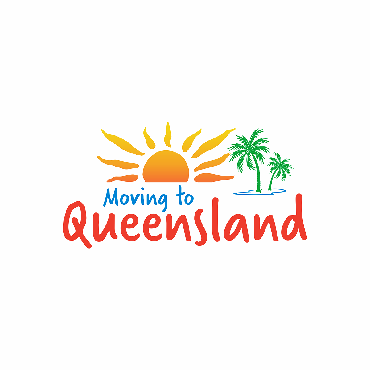
Logo for business called moving to Queensland
¿Quieres ganar un trabajo como este?
Este cliente recibió 149 diseños de logo de 61 diseñadores. Eligieron este diseño de logo de 333 Adrian 888 como el diseño ganador.
Únete gratis Encuentra trabajos de diseño- Garantía
-
 A$150
A$150
-
 149 diseños
-
 61 diseñadores
Resumen de Diseño de Logo
Logo for Australian interstate removal business targeting people that want to move from southern States up 2 Queensland so want to radiate the feeling of let' go or I'm going to do it but still gotta put out a message of credibility and remember it's still a removalist business and lean towards the word Queensland standing out.
check.pics for details and ideas on attachments below.
I did like the logo man and van logo just the fullness of it.
Really looking for something that fills up the whole circle or Square.
And the other Queensland colourful logo attachment I did like just for the known colours.
Objetivo del mercado(s)
The main target market is people there in big cities southern states that' are moving North to Queensland as a little bit of escapism. And a cheaper lifestyle and looking for someone with a big truck
So the whole palm Beach feel is good but still gotta put out a message of credibility.
Texto del logo
Moving to queensland
Estilos de logo de interés
Logo con personaje
Logo con ilustración o personaje
Estilos de fuente para usar
Colores
Diseñador para elegir los colores que se utilizarán en el diseño.
Mira y siente
Cada control deslizante ilustra las características de la marca del cliente y el estilo que debe comunicar el diseño de tu logotipo.
Elegante
Atrevido
Juguetón
Serio
Tradicional
Moderno
Atractivo
Profesional
Femenino
Masculino
Vistoso
Conservador
Económico
De Alta Gama
Requisitos
Debes tener
- There are no real must haves apart from the text moving to Queensland.
- Was looking for some sort of modern font or professional marketable font.
- But it can be up to your imagination.with what you design
Agradable de tener
- Was looking for some modern fonts saying
- moving to Queensland.
- On the logo
- With good colour coordination.
- I did like the colour coordination of the design we gave five stars to with the Queensland red it could fit in well with the theme colour of the web site.
- Ideally something artistic with good font that says clearly moving to Queensland prefer Queensland in a bit bigger letters
- Had the idea of a palm tree.
- More looking for a character design.
- You can also have a picture of a truck but that's optional
- I like how about my moovers attachment logo stands out because it's a big logo that takes up the whole box like on the attachment where it is in with a few other logos on a comparison website
- When it's in a list of other logos the fullness of it.
- And like the colour coordinationon on the Queensland logo at the bottom on the attachments