Transform Rehabilitation physical therapy logo
¿Quieres ganar un trabajo como este?
Este cliente recibió 105 diseños de logo de 44 diseñadores. Eligieron este diseño de logo de kytdhfx como el diseño ganador.
Únete gratis Encuentra trabajos de diseño- Garantía
-
 US$120
-
 105 diseños
-
 44 diseñadores
Resumen de Diseño de Logo
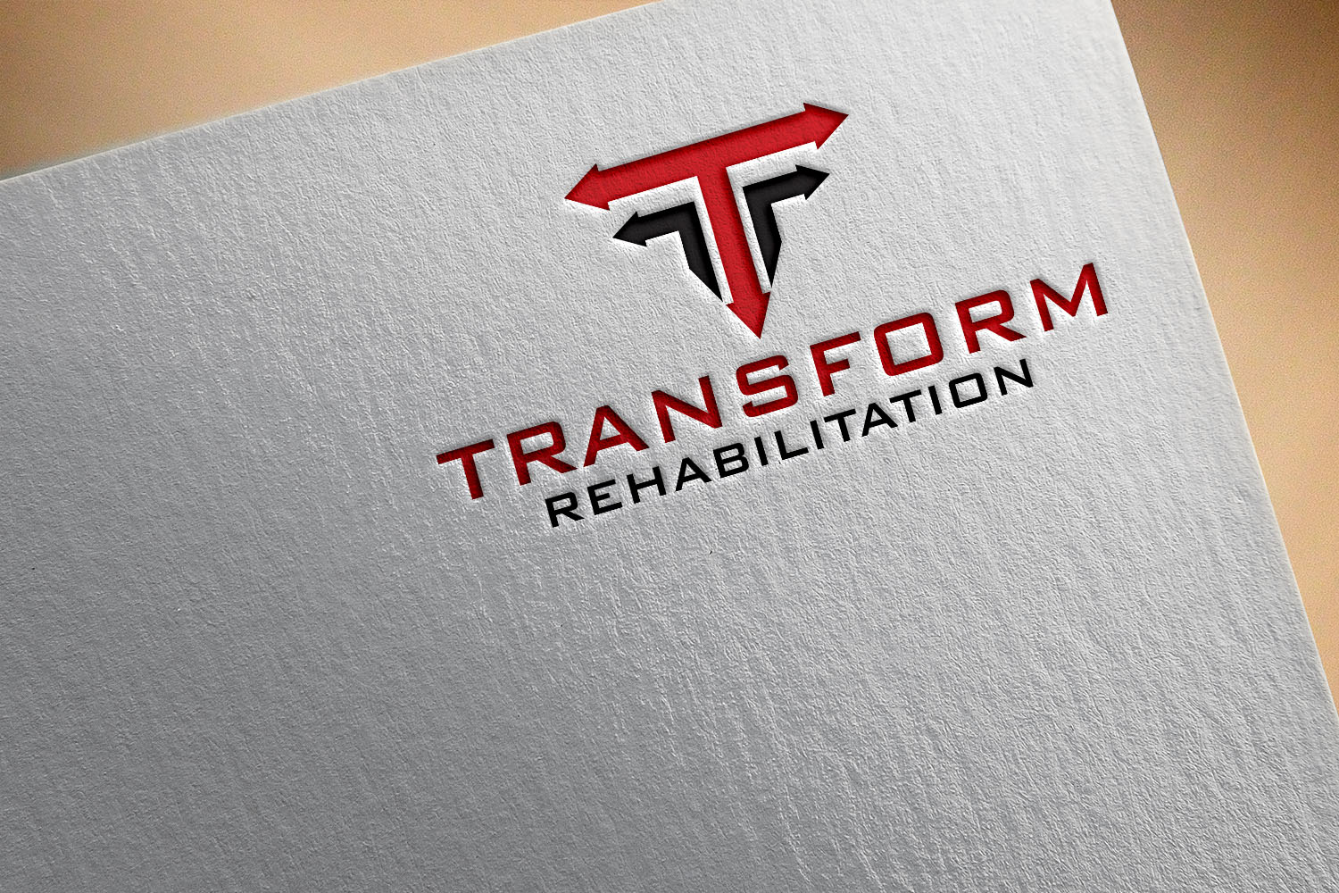
I need a logo design for a new physical therapy business in the Lehigh Valley area in PA. Attached is the Transform rehabilitation logo which I need altered and perfected.
First I need the gold gradient background gone. Its too difficult to add the logo to pamphlets and other documents w/o it being too difficult to blend in. preferably White or a light grey background will work best.
I also want each of the 5 arrows to be Red ("100 MPH" red paint from Behr is what our building is using as our accent color) Maybe the arrows could still be thinly outlined in black, filled in with the red.
I want the entire thickness of the entire logo to be slightly less.
I also need the logo to be perfected from the many little flaws. You'll notice many imperfections (length of arrows not being the same, edges not perfect, lines not perfectly straight etc)
For the logo text I want It to say "Transform Rehabilitation" I want the "Transform" on top of the "Rehabilitation". I also want them to both be the same length so the font of "Transform" needs to be a larger than the "rehabilitation" font. I was using "bank gothic" as the font before, but if you think you can find a better font, please don't be shy to suggest
Also, if you think you can make anything look better please be creative and use your expertise to make it a great logo. I trust you!
Texto del logo
Transform Rehabilitation
Estilos de logo de interés
Logo pictórico / combinado
Un objeto del mundo real (texto opcional)
Logo abstracto
Conceptual / simbólico (texto opcional)
Mira y siente
Cada control deslizante ilustra las características de la marca del cliente y el estilo que debe comunicar el diseño de tu logotipo.