hoptop
¿Quieres ganar un trabajo como este?
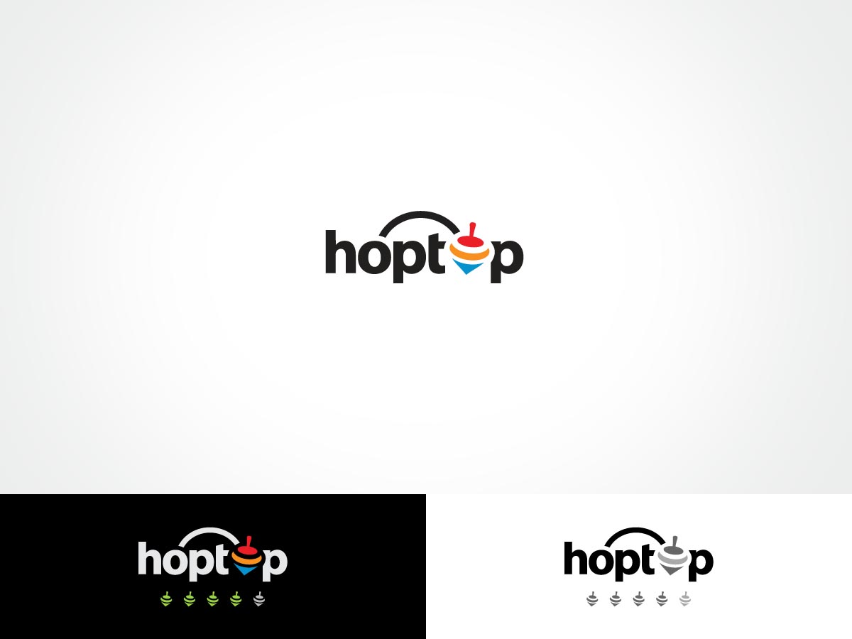
Este cliente recibió 87 diseños de logo de 28 diseñadores. Eligieron este diseño de logo de ArtTank como el diseño ganador.
Únete gratis Encuentra trabajos de diseño- Garantía
-
 US$200
-
 87 diseños
-
 28 diseñadores
Resumen de Diseño de Logo
We need a logo design for a new company based in Boston called "hoptop". hoptop.co is a new marketing competition website as well as an online marketing community. It helps marketers to get more projects done with less time/budget/resource. It also provide consultants and freelancers new business opportunities. The target audience are mainly from USA, Canada and some European countries.The competition provides ranking and review opportunities to build professional reputation and networks.
Hop means "Jump". Top means "Number 1" as well as "Spinning Top". "hoptop" means "Jump to the top". The website features competition projects, ranking and reviews. We would like to get a spinning top design in the logo. It should be able to separate from the text. (Example: Twitter. The logo can be displayed with the bird or without or just the bird).
The spinning top is a childhood game in China. (Reference: http://kaleidoscope.cultural-china.com/en/144K1186K1618.html) I also attached the history of spinning tops. It will be ideal that the spinning top design is in motion and can be used as review buttons (Examples as attached from tripadvisor, google plus and yelp).
We wanted the logo to be simple but not too simple, modern and fun. It can be easily described and remembered.
Actualizaciones
Just updated the brief to include the color scheme options and some logos I like. Thank you!
Added Thursday, January 02, 2014
Hello, just updated the scale of look and feel. I've increased the weighing for Playful, Modern, Professional and Upmarket. Out of all of those, Playful and Modern should get the most weighting. Thank you!
Added Thursday, January 02, 2014
Project Deadline Extended
Added Saturday, January 04, 2014
Tipo de industria / entidad
Marketing
Texto del logo
hoptop
Estilos de logo de interés
Logo con emblema
Logo contenido dentro una forma / figura
Logo pictórico / combinado
Un objeto del mundo real (texto opcional)
Logo abstracto
Conceptual / simbólico (texto opcional)
Logo con personaje
Logo con ilustración o personaje
Logo de marca de nombre
Logotipo basado en palabra o nombre (solo texto)
Logo con siglas
Acrónimo o logo tipográfico (solo texto)
Colores
Colores seleccionados por el cliente para ser utilizados en el diseño del logotipo:
Mira y siente
Cada control deslizante ilustra las características de la marca del cliente y el estilo que debe comunicar el diseño de tu logotipo.
Elegante
Atrevido
Juguetón
Serio
Tradicional
Moderno
Atractivo
Profesional
Femenino
Masculino
Vistoso
Conservador
Económico
De Alta Gama
Requisitos
Agradable de tener
- an illustration of spinning top in motion. The top also can be listed as five tops in a row for review system. (e.g. five stars = five tops. 3.5 stars = 3.5 tops)
color scheme choices: blue, orange, red, or multiple colors.
I like the design of twitter, WWF and dropbox. I've attached the logos as some examples. Please also consider that the logo of spinning top can be used in the review system (i.e. # of stars = # of spinning tops)
It would be nice to see some designs around the Os in hoptop. Some ideas: use some kind of motion (e.g., a wave or a curved line) of the first O jumping/connection to the second O. Or maybe the Os are tilted to the right while everything else is straight so that it projects motion? Or last idea, maybe the Os are slightly elevated above the other letters so that they appear to be jumping? Thank you!