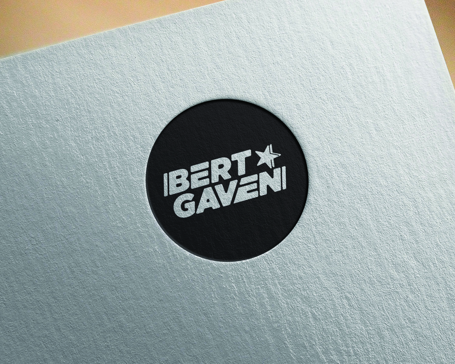
DJ Logo - Bert Gaven
¿Quieres ganar un trabajo como este?
Este cliente recibió 35 diseños de logo de 17 diseñadores. Eligieron este diseño de logo de Rzk como el diseño ganador.
Únete gratis Encuentra trabajos de diseño- Garantía
-
 A$120
A$120
-
 35 diseños
-
 17 diseñadores
Resumen de Diseño de Logo
Howdy, Y'all!
I have recently started DJing professionally and need a logo to help build my brand. It will feature in event advertising, Facebook/other social media and on merchandise.
I have attached a couple quick drawings below - clearly, I shouldn't start pursuing a career in graphics design anytime soon.
I really like the rounded corners on the font and a star after 'Bert'. Looking at it now, I'm not a big fan of the two lines before the star, I think it would be best not to include them. If possible, I would like to have blue font over a white background and white font over black background. I also really like the extra line at the start of the 'B' and at the end of the 'N'
Thanks so much
Love
Bert
Objetivo del mercado(s)
Club Promoters, party goers and other people in the music industry
Texto del logo
Bert Gaven
Estilos de logo de interés
Logo de marca de nombre
Logotipo basado en palabra o nombre (solo texto)
Estilos de fuente para usar
Colores
Colores seleccionados por el cliente para ser utilizados en el diseño del logotipo:
Mira y siente
Cada control deslizante ilustra las características de la marca del cliente y el estilo que debe comunicar el diseño de tu logotipo.
Elegante
Atrevido
Juguetón
Serio
Tradicional
Moderno
Atractivo
Profesional
Femenino
Masculino
Vistoso
Conservador
Económico
De Alta Gama
Requisitos
Debes tener
- Bert with a star at the end. Gaven to start below Bert with the G starting under the E in Bert. Rounded corners on the font. As per my terrible drawing
Agradable de tener
- Two lines, one at the start of the B and the other at the end of the N as per the quick drawing I attached
- Would also be good to see it with blue font on a white background and one in white font on a Black Background
No debería tener
- Please do not include the 'font size' guidelines in the drawing and the two lines between 'Bert' and the star.