Pain Research and Medical Practice logo
¿Quieres ganar un trabajo como este?
Este cliente recibió 185 diseños de logo de 54 diseñadores. Eligieron este diseño de logo de instudio como el diseño ganador.
Únete gratis Encuentra trabajos de diseño-
 US$900
-
 185 diseños
-
 54 diseñadores
Resumen de Diseño de Logo
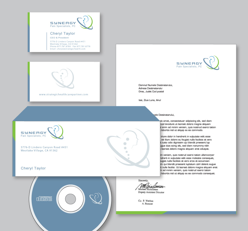
This is for a progressive California medical practice, Synergy Pain Specialists (Specialty) that treats ALL types of people with PAIN. Typical patients have back or neck pain however. There is an active research component of the practice that brings the latest, most advanced treatment options to the table. The logo should convey professionalism and technical clarity, but not be cold. It should somehow convey pain, but triumph (over pain). We are open to any representations or ideas, but I have some vague thoughts that could be used (NOT required however) as follows....
Other pain medical practices, especially those that do a lot of spine work like Synergy, have pictures of a person with a spine visible in it. I am open to this.
Frequently the person would be gripping their back to indicate pain. Other logos show gripping of the neck or head to indicate pain and illness. We want to emphasize healing, not illness. For the Synergy logo, I think the avatar/person might be raising their arms trimuphantly. Not straight up like "I am the champ", but elbows bent, fists formed like "yes, I just pulled it off."
For some reason I see the person seen from a slightly low angle. I guess this is more powerful (empowering?) and triumphant.
I think you may somewhat see a face, but not quite. It would be nice if sex wasnt exactly clear either.
As opposed to red and orange to indicate pain, I think green is a more healing. I do have a concern over a logo that is too colorful however as the logo should translate well into grayscale for paperwork/letterhead.
Draft text for logo "Providing comprehensive diagnostics, progressive treatment, and collaborative care"
Actualizaciones
"emphasize triumph over pain" is a refrain that is being given to most all submissions. Also consider toning down the "bold factor", need more sophistication. maybe we should have put the slider at neutral
Added Tuesday, March 20, 2012
Project Deadline Extended
Reason: many designs are close and being seriously considered, but none are a final rendition.
Added Wednesday, April 04, 2012
although some are very close, we are so far having trouble getting a clear winner. A designer gave us inspiration that I am going to pass along. Pain is neurologically mediated, so neurons and the brain could be depicted (not just the spine). Energy be it magical, biological, chemical or electrical can stop pain. Consider these new themes as possibilities for the logo. These could be added to current designs, but I also imagine some of the more creative out there could use these themes alone to come up with a winner. We are pushing the deadline back 10 days to allow further submissions.
Added Wednesday, April 04, 2012
Tipo de industria / entidad
Progressive
Texto del logo
Synergy Pain Specialists, PC
Estilos de logo de interés
Logo pictórico / combinado
Un objeto del mundo real (texto opcional)
Mira y siente
Cada control deslizante ilustra las características de la marca del cliente y el estilo que debe comunicar el diseño de tu logotipo.
Elegante
Atrevido
Juguetón
Serio
Tradicional
Moderno
Atractivo
Profesional
Femenino
Masculino
Vistoso
Conservador
Económico
De Alta Gama
Requisitos
Agradable de tener
- triumph over pain somehow depicted
No debería tener
- illness depicted, PC emphasized. PC is simply professional corporation, a designation required in california (similar to LLC)