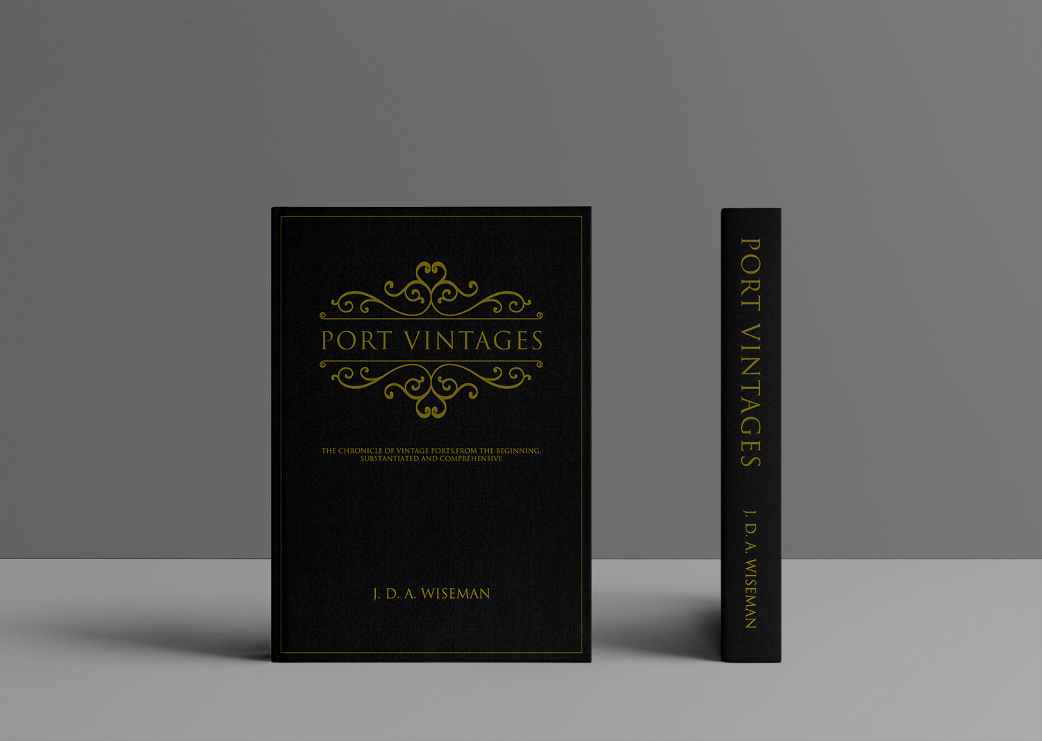
Port Vintages, a definitive reference book on port
¿Quieres ganar un trabajo como este?
Este cliente recibió 41 diseños de portada de libro de 19 diseñadores. Eligieron este diseño de portada de libro de Art_Seduction como el diseño ganador.
Únete gratis Encuentra trabajos de diseño- Garantía
-
 £170
£170
-
 41 diseños
-
 19 diseñadores
Resumen de Diseño de portada de libro
My husband has just finished writing a big book on Vintage Port. We need a hardcover book flap design for this book that is impressively huge. It's taken 10 years to research and write. It's 650 pages, interior is A4, exterior 4mm larger, and weighs nearly 3 kilos. It's a special book for people in the wine and port industry, as well as for someone who loves to drink Vintage Port. It can be a beautiful coffeetable book too.
The book is mainly about port and its declared vintages. It's also about the history of port, who drank it, when, how, where, who bought it, for how much, and the port houses are also described in detail.
The wine expert Michael Broadbent wrote a book about vintage wine in 2002, and my husband would like to have a similar cover for his book. (A photo attached in files). I've attached other photos to give the designers an idea of the look and feel of the 'port culture', as well as photos of the typeface that my husband will be using for the inside hardcover.
Objetivo del mercado(s)
Wine and port industry. Wine aficionados.
Tipo de industria / entidad
Winery
Estilos de fuente para usar
Colores
Colores seleccionados por el cliente para ser utilizados en el diseño del logotipo:
Mira y siente
Cada control deslizante ilustra las características de la marca del cliente y el estilo que debe comunicar el diseño de tu logotipo.
Elegante
Atrevido
Juguetón
Serio
Tradicional
Moderno
Atractivo
Profesional
Femenino
Masculino
Vistoso
Conservador
Económico
De Alta Gama
Requisitos
Debes tener
- Book Cover must have Title: "Port Vintages" and "J. D. A. Wiseman" (files attached to show proper typeface). One of the files is a flap jacket book cover that my husband designed himself. We're looking for more design ideas, and that pdf is a close winner to what he wants.
Agradable de tener
- illustration or painting of port glasses, or grapes, or similar. Dark colors, especially port wine, deep red wine colors. Gold writing, black writing, with red/berry/maroon accents. Luxury, elegance, has a masculine edge, traditional, but not too old-school and boring (like grandpa). Textures that are including with the culture of drinking vintage port are leather, velvet, cigar, wood, marble, winter, fireplaces. This sounds quite heavy, but it also should be simple and clean. I hope this isn't too confusing. Thanks!
No debería tener
- Bright colors, playfulness.