

 Refresh
Have you played "it"?
¿Quieres ganar un trabajo como este?
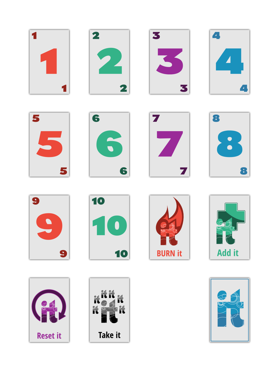
Este cliente recibió 79 diseños gráficos de 3 diseñadores. Eligieron este diseño gráfico de design.bb como el diseño ganador.
Únete gratis Encuentra trabajos de diseño
-
 US$190
-
 79 diseños
-
 3 diseñadores
Resumen de Diseño Gráfico
I am creating a card game called “IT” and will need help designing the following:
The name of the game is “it”. So I need a logo and I want it to be the word “it” but obviously I want to word it to have its own style and look. So it will be recognizable. The “it” logo will be on the back of all the cards and on the box that I sell it in.
There will be cards numbered 1-10 in the game and I want it to be a basic design with some color on each of those cards. Preferably where the number is listed in 2 of the 4 corners in smaller text so that you can always see what card it is, whether it is upside down or not. I visualize the number being large in the center of the card as well. I want there to be some sort of simple and modern design element to the card that we can repeat on all the numbered cards. All the numbered cards being the same color is fine, but I am also ok with having some variation of the color if you like that.
There are 4 action cards in the deck that will have there own art work on card. I want the same theme to carry between all the actions cards and that action is that whatever the descriptive word is that its happening to the word “it”. It will make more sense when you see the categories below. Each action card will have a short sentence on the bottom describing how house the card so design the card knowing that.
“BURN it” card-The word “it” either being burned in a fire or the word “it” looking burned standing alone or maybe the word “it” is on fire or its seared. If you have other ideas I am excited to see them.
“Add it” card- (addition) This card allows you to add other card values together. So something that show addiction happening or even the word “it: being added. i.e. i+t=it
“Reset it”- I like the idea of this one having a reset button on it and the word “it” is built in to the reset button. The I and the t being curved to look like a reset button if that makes sense.
“Take it”- This card forces you to take the entire discard pile so its not a BAD card. Do whatever you come up with here. I want the card to be darker in color since its a BAD card. Something that shows “it” being taken.
I want everything to be very simple and clean looking. I want to design and feel of the cards to be modern. I really like logos like Nike and Apple. Very basic but strong. I included some basic logos I found online just to give an example of simple. Simple with a pop. Something that still draws attention and maybe the color helps with that.
Objetivo del mercado(s)
Families and college age gamers
Estilos de fuente para usar

Colores
Diseñador para elegir los colores que se utilizarán en el diseño.
Mira y siente
Cada control deslizante ilustra las características de la marca del cliente y el estilo que debe comunicar el diseño de tu logotipo.
Elegante
Atrevido
Juguetón
Serio
Tradicional
Moderno
Atractivo
Profesional
Femenino
Masculino
Vistoso
Conservador
Económico
De Alta Gama
Requisitos
Debes tener
- A simple feel to the design with some color
Agradable de tener
- a playful feel to the design
No debería tener
- complex designs or art work
