OptiFleet Logo - Help! Need a logo now! New business, with a Fresh, Savvy & Trustworthy brand image
¿Quieres ganar un trabajo como este?
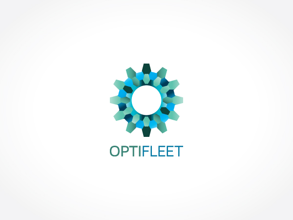
Este cliente recibió 238 diseños de logo de 20 diseñadores. Eligieron este diseño de logo de Kitchenfoil como el diseño ganador.
Únete gratis Encuentra trabajos de diseño- Garantía
-
 US$440
-
 238 diseños
-
 20 diseñadores
Resumen de Diseño de Logo
We are a start up company in New Zealand providing vehicle fleet consulting services to organisations in the private and public sector. Our name is Optimal Fleet Solutions Limited (OptiFleet). Over the next 2 years our company will move into the development of cutting edge fleet technology solution development but currently our core business is to understand how organisations currently purchase, manage and dispose of their vehicles, we then map this against best practice to show them where they can improve. We help organisations to reduce cost and risk, and be more sustainable when managing their fleets.
The final design should reflect a modern, business savvy, fresh and dependable organisation. Our consultants are vibrant, young and knowledgable people so the brand should reflect this by using a colour or having an element that sets it apart from other suit and tie consultancy firms.
We like the mix of colours used in the City of Melbourne logo attached below. The green and blue represent sustainability and dependability. Other highlight colours also bring a fresh element so one other complementary 'pop' colour could be used as well. We also love how this design seems to glow which makes it feel shiny and fresh. We also like the colours used in the Meridian logo. We would like to keep the number of colours used to a maximum of 3 or 4 to limit printing costs.
While our original brief suggested the use of a Planetary Gear Set graphic would be a good metaphor for our services, designs using this as inspiration were not received well by our first focus group. The gear images were not translating as "vehicle" or "fleet" but more as engineering.
Regarding the fonts, we would like to have a sans serif font that is curved as opposed to square as we want it to look modern, rather than "computery". Examples are provided below in the ColourFruit example and Environment Solutions. The font should not be too wide, nor too narrow just a nice balanced font width.
We would like a graphic that is dynamic, so the use of 3D or other techniques to represent this is appealing to us. Examples, Ultrasound Solutions and City of Melbourne attached below. It would be nice to have a logo symbol that could be recognised as ours, even without the OptiFleet text, so we could it to apply to other sub-brands as they are developed. The graphic must be clean and modern and ideally should have an element that makes it unique to us, with a subtle reference to vehicles or fleets.
Further to our original brief, after seeking feedback on the designs submitted to date, the following comments were given:
Use of too much dark blue, eye shaped graphics and rounded square font reads medical or optometrist alongside the "opti" component of our name.
Use of gears symbols doesn't read vehicles/fleet, but engineering.
Use of square, computer based fonts looks dated.
We have our first deliverable due to a client in only a fortnight so we're really keen to get to an outcome on branding this week, so any ideas you can throw at this would be greatly appreciated! Many thanks.
Actualizaciones
Project Deadline Extended
Reason: We have decided to extend the deadline by 2 days to give designers the opportunity to produce further options over the weekend.
Added Thursday, March 22, 2012
Project Deadline Extended
Reason: We have now forwarded our favourite designs to a focus group and will come back to the designers with any changes or feedback that may be necessary following this process. We are still keen to see the revisions requested earlier from designers as these will be forwarded on to the focus group as soon as they arrive if they meet our requirements.
Many thanks
Jessie and Jack
Added Monday, March 26, 2012
Project Deadline Extended
Reason: We are still working through iterations of designs with designers following on from our focus group and their feedback so we need to extend our deadline to ensure we have enough time to get to a good outcome. I have just updated our brief to reflect some of the feedback from this focus group, particularly to say that the "gear set" images were not resonating with quite a number of them. Our brief otherwise is pretty much the same... Sans Serif Text, 3D graphic that subtly and stylishly hints at fleet, or vehicles, or the concept of optimisation... it must be unique to us and instantly recognisable. The Blues and Greens of the City of Melbourne logo, and their glossy, reflective application are appealing as we feel they represent a fresh, savvy, sustainable and dependable organisation. Dark blue logos or eye shaped logos should be avoided because they seem to be translating as medical or optician's logos alongside the "Opti" part of our name. Thanks.
Added Wednesday, March 28, 2012
Objetivo del mercado(s)
Chief Executives, Fleet Managers, High Level executives in private and public organisations with 20+ vehicles
Tipo de industria / entidad
Sustainability
Texto del logo
OptiFleet
Estilos de logo de interés
Logo abstracto
Conceptual / simbólico (texto opcional)
Mira y siente
Cada control deslizante ilustra las características de la marca del cliente y el estilo que debe comunicar el diseño de tu logotipo.
Elegante
Atrevido
Juguetón
Serio
Tradicional
Moderno
Atractivo
Profesional
Femenino
Masculino
Vistoso
Conservador
Económico
De Alta Gama
Requisitos
Debes tener
- Modern, fresh and clean design. Not too busy or complicated. Sans serif fonts with clean lines that complement the logo image. Possibly a 3D component to the graphic only (not text - see City of Melbourne, Ultrasound in motion examples where font is flat but image is 3D). A graphic with fine or etched lines (Meridian or Environment Solutions) or shattered/optical solid 3D shape (like City of Melbourne), a stylised/abstract representation of the planetary gear set or something that represents vehicles and fleet.
Agradable de tener
- Clever inter-relationship between image and text
No debería tener
- Too many colours. Old style or serif fonts.