International representatives of Mexico in World Photographic Cup
¿Quieres ganar un trabajo como este?
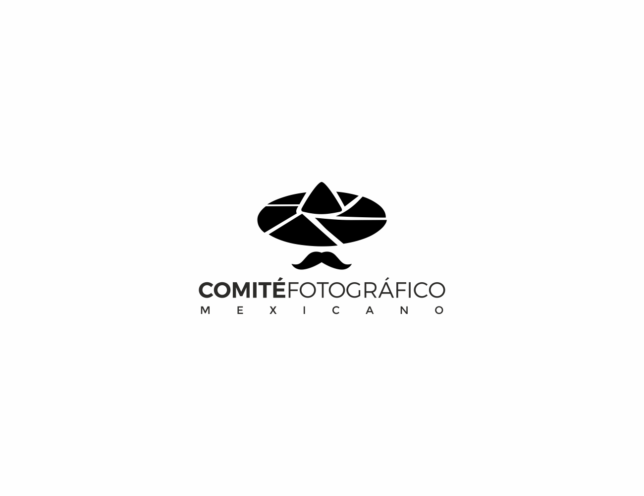
Este cliente recibió 122 diseños de logo de 48 diseñadores. Eligieron este diseño de logo de MOH Studio como el diseño ganador.
Únete gratis Encuentra trabajos de diseño- Garantía
-
 US$150
-
 122 diseños
-
 48 diseñadores
Resumen de Diseño de Logo
Our organization has just turned 3 years old, we have grown tremendously in importance in our country as we have achieved great results nationally and internationally. Getting top spots at World Photographic Cup, which is like the Olympics of photography. For this reason we feel we have outgrown our logo, as it is very childish and does not look as professional as the photographers/artists we now represent. The text portion of it is ok, what we feel need a desperate upgrade is the image part of the logo. The image was designed with elements that we DO like:1. The hat or "mexican sombrero" which is a stereotypical aspect of our culture but was made to look like the dipham of a camera. However we often get people that don't see the diaphragm and don't understand the why for the hat. 2. The man is a "happy mexican" fact that we do like as we like for our organization to be known as friendly and approachable. We have created a great community that continues to grow and brought the whole mexican industry together. 3. The man is winking as you do when you take a picture. However there are elements that we definitely DON’T care for1. It's too cartoon like and childish2. The "saraper" or wavy part at the bottom3. The fact that the logo resembles that of “mexican taco” restaurant on mex/usa border. What we would like to see portrayed in our evolution of a new logo:1. A graphic or abstract representation of the old logo 2. Something modern- avant garde -innovative, - pioneering, -progressive, unconventional That is what we are. 3. That conveys the serious respected organization we have grown to be, but that also keeps the fresh and approachable look and feel that has helped us be where we are now. 4. Elements that although they might make you think oh this is the Mexican team, does not feel like a stereotypical representation, (we get complaints about portraying bad stereotypical image of méxico)5. Finally that when you see it you do think we are a photographic organization. Making it implicit and not explicit. I am including our current logo and the stationary we are currently using for our communications.
Actualizaciones
Need extra days to review
Tipo de industria / entidad
Photographer
Texto del logo
Comité Fotográfico Mexicano
Estilos de logo de interés
Logo abstracto
Conceptual / simbólico (texto opcional)
Logo con siglas
Acrónimo o logo tipográfico (solo texto)
Estilos de fuente para usar
Mira y siente
Cada control deslizante ilustra las características de la marca del cliente y el estilo que debe comunicar el diseño de tu logotipo.
Elegante
Atrevido
Juguetón
Serio
Tradicional
Moderno
Atractivo
Profesional
Femenino
Masculino
Vistoso
Conservador
Económico
De Alta Gama
Requisitos
Debes tener
- CFM - Comité Fotográfico Mexicano