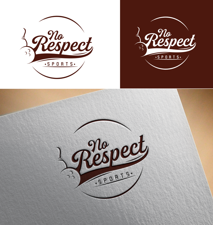
No Respect Sports Productions Logo

¿Quieres ganar un trabajo como este?
Este cliente recibió 54 diseños de logo de 19 diseñadores. Eligieron este diseño de logo de victor2 como el diseño ganador.
Únete gratis Encuentra trabajos de diseño- Garantía
Resumen de Diseño de Logo
We are looking to create a logo for a brand new company called No Respect Sports Productions. We are inspired by a comedian from the 1970s and 1980s from our youth named Rodney Dangerfield. Rodney famously used the lines "I get no respect" in a lot of his bits. Here is a commercial from 1982 where he is in a position to win for his team if he only gets one bowling pin and he fails.
https://www.youtube.com/watch?v=J6SBtg9VQ9M
Objetivo del mercado(s)
People that play Fantasy Football, which probably biases toward men ages 25-44 in the United States.
Tipo de industria / entidad
Entertainment
Texto del logo
No Respect Sports
Estilos de logo de interés
Logo pictórico / combinado
Un objeto del mundo real (texto opcional)
Logo con personaje
Logo con ilustración o personaje
Estilos de fuente para usar
Colores
Diseñador para elegir los colores que se utilizarán en el diseño.
Mira y siente
Cada control deslizante ilustra las características de la marca del cliente y el estilo que debe comunicar el diseño de tu logotipo.
Elegante
Atrevido
Juguetón
Serio
Tradicional
Moderno
Atractivo
Profesional
Femenino
Masculino
Vistoso
Conservador
Económico
De Alta Gama
Requisitos
Debes tener
- We are looking for the logo to play off the video above incorporating bowling into the icon of the logo somehow in a stylistic way to symbolize the sports part of the No Respect Sports, but also in homage to the comedian Rodney Dangerfield. We are looking for a logo that incorporates a style from that era i.e. early 1980s in the United States.
- We are very much open to ideas on how bowling imagery is used in the logo. Use of a bowling ball or bowling pin could be abstract. The bowling icon could represent a gutter ball to reference the video and the spirit of No Respect.
- The logo must be able to be produced black and white as well as color.
Agradable de tener
- The winning logo will have a feel that the entire visual language of the company can be built around. Designers should feel free to have fun with the concept leveraging style and color from the early 1980s.
No debería tener
- I can't think of any should not haves.