Down In Splendour - logo design for a UK based alt-rock band
¿Quieres ganar un trabajo como este?
Este cliente recibió 133 diseños de logo de 41 diseñadores. Eligieron este diseño de logo de JACQUI como el diseño ganador.
Únete gratis Encuentra trabajos de diseño- Garantía
-
 NZ$240
-
 133 diseños
-
 41 diseñadores
Resumen de Diseño de Logo
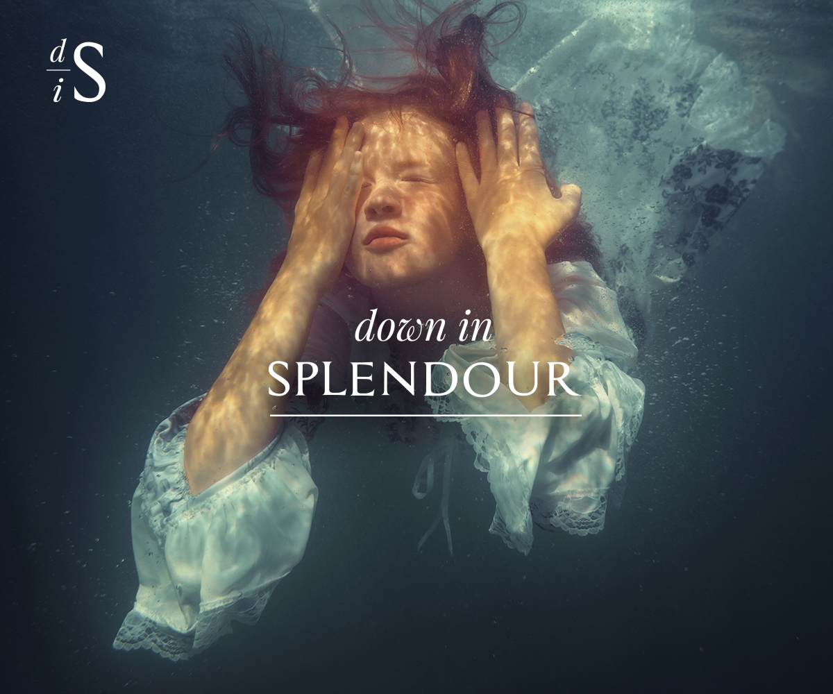
Down In Splendour are a London based alternative rock band. Their music encompasses alt-rock, psychedelic, progressive, world and acoustic.The band are looking for a logo that can be used in a variety of formats and captures the look and feel of their music.The logo will be used in a variety of media and formats. The included image (example: Girl Under Water) has been used as a backdrop at Down In Splendour concerts and provides a sense of the feel of the band and style needed. A striking, organic and flexible logo that lends itself to multiple uses, formats and placement.A screenshot of the Down In Splendour website (under construction has also been attached).Key Inclusions1) White/Black/Reversible. Organic feel. No colour inclusions, but the format should allow for the logo to be potentially rendered in colour if needed in the future. (examples attached - Pink Floyd)2) Simple but striking, and versatile. It will need to work in a variety of settings e.g. web, social media, album covers, posters, T-shirts, vinyl3) Striking font, but bear in mind that the font should be flexible enough to sit in a variety of placements. Ie. Not so extreme that it jars with everything else likely to be around it. Fonts can be adjusted for impact if desired. (examples attached - The Beatles, Abba4) Workable in a portrait and landscape setting5) Two formats:a. Full: Down In Splendour (example: Foo Fighters)b. Abbreviated: using first letters – DiS (avoiding the sense of ‘dissing’ someone though) – suggest the emphasis goes on the ‘D’ and the ‘S’ with the ‘I’ smaller or less emphatic. (example: FF - Foo Fighters)
Objetivo del mercado(s)
Contemporary music fans with an interest in alternative rock, progressive, psychedelic, world and folk music. Keen to avoid the usual rock cliches.
Texto del logo
Down In Splendour
Estilos de logo de interés
Logo de marca de nombre
Logotipo basado en palabra o nombre (solo texto)
Logo con siglas
Acrónimo o logo tipográfico (solo texto)
Estilos de fuente para usar
Colores
Colores seleccionados por el cliente para ser utilizados en el diseño del logotipo:
Mira y siente
Cada control deslizante ilustra las características de la marca del cliente y el estilo que debe comunicar el diseño de tu logotipo.
Elegante
Atrevido
Juguetón
Serio
Tradicional
Moderno
Atractivo
Profesional
Femenino
Masculino
Vistoso
Conservador
Económico
De Alta Gama
Requisitos
Debes tener
- Simple, elegant and striking. Down In Splendour is fairly sophisticated alt-rock music, so we are keen to avoid cliched rock imagery.
Agradable de tener
- A reversible format black/white and also an abbreviated/icon logo - as detailed in the project description.
No debería tener
- Should avoid the standard rock image cliches. Down In Splendour is fairly sophisticated alt-rock music.