DentalOfficeLogo-1st,2nd,3rd prize&guaranteed pay
¿Quieres ganar un trabajo como este?
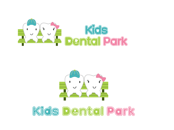
Este cliente recibió 245 diseños de logo de 36 diseñadores. Eligieron este diseño de logo de green como el diseño ganador.
Únete gratis Encuentra trabajos de diseño- Garantía
-
 US$641
-
 245 diseños
-
 36 diseñadores
Resumen de Diseño de Logo
Since most patients will be younger than 18, patients will be coming in with adults, most likely mom or grandparents. So neutral to slightly feminine design might work better. I want soft and gentle image with a little bit of firm image either sprinkled or hidden. Soft and gentle imaging being the main image while bit of firm image is more of sub-quest type of deal where it is not needed but bit of extra. I prefer softer brighter colors though dark color can be used to for lettering, outlining, emphasis, etc. And please avoid using simple generic tooth shape. If it is going to be something original and stands out, (to me anyway) you could stand out among others but if it is generic design I might just glance over it real quick. Think of tooth as double edged broadsword where you could whack the monster for 1 shot kill or miss it all together and get hit my the monster for 1 hit death.
I do prefer some imagery to go with the logo though not absolute necessity. Since the name includes the name park, anything that could be considered part of it of could work. Or you could go with subtle image of tooth. Or if you can figure out a way to combine two without being too busy, that could work as well. What I have mentioned are just guidelines and not absolute rules. For all I know a logo that didn't follow any of the above might just call out to me and pick that, who knows.
Actualizaciones
Thanks so much for all your designs. I have received so many nice designs, it was hard to narrow down the field. I have sent out a number of requests for final revisions to the a number of finalists. Please modify the designs as mentioned in the feedback. I should be available today for almost instant feedback so those of you received feedback please send in your modified designs ASAP so that you could receive more feed backs before the closing. Good luck!
Added Tuesday, April 03, 2012
Project Deadline Extended
Reason: Playing field has been narrowed already. I am having a slight problem contacting a few finalists to turn in there final designs.
Added Tuesday, April 03, 2012
Project Deadline Extended
Reason: We are having tough time trying to pick 3 winners among so many great designs and eliminate the others therefore extending it for another day.
Added Thursday, April 05, 2012
Project Deadline Extended
Reason: This is a lot tougher than expected. We are no longer accepting new designs but instead trying to determine who will be 1st, 2nd and 3rd. Thanks for your patience.
Added Saturday, April 07, 2012
Project Deadline Extended
Reason: Finally we are down to 3 finalists. Feedbacks and messages have been sent out to fine tune and improve the designs to our liking. Because they are so close to each other, even a little change could have big impact on your standing. Please do turn them in as soon as possible so that we can determine 1st,2nd, and 3rd places.
Added Sunday, April 08, 2012
Tipo de industria / entidad
Call
Texto del logo
Kids Dental Park
Estilos de logo de interés
Logo pictórico / combinado
Un objeto del mundo real (texto opcional)
Logo abstracto
Conceptual / simbólico (texto opcional)
Logo con personaje
Logo con ilustración o personaje
Mira y siente
Cada control deslizante ilustra las características de la marca del cliente y el estilo que debe comunicar el diseño de tu logotipo.
Elegante
Atrevido
Juguetón
Serio
Tradicional
Moderno
Atractivo
Profesional
Femenino
Masculino
Vistoso
Conservador
Económico
De Alta Gama
Requisitos
Debes tener
- Soft and colorful. At least 3 colors besides white/white background. More emphasis on pictorial aspect in terms area it takes up than text.
No debería tener
- DO NOT USE CLICHE TOOTH! If tooth is different enough to stand out,that is fine but I have seen TONS of variations of generic tooth used all over catalogs, ads, etc. Unless the tooth in itself can stand out as a character logo or very different, avoid using it.