Well established security and network consulting firm looking for a new logo
¿Quieres ganar un trabajo como este?
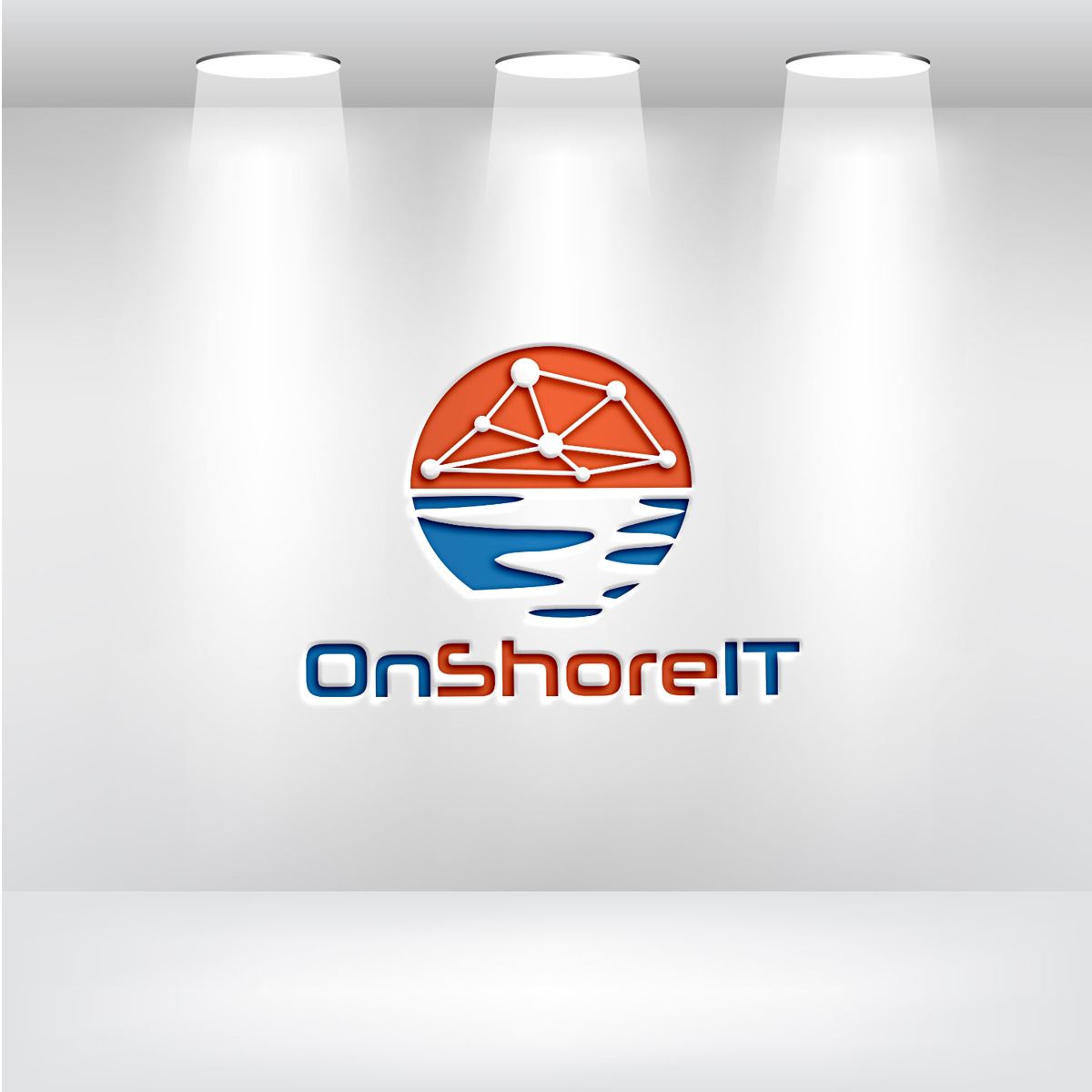
Este cliente recibió 232 diseños de logo de 130 diseñadores. Eligieron este diseño de logo de arena plip como el diseño ganador.
Únete gratis Encuentra trabajos de diseño-
 US$240
-
 232 diseños
-
 130 diseñadores
Resumen de Diseño de Logo
We are looking for an eye catching design in vector format that can scale from icon to large print format (a simplified icon size is fine). Our main business is designing emergency 911 networks for state and local governments but we also work with many other types of verticals. Our current website is www.onshoreit.net. Our staff are all top level experts and have done large scale projects for ATT, Disney and others. We are also working in the DevOps fields. We want a logo that is unique and fits our name. Our company is fluid and responsive, customer focused and cutting edge.
The current submissions have helped us narrow down what we are looking for significantly.
Objetivo del mercado(s)
All data networking and network security clients. We specialize in cutting edge design and technologies and have worked large projects for ATT, Disney and others.
Tipo de industria / entidad
Consulting
Texto del logo
OnShoreIT
Estilos de logo de interés
Logo pictórico / combinado
Un objeto del mundo real (texto opcional)
Logo abstracto
Conceptual / simbólico (texto opcional)
Colores
Diseñador para elegir los colores que se utilizarán en el diseño.
Mira y siente
Cada control deslizante ilustra las características de la marca del cliente y el estilo que debe comunicar el diseño de tu logotipo.
Elegante
Atrevido
Juguetón
Serio
Tradicional
Moderno
Atractivo
Profesional
Femenino
Masculino
Vistoso
Conservador
Económico
De Alta Gama
Requisitos
Debes tener
- Must be able to convey the company name in logo form. The logo should be able to work with light and dark backgrounds. It should be able to scale to icon size up to building sign-age. Logo should be recognized as a technology brand within 2 seconds. Logo should flow well with good contrast. Fonts should be unambiguous and you must be careful how the end of Shore buts up to IT so the customer clearly sees OnShore IT and not OnShoreLT (a large i and small L are easily confused). Contrasting colors for the words could work but we are open to anything that defines the name.
No debería tener
- No cartoon logos or logos that are text only.