

 Refresh
Boutique Independent Music label needs a logo design
¿Quieres ganar un trabajo como este?
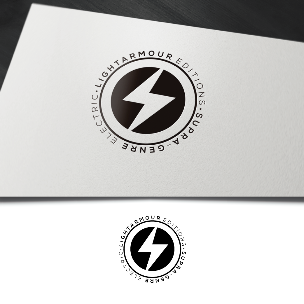
Este cliente recibió 36 diseños de logo de 17 diseñadores. Eligieron este diseño de logo de WooW Designs como el diseño ganador.
Únete gratis Encuentra trabajos de diseño
-
 A$220
A$220
-
 36 diseños
-
 17 diseñadores
Resumen de Diseño de Logo
Lightarmour Editions is a new independent music label based in Perth Australia. Distinctly, the label is not genre-specific, but rather a vehicle for music that is imaginative, emotional, powerful, and not overly concerned with commercial accommodations. The label shares its zeitgeist with legendary underground labels of the UK in the late 70s and early 80's - such as Factory records, 4AD records, Mute Records, Some Bizzarre etc.A logo is required for all future print and online needs and to concrete the identity for a spate of vinyl and digital releases upcoming. The logo needs to be visually simplistic and striking enough to work on the back of a record sleeve, record label, CD booklet, Website, T-shirt designs, Badges, and Posters etc. Simple colour scheme of Black and Red (slightly dark cherry red), or Black and Orange/Tangerine. The main body of the logo is to be circular, and contain a symbol within. In order to guide the design elements, a description of the name and meaning of the label follows:"Lightarmour" is made of two words - light and armour and refers to a strong protective aspect that, that protects within it something beautiful and noble but fragile/precious. The circular part of the logo is the armour, the inner glyph the 'light'. It is also a play on the idea of a 'lightarmour' charge (cavalry) and therefore musically an electrifying strike of light/energy. I have attached some images that act as good references for possible stylings of the logo, as well as a copy of the current logo which conveys the idea well but is too fine (complex linework) to work as a logo. as for the internal glyph: Two favoured directions - Either an abstracted symbol representing light/energy/music, or an abstracted symbol based on the Japanese Kanji forms that may or may not be derived from the meanings/words used to describe the logo (i.e. light, etc). Either way, a geometric and minimalist look is desired.The logo is to be used for print and online, so if possible a Scalable Vector Graphics (SVG) version would be great, along with the bitmap/jpeg/tiff etc versions.The logo should be able to be used with just the logo shape itself, and also the logo with the text "Lightarmour Editions" - modern looking fonts please. Finally, the following slogan, which will be used on upcoming promotions, may assist in gauging the flavour of the label and its designs:"Supra-Genre Electric"Music and more background can be found at the website:http://lightarmour.com.auThankyou, Regards Vince
Texto del logo
Lightarmour Editions
Estilos de logo de interés
Logo con emblema
Logo contenido dentro una forma / figura



Logo abstracto
Conceptual / simbólico (texto opcional)



Estilos de fuente para usar


Colores
Colores seleccionados por el cliente para ser utilizados en el diseño del logotipo:
Mira y siente
Cada control deslizante ilustra las características de la marca del cliente y el estilo que debe comunicar el diseño de tu logotipo.
Elegante
Atrevido
Juguetón
Serio
Tradicional
Moderno
Atractivo
Profesional
Femenino
Masculino
Vistoso
Conservador
Económico
De Alta Gama
Requisitos
Debes tener
- clean geometric shapes.
- modern-looking font
Agradable de tener
- see project description
No debería tener
- frilly or old-world typo


