Unique and Challenging - Website Template PSD - Pay To Click PTC Industry
¿Quieres ganar un trabajo como este?
Este cliente recibió 18 diseños web de 6 diseñadores. Eligieron este diseño web de LV2 como el diseño ganador.
Únete gratis Encuentra trabajos de diseño- Garantía
-
 US$300
-
 18 diseños
-
 6 diseñadores
Resumen de Diseño Web
The top website in this market are:
http://clixsense.com
http://neobux.com
http://nurdbux.com
Most of the websites in this market have templates that look like the following:
https://www.pixelior.com/portfolio.php
https://www.pixelior.com/portfolio.php
I want to do something a bit different. Minimize graphics unless absolutely necessary. Make more use of CSS and HTML5 for effects.
The scripts use the smarty template system. So you should be aware of it's limitations / benefits etc. Should be aware how to use CSS + HTML5 vs images / graphics.
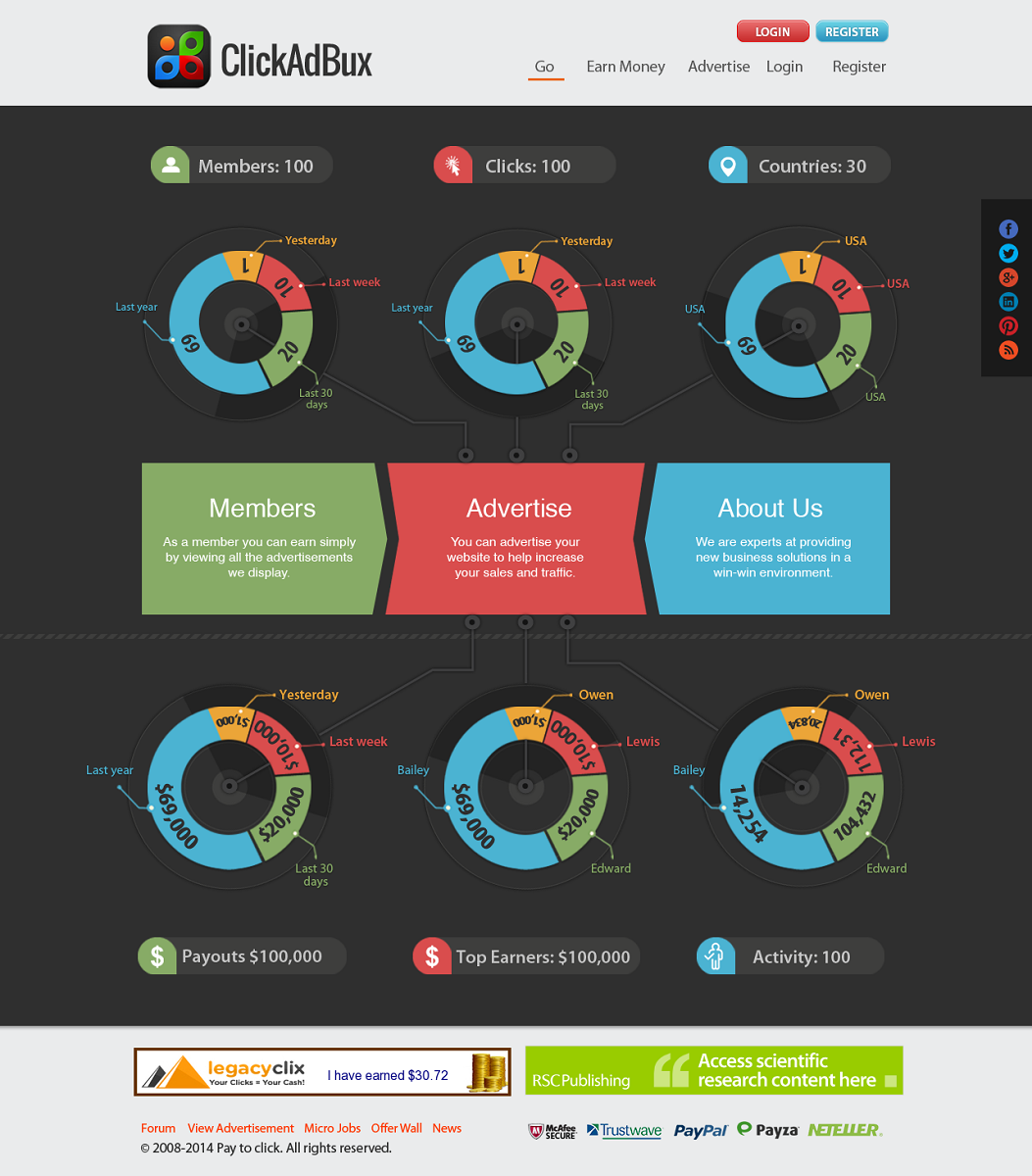
I want it to be a cross between a cockpit and infographic. There's lots of statistics that members who click vs advertisers who pay for advertising might want to see. Total members, active in last X days, and Y days and Z days, etc. Online now. New members today, in the last week, month, etc. Total paid out to members today, paid out over 7 days, month, total etc. Impressions served today, over 7 days, month etc. Clicks served today, over 7 days, month, etc. Maybe a scrolling list of all the current clicks going through. top clickers, top earners, top advertisers, top countries etc. lots of statistics to present.
I would cache this page and process it on a sliding scale frequency based on how busy the server was at the time.
* Or maybe you can make the case for less is more and not put so much information. I'd rather stick to simpler and optimized for advertiser conversion. * Goals are to make members sign up and advertisers to spend some money.
There should be space for:
- header w/ logo + name etc. possible space for one 468x60 banner on right
- menu
- home page body looking like cockpit + infographic type feel
- place for two 468 x 60 banners
- footer with text links to various pages on left, social media account buttons.
- place for images of payment processors available
Actualizaciones
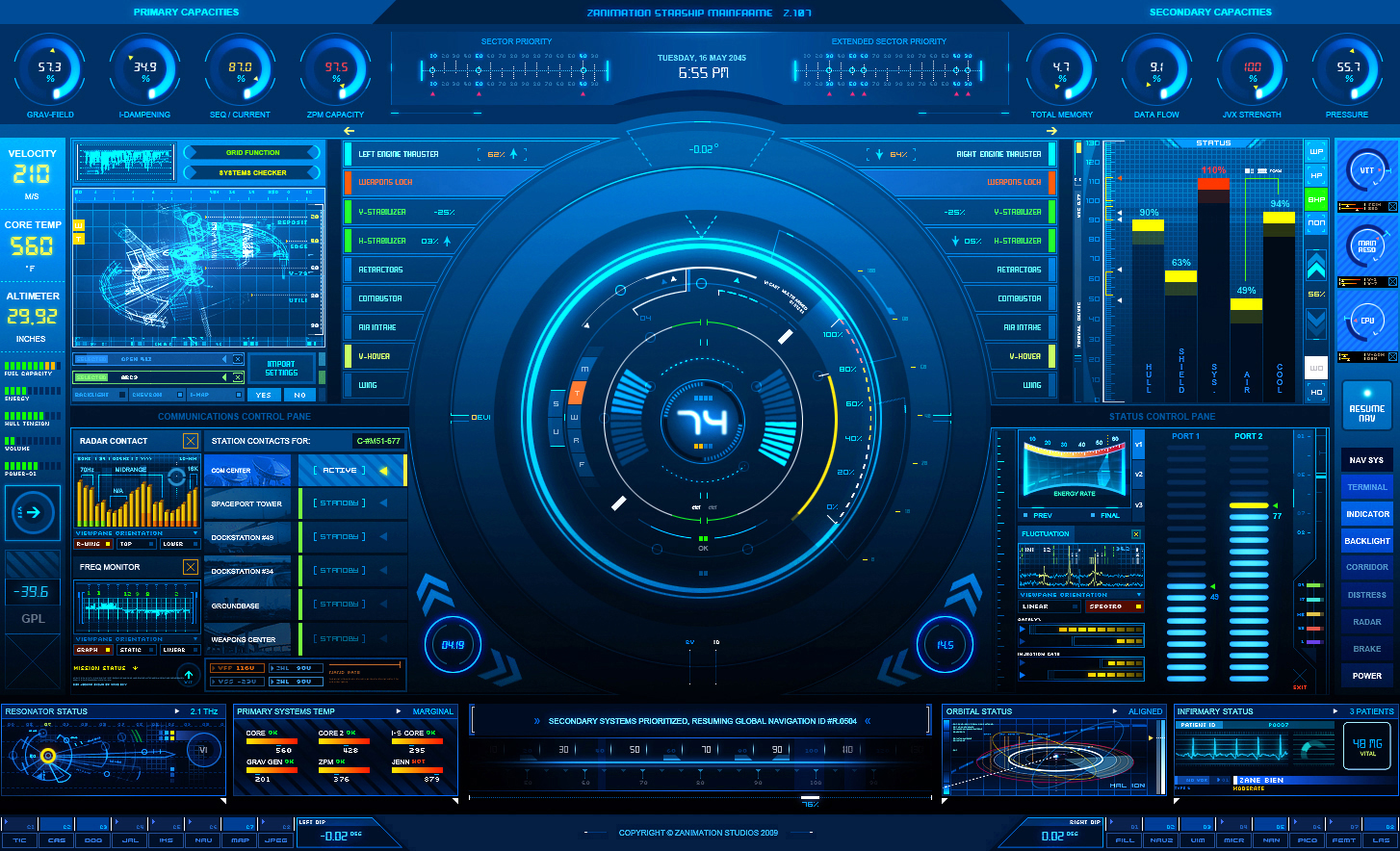
Please have a look at the examples in the comments. Take your inspiration from the data representation of infographics or a HUD from a game. It doesn't have to be that complicated but I'm looking for a unique way to represent typical advertising network data. clicks, members, earnings, ads, activity over different intervals, current stats etc.
http://fc04.deviantart.net/fs44/f/2009/120/2/a/AdvancedUI__Status_Screen_by_z_design.jpg
Added Tuesday, January 14, 2014
http://infographics.pw/ some infographic templates.
Black background.
Lots more demographic data representation UI elements.
Take inspiration from game HUDs.
Added Wednesday, January 15, 2014
Project Deadline Extended
Reason: There are a few decent options but nothing that really gets what I'm looking for.
Added Thursday, January 16, 2014
Objetivo del mercado(s)
- Pay To Click advertisers are the main focus.
Tipo de industria / entidad
Industry
Requisitos
Debes tener
- - CSS + HTML5 dominant
- - less reliance on images / graphics unless required
- - good data visualization of typical industry statistics
- - dual purpose design
- - a unique design different from anything they've seen before to make them want to join and see the rest of the website
- - to convey to advertisers that it's a vibrant community where members will want to join
- * incorporate the colours of the logo.
- black background, unless you have a real good argument for white
- high contrast easy to read text colour, you choose
- incorporate green, red, and blue, logo colours
- maybe green for earnings, red for clicks blue for member statistics
- muted readable versions of the colours, not so bright that they cause eye strain.