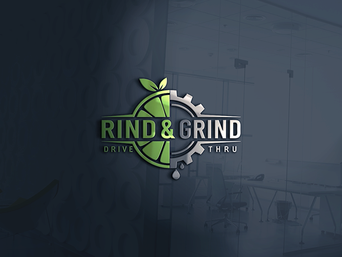
Rind & Grind Drive Thru
¿Quieres ganar un trabajo como este?
Este cliente recibió 361 diseños de logo de 151 diseñadores. Eligieron este diseño de logo de NATURAL SRI como el diseño ganador.
Únete gratis Encuentra trabajos de diseño- Garantía
-
 US$490
-
 361 diseños
-
 151 diseñadores
Resumen de Diseño de Logo
Need a logo to represent our juice bar concept. Rind & Grind will feature health based smoothies, fresh squeezed juices, and premium coffee. The business is geared towards creating a fun, social atmosphere for individuals looking for a nutritious option to gather over. The store will be family friendly and logo should be playful with the fruit and show a little masculinity with the grind portion.
Actualizaciones
Need a couple of days before selecting a winner
Objetivo del mercado(s)
Individuals of all ages looking for something nutritious and healthy to drink.
Tipo de industria / entidad
Juice Bar
Texto del logo
Rind & Grind
Estilos de logo de interés
Logo pictórico / combinado
Un objeto del mundo real (texto opcional)
Colores
Diseñador para elegir los colores que se utilizarán en el diseño.
Mira y siente
Cada control deslizante ilustra las características de la marca del cliente y el estilo que debe comunicar el diseño de tu logotipo.
Elegante
Atrevido
Juguetón
Serio
Tradicional
Moderno
Atractivo
Profesional
Femenino
Masculino
Vistoso
Conservador
Económico
De Alta Gama
Requisitos
Debes tener
- The rind of a fruit to represent the Rind portion of the name. The Grind portion of the name could be represented with coffee bean or some kind of machinery like the cog. This signifies an active motion and "Grind" to represent the coffee portion of our menu. When using the cog please refer to "Smoothie Factory" logo and make sure we have a different look. Logo must be in one color with no gradients, shadows, or special effects. Solid outlines are fine. Logo must be easy to invert and create outdoor channel letter signage. Font can be in different color.
- The concept will have drive thru so below the Rind & Grind saying there should be an optional Drive Thru tagline. The Drive Thru tagline should be removable for stores that do not have a drive thru.
- The logo should be clear, precise, simple, yet unique it its look. The design we have submitted is a good base but it is complicated and font is hard to read. Logo must be balanced between feminine and masculine. Must be fun and healthy. Also we are not wanting R&G font in the logo as shown. Maybe more fruit, a straw, special design, etc.
Agradable de tener
- Would be nice if logo can represent fruit, and active lifestyle. In the logo we wish for the "Rind" portion to be feminine or family friendly while the "Grind" portion to be masculine. Coffee is secondary to our business and should not dominate the logo.
No debería tener
- No gradients, shadows, special effects. 2 color max but logo must look good in single color and not dependent on multi color. Coffee is secondary to our business and it should not dominate the logo. We initial felt the cog wheel could represent The Grind and coffee but realized another company Smoothie Factory uses this and we must look significantly different. There should be no fonts in the logo itself. We submitted a sample with R&G in the logo but that needs to be eliminated.