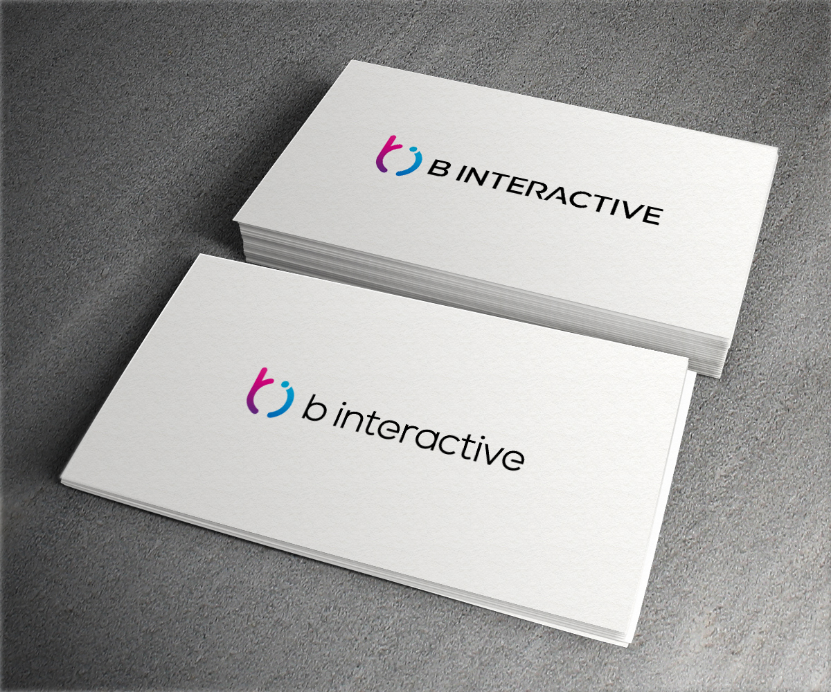
New Logo & Logotype For Digital Marketing Agency

¿Quieres ganar un trabajo como este?
Este cliente recibió 116 diseños de logo de 53 diseñadores. Eligieron este diseño de logo de aglaronde23 como el diseño ganador.
Únete gratis Encuentra trabajos de diseño- Garantía
Resumen de Diseño de Logo
Hey everyone!
Glad to see you'rere checking out this project and want to help us get a new logo!
Here's what we need - both a logo and logotype.
Who we are:
Performance marketers who spent hundreds of thousands of advertising dollars online and got 2 million dollars in revenue from that.
What do we do:
We help e-commerce clients with proven business models 2x, 3x, and 10x their revenues in the shortest time possible.
We do this through internet marketing, mainly Facebook ads, conversion optimization, and proven strategy.
Positioning of our brand:
Innovative - we are among the top pros in the industry and come up with new strategies to maintain this competitive advantage
Boutique - we prefer having 10 clients and working more closely with them than having 30 clients and not working closely with them
Driven - we LOVE performance marketing. We are truly passionate about it. Enthusiastic. We breathe performance marketing. It's in our DNA.
Why do we need a new logo:
We want to heavily grow the company and our focus for the next couple of months will be bringing on awesome new clients. We never really worked on the design side of things, but this time we want to redo everything from scratch. That's why we need your help.
In terms of design, we like simple and minimalist creations.
Logos we like that you can use for inspiration:
1) https://www.topinteractiveagencies.com/wp-content/uploads/2015/11/loop_agency-logo-tia.jpg
2) https://1j4dxh3osksd37xz5g2py9uw-wpengine.netdna-ssl.com/wp-content/themes/codewise/images/logo.svg
3) MyLand (logo in top left corner): http://www.myland.pl/
4) https://www.futuredigital.co.uk/wp-content/uploads/2018/04/fd-logo_web.png
5) https://thumbor.forbes.com/thumbor/1280x868/https%3A%2F%2Fblogs-images.forbes.com%2Fsteveolenski%2Ffiles%2F2016%2F07%2FMastercard_new_logo-1200x865.jpg
6) Apple
Colors:
I really like contrasting colors and would like to see contrast in our new logo. Feel free to use black, gray, purple, blue, white, these kinds of colors. We will be designing a new website too and it'll be very contrasting so please keep that in mind.
I would rather avoid red, yellow, green, orange, etc (unless done in a really cool way like Codewise's or Mastercard's logos above).
We'll be providing feedback about all logos submitted in this project to help guide you so you don't have to do as much figuring out.
Attached is our current logotype. It's kinda okay, I don't really like it that much. I made it myself 2 years ago, I think it looks outdated now.
IMPORTANT: Feel free to spell the brand name as B INTERACTIVE, B Interactive or b interactive if you think either looks better.
Thanks and our team is looking forward to working with you.
Tom
Objetivo del mercado(s)
E-commerce business owners whose companies are spending $15k USD+ per month on Facebook
Tipo de industria / entidad
Digital Marketing
Texto del logo
B Interactive
Estilos de logo de interés
Logo pictórico / combinado
Un objeto del mundo real (texto opcional)
Logo abstracto
Conceptual / simbólico (texto opcional)
Estilos de fuente para usar
Colores
Diseñador para elegir los colores que se utilizarán en el diseño.
Mira y siente
Cada control deslizante ilustra las características de la marca del cliente y el estilo que debe comunicar el diseño de tu logotipo.
Elegante
Atrevido
Juguetón
Serio
Tradicional
Moderno
Atractivo
Profesional
Femenino
Masculino
Vistoso
Conservador
Económico
De Alta Gama
Requisitos
Debes tener
- Modern, creative colors
- Unique shapes
- Simple design (think Apple kind of design)
- Horizontal look - this looks better on websites
Agradable de tener
- It'd be nice if you were able to fit the logo next to the logotype (as opposed to above or below the logo).
- Please check the brief for more tips.
No debería tener
- Please avoid using red/yellow/orange/green unless they go really well together or are used very unconventionally like in Codewise's and MasterCard's logos (linked above in the brief)