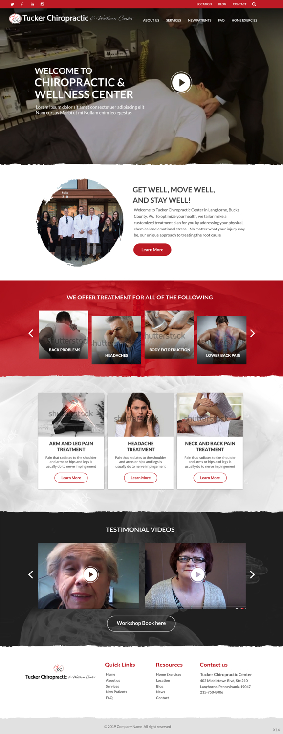
New Wordpress theme/Update website

¿Quieres ganar un trabajo como este?
Este cliente recibió 18 diseños web de 3 diseñadores. Eligieron este diseño web de pb como el diseño ganador.
Únete gratis Encuentra trabajos de diseñoResumen de Diseño Web
Many of our plug ins are in need to updating and Id like to make my website more modern. We are a Chiropractic office and our logo colors are black, white and red. My goal is to have an updated look that allows me to make simple edits(such as i currently have limitations on # of employee profiles) and stay operating well on my lunarpages hosting compnay ive prepaid for a few years for. And to keep working well on the mobile platform. Can email all the edits id like to make to www.DrDavidTucker.com Thanks
Here are the exact edits:
bright red, colors, etc
Change NEw patient Tab from coupon to special offers-Change word download on NP forms
Remove blog text on sites
UPDATE YOUTUBE videos-Upload all from FB-So the YouTUbe link on site is relevant-REmove 2 tabs on top
Update FAQ tab to our recent edited sheet on common myths
Update office hours
Testimonial videos on conditions page -LBP-back pain video, etc. and one landing page or smaller icon on home page but when you click it pops up larger over website.
Keep video on front but put elsewhere. Lower on office tour with pics, but video icon is first.
add MOST INSURANCES ACCEPTED
Add Get Well Move Well Stay Well
Capitalize We diagnose & address the root cause to your health problem
Eliminate Home Exercise Tab?
Instead of video , picture office tour that rotates-use blur iphone pics
black bright red and white-black and white backgrounds alternate as you scroll down page
New testimonial videos -with Me and DrG-LINKS FOR PATIENT VIDEOS or MY VIDEOS-Educational
Unlimited Staff profiles-easy to change
Scrolling down home page-Pain pic on top, then office team pic then below that office tour, then map
Call to action tabs-Free Consult-Free Mechanical Massage, MASSAGE coupon
Change about us to meet the team?
Single space my bullets -Profile
Merge Location into Contact Us
all conditions on home page on one tab
Pain relief picture? Get well Move Well Stay Well tagline-On top wording explains what we do-Root cause. Then 3 clickable buttons below-New patients-Scheduling-Meet the team-Back Brace-Vitamins?
update layout, pictures(thoroughout), coloring, and flow of the main page
about us page also layout wayyyyyyyyyy to wordy
services pages again layout and wordy, bulleted points not necessary when listing services
personally interesting facts adn stas are not needed and articles ( if that stuff was important to you ass links for them)
FAQ is its own tab why is it also under services ? one place only (layout on this page)
weightloss tab isnt even avalible...page not found
is Bucks County X-Ray and Chiropractic Analysis a necessary tab ?
for the supplements it has no details, simply directs you to metagentics page ( not in a new tab either )which I feel can be confusing. We use their products but its listed under services. what are those services in regards to supplements, know what I mean?
for location the google map is unable to load map correctly......not helpful. also why is the description of what we do within the directions on how to find us? and when clicking the lionk for directions this message pops up 'There was an error geocoding your location. Check the address and try again"
video testimonals need major updating
also on blog/news you have misconceptions abouit chiro, redundant, these type of things should be on the FAQ page.
social media tabs, relevance of the first and last button
Also their supplement tab leads to our own page...explains to picks then a link for separate landing page to buy , include isagenix that way. And stress support in office.
Go into their practice area tab and a short way down they have what they offer there but it’s in a box that you go left or right to see what they offer. It’s neater and still gets point across
They do this again under conditions. I’d like to see this utilized for our sight :)
Also like you mentioned we had but I couldn’t see. Is at the bottom of each page was a click to schedule appointment that’s 👌🏼 Perfect
https://www.pssmwellness.com/
http://www.lvrgmedia.com/
http://www.designedclinicalnutrition.com/
Refer to https://sprucechiropractic.com/ to see how conditions treated was put in
OR EVOLVING PIC
CODING is already included on thebudget for this website.
Número de páginas requeridas
1 page
Mira y siente
Cada control deslizante ilustra las características de la marca del cliente y el estilo que debe comunicar el diseño de tu logotipo.