help set us apart- care and education focused dental office
¿Quieres ganar un trabajo como este?
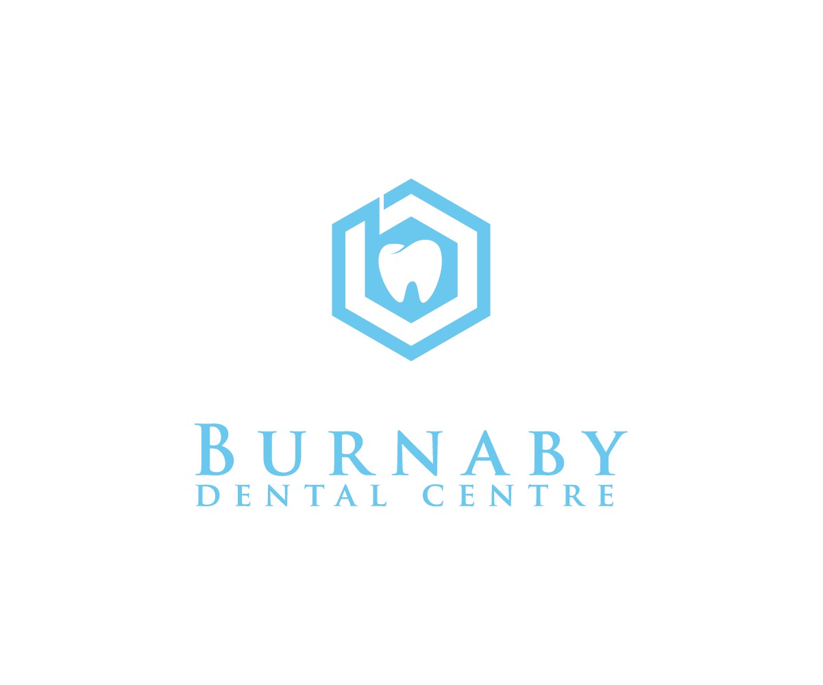
Este cliente recibió 144 diseños de logo de 52 diseñadores. Eligieron este diseño de logo de Wild Geek como el diseño ganador.
Únete gratis Encuentra trabajos de diseño- Garantía
-
 C$150
C$150
-
 144 diseños
-
 52 diseñadores
Resumen de Diseño de Logo
Hey there! we are a dental practice looking for a bright logo that is different from the majority of logos in our field (ie a tooth). Open to artistic interpretation, excited to see what designs come back. Our colour palette is more in the more "tame" (pastels and softer) blue wheel house but open to new ideas.about us:family focused dental office, values- care, community, education. We love what we do and we try to challenge the common perception that going to the dentist has to be a negative experience. Thanks for your time and efforts
Actualizaciones
Need extra days to review
Objetivo del mercado(s)
30-50 y/o women, families....anyone that wants a caring family friendly dentist
Texto del logo
Burnaby dental centre
Estilos de logo de interés
Logo con emblema
Logo contenido dentro una forma / figura
Logo pictórico / combinado
Un objeto del mundo real (texto opcional)
Logo abstracto
Conceptual / simbólico (texto opcional)
Logo con personaje
Logo con ilustración o personaje
Estilos de fuente para usar
Colores
Colores seleccionados por el cliente para ser utilizados en el diseño del logotipo:
Mira y siente
Cada control deslizante ilustra las características de la marca del cliente y el estilo que debe comunicar el diseño de tu logotipo.
Elegante
Atrevido
Juguetón
Serio
Tradicional
Moderno
Atractivo
Profesional
Femenino
Masculino
Vistoso
Conservador
Económico
De Alta Gama
Requisitos
Debes tener
- we give you free range- Ideally someone should see the image and think dental office. As I said if you can get creative and project that image with your logo without using the typical "single isolated molar" imagery I would be extremely impressive
Agradable de tener
- see above
No debería tener
- see above- pretty open to what you want to make. Colour wise we want to stay more in the blue end of the colour spectrum versus the more vibrant oranges/reds
- I have attached our current logo (because the website made me)- but I feel this logo is dated and not a good representation of our office or really symbolic of who we are. so if you go based off that you're unlikely to have success