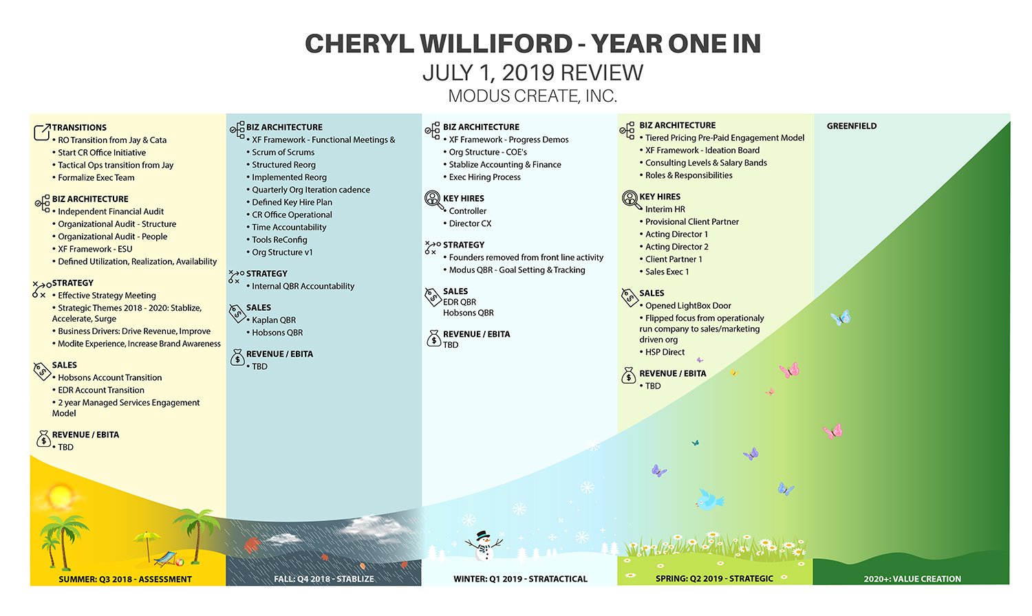
Executive Performance Review mapped on J-curve
Ganador
¿Quieres ganar un trabajo como este?
Este cliente recibió 33 diseños de infográficos de 12 diseñadores. Eligieron este diseño infográfico de IndreDesign como el diseño ganador.
Únete gratis Encuentra trabajos de diseño- Garantía
-
 US$190
-
 33 diseños
-
 12 diseñadores
Resumen de Diseño Infográfico
I need to turn an executive company performance review into a visual infographic. The list of accomplishments is grouped into four calendar quarters. Each quarter needs a subtle representation of the season. The four quarters and associated list of accomplishments need to be mapped to a J-curve. - Spreadsheet with accomplishments attached (Throughput)- Sample image of a J-curve. You can google J-curve to see more images.- The title should be "Cheryl Williford Year in Review"
Objetivo del mercado(s)
Board of Directors
Mira y siente
Cada control deslizante ilustra las características de la marca del cliente y el estilo que debe comunicar el diseño de tu logotipo.
Elegante
Atrevido
Juguetón
Serio
Tradicional
Moderno
Atractivo
Profesional
Femenino
Masculino
Vistoso
Conservador
Económico
De Alta Gama
Requisitos
Agradable de tener
- This will be presented to a company founder that is an artist and customer experience expert. He is very visual so a nice visual representation of the data will be impactful. He also uses the phrase that you have to live with or work with someone for four seasons before you really know them. This is why I have the seasons mapped to the quarters. The Fall season motif should be gloomy and stormy.
Archivos
Descargar todos los archivos - 0,0 MBPNG
j_curve.png
jueves, 23 de mayo de 2019
XLSX
Cheryl Year in Review v2 Saturday, 25 May 2019 15:26:49
sábado, 25 de mayo de 2019
Pagos
1er lugar
US$150
Pagos de participación x 4
US$10