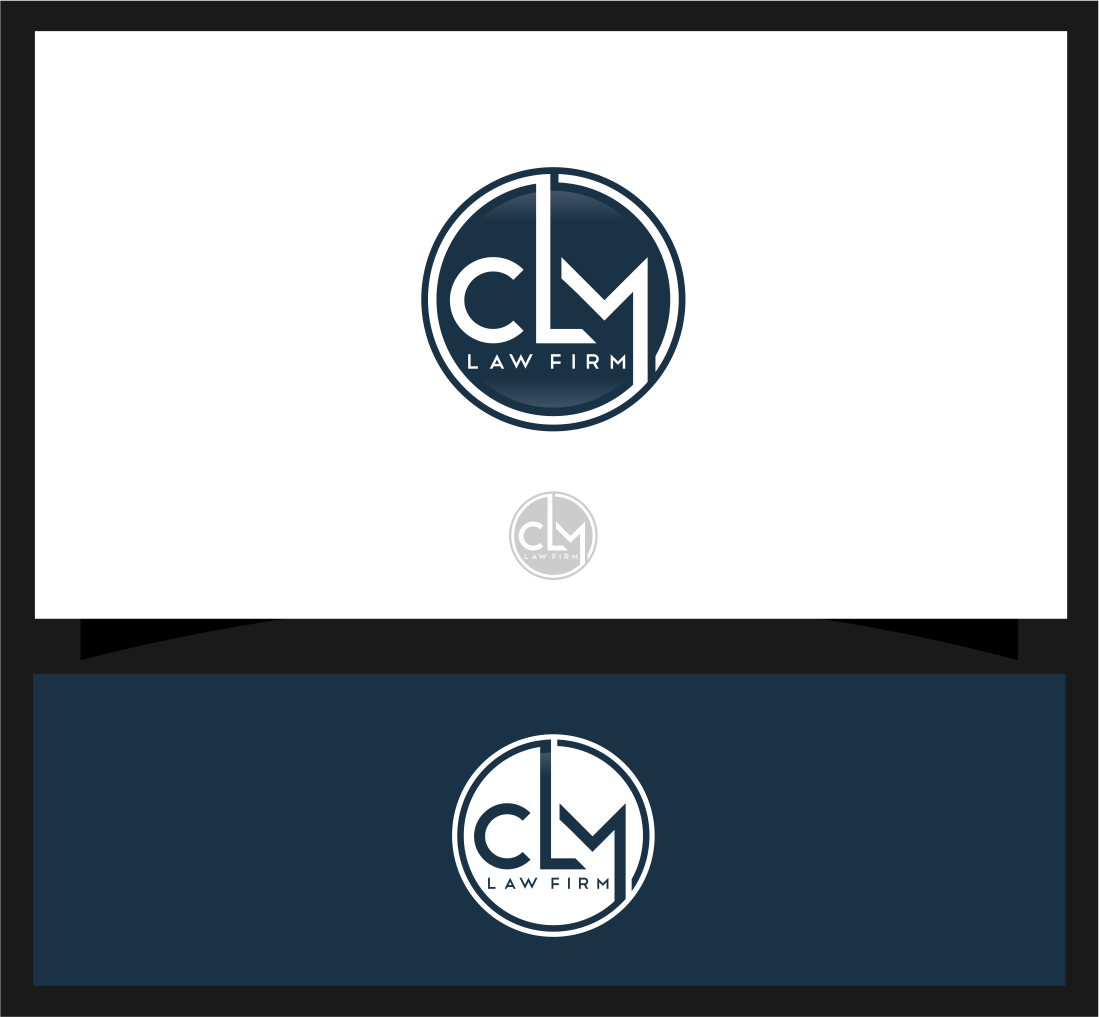
CLM Law Firm Logo
¿Quieres ganar un trabajo como este?
Este cliente recibió 67 diseños de logo de 35 diseñadores. Eligieron este diseño de logo de mhaxx8 como el diseño ganador.
Únete gratis Encuentra trabajos de diseño-
 US$110
-
 67 diseños
-
 35 diseñadores
Resumen de Diseño de Logo
You have helped me 2x in the past (Gutierrez & Meza Law & Meza Law Group)—and done GREAT. Since forming the Meza Law Group, I have merged and formed the Carmona Lozano Meza Law Firm here in Texas. When we first began in 2019 we had a local designer get us a logo, something to just get us started. We are now expanding offices and looking to get merchandise and advertising going so we want to finalize the logo.
Needless to say, we're not happy with the current logo. We like certain elements of the logo, but suffice it to say that IT'S JUST MISSING SOMETHING(S).
We mostly practice criminal defense, but we don't want to limit ourselves to that area and also practice in general civil areas. We are looking to expand into more in the future.
Things we like:
- The gold circle/ring. Color could be more gold or thicker but we like the circle opposed to a square etc.
- We like the "M" the way it is, but were thinking that it should maybe be moved left and closer to the "L".
-We like the flow of the "CLM" to give off the cohesive vibe. We are a firm but want the client to feel as if we're one and get the "Team" vibe from looking at the logo.
Things we need:
-Symmetry is HUGE. The spacing/white space appears to off. There is a lot of white space. Im hoping you can look at this and tell us what is off.
- We like clean, polished, classy and modern.
- We like the colors blue and gold as is, but are open to variations of those colors.
- I want to see you get a little creative and add some variations and give us some options. This Logo is going to be on full display on the wall as soon as you enter the firm, on clothing, on business cards, on our website etc.
We would like to get the logo down and then get different renditions like you did last time for the different uses. W the words to the side, below, logo alone, logo on the window etc.
--The second image was to give you an idea of what we think the letters should look like in regards to spacing.
Again, this logo is a good starting point but I would like to see what kind of variations you can give us and what direction your creativeness takes you.But if you read this and have a brilliant idea that doesn't involve our foundational logo, please feel free to draft it up and let us see it.
Texto del logo
CLM LAW FIRM