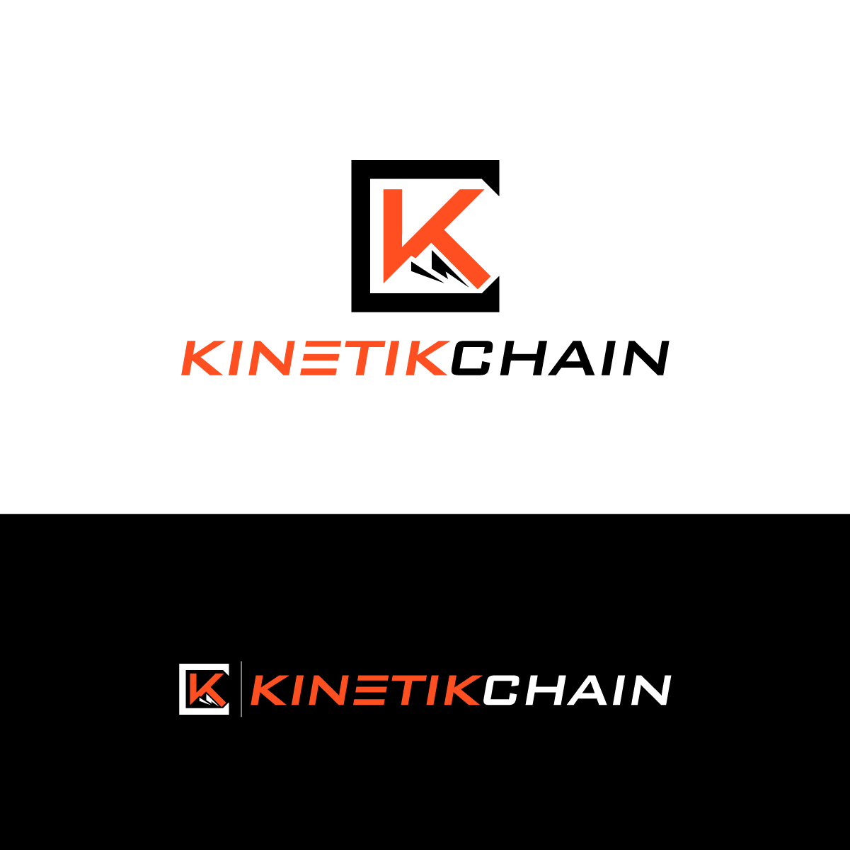
Sports Physical Therapy Business Needs Awesome Logo Design

¿Quieres ganar un trabajo como este?
Este cliente recibió 279 diseños de logo de 59 diseñadores. Eligieron este diseño de logo de SS DESIGNS como el diseño ganador.
Únete gratis Encuentra trabajos de diseñoResumen de Diseño de Logo
We need a logo design for our sports and orthopedic physical therapy company (KinetikChain Denver) based in Denver, Colorado. We help people in Denver quickly recover from pain or injury so they can stay active in their favorite sport/hobby, exercising, and get back to what they love to do. We are a cash based business and hope to give off a somewhat upscale vibe. We are open to anything, but also have some ideas. In Denver we have the mountains as a backdrop to our city and are interested in having the mountains in our logo, and possibly the mountains being a crown of some sort. We are not a huge fan of the odd shaped bodies with floating circular head that you see in many health logos (unless they are cleverly worked into the logo or wording. We are open to new colors and new color combinations. We have attached our current logo below as well as some other logos we like.
FYI-In medicine the Kinetic Chain (we changed the spelling to make it unique) is the idea that something far away from the problem area could be causing the issue. Like a foot issue causing a series of ripple effects that cause back pain. Many practitioners only look at the spot of pain and not the cause of the pain. Also most clinics because of insurance issues see 3-4 pt.'s an hour and most of the physical therapy is done by techs or aides who do not have a medical degree. We differentiate ourselves by giving one on one care in an upscale setting and getting to know the client on a deeper level as well as being better therapists. We are trying to create not only a resolution of their pain, but an upscale experience in our clinic where they get the Dr.'s phone number and feel like they know everyone and care for everyone in our clinic. We go above and beyond striving to make a memorable impression on everyone.
We always work in 3 phases: 1) Get rid of the pain 2) Get to the Root cause of the problem 3) Teach you how to keep it away.
Also if you want to know more you can check out our instagram here: https://www.instagram.com/kinetikchaindenver/
Actualizaciones
Need extra days to review
Objetivo del mercado(s)
Active adults in their 30's through 50's who are missing out on their favorite activity and everything about it they love because of pain or injury.
Tipo de industria / entidad
Health And Wellness
Texto del logo
KinetikChain
Mira y siente
Cada control deslizante ilustra las características de la marca del cliente y el estilo que debe comunicar el diseño de tu logotipo.
Elegante
Atrevido
Juguetón
Serio
Tradicional
Moderno
Atractivo
Profesional
Femenino
Masculino
Vistoso
Conservador
Económico
De Alta Gama
Requisitos
Debes tener
- The words KinetikChain
Agradable de tener
- It would be nice if there is some sort of symbol we could use separately to relate to the brand in addition to the name.
- I am not stuck with our current color scheme and would like to see some other possible color combinations.
- 3+ colors
No debería tener
- People unless it is cleverly worked into the name or logo. However, if you think it would work I have included some pics of the logos where I thought these actually worked well.
- No Red color.