SAFe PI Planning Web App - Lean Agile at Scale - Distributed Big Room Planning Web & Touchscr...
¿Quieres ganar un trabajo como este?
Este cliente recibió 12 diseños gráficos de 3 diseñadores. Eligieron este diseño gráfico de MIND como el diseño ganador.
Únete gratis Encuentra trabajos de diseño- Garantía
-
 US$190
-
 12 diseños
-
 3 diseñadores
Resumen de Diseño Gráfico
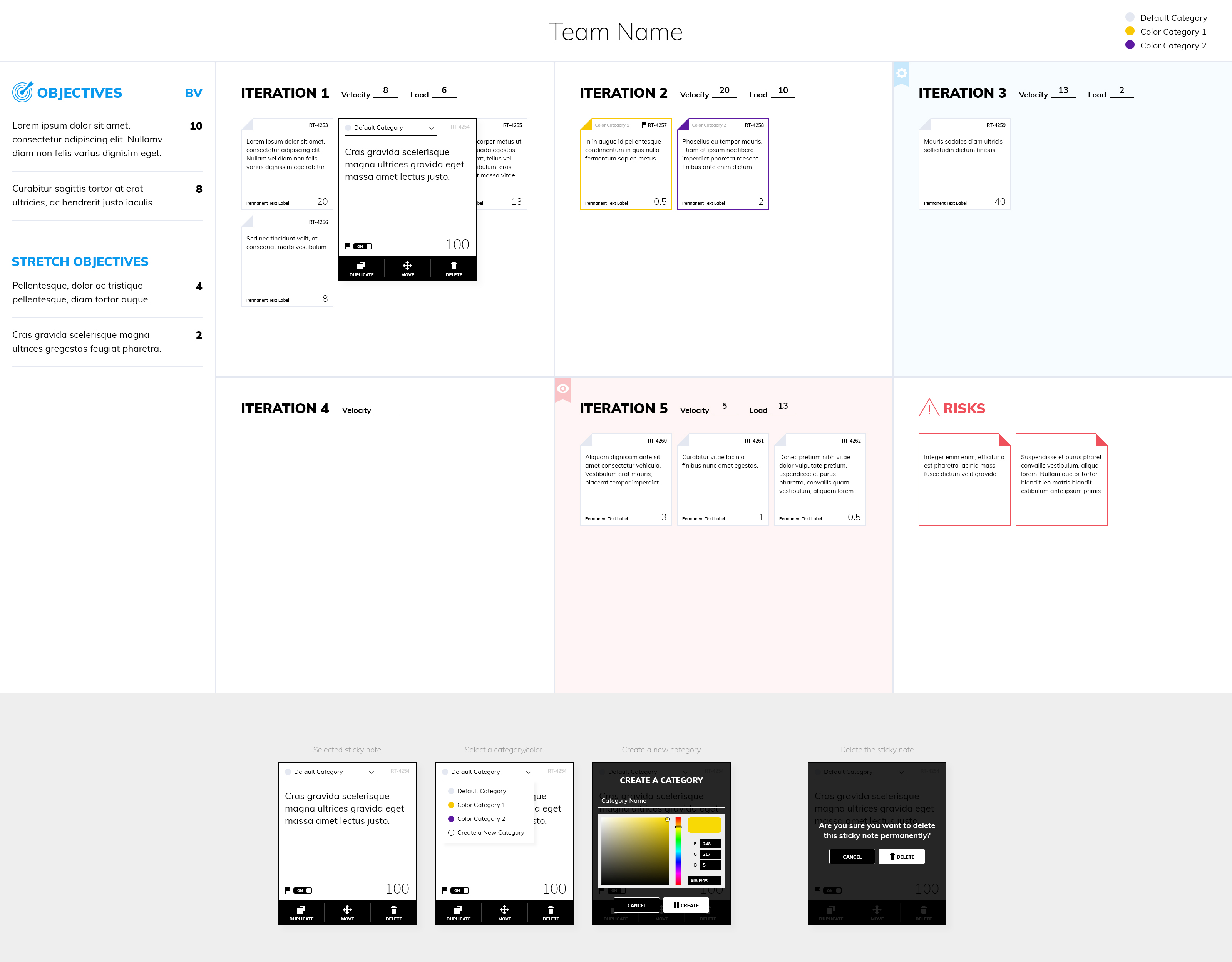
We are the provider of the piplanning app http://piplanning.io which currently is a desktop application. We are now working to bring all the features to a web-app but we don’t have a catchy design yet. The piplanning app is a visual collaboration tool for globally distributed teams and organization. Imagine a wall with lots of sticky notes on a flipchart hanging there – that’s basically our app just in a digital format. In general we want a light, modern, state of the art look and feel. Please take colorblind people into consideration when designing it.We are specifically looking for the following two design parts:- Design of the board structure- Sticky note designRequirements for the board structure- 16:9 ratio fixed- The board can be structured in 2 to 12 iterations + Risk Area and Objectives. Most common is 5 iterations + Risk Area and Objectives. Please go with the most common one but have in the back of your head that it needs to be compatible with 14 sections. Just for your imagination: in real life each of these areas on the board is one flip chart page.- Team Name: Somewhere on the board has to be the team name. It has to be easy to find and read.- In the iteration fields the user can set a velocity. That’s a simple numbers field. The load is calculated automatically and is just a number displayed on the board. There is an automatic visual indicator which should show with green or red colors if the teams are still in the plan. How this is brought to the attention is up to you.- Objectives & Stretch Objectives: The area with the Objectives is a list with text and a prioritization number attached to it. BV on the sketch stands for Business Value.Sticky Note design descriptionThe Sticky Note represents a physical sticky note or post-it note. When the user sees it he should instantly understand it as a sticky note and so for intuitively know what to do with it.Unselected sticky noteIf the sticky note is not selected it should be a simple sticky note sitting on the board.Following you find the things visible when the sticky note is not selected:- The sticky notes have a squared form factor- There is the text which is on the sticky note- In the upper right corner is a small sticky ID. Something like e.g. RT-4253.- Somewhere on the sticky note is also a number which should be easy to read. The numbers range from nothing over 0.5, 1, 2, 3, 5, 8, 13, 20, 40 up to 100.- Somewhere on the sticky needs to be a permanent text label. Not bigger than the rest of the text on the sticky note but easy to read.Selected sticky noteIf the user clicks on the sticky note once the following information needs to be displayed and he needs to be able to do the things listed and described below:- The sticky notes have a squared form factor- The user can write text on it- He can select different colors. These colors need to have a label so he knows what the function of these colors are.- By clicking a button he can add a flag to the sticky note- He can open a selection to choose the following number displayed on the sticky: 0.5, 1, 2, 3, 5, 8, 13, 20, 40, 100.- There is a delete sticky button. Place it where it makes sense from an intuitive stand point.- If he clicks the delete button, a short dialog appears on the sticky note: “Are you sure you want to delete this sticky note permanently? (It might delete an issue in your ALM tool)” He can confirm that by pressing “Delete” or “Cancel”.- In the upper right corner is a small sticky ID. Something like e.g. RT-4253.- Somewhere on or next to the sticky note needs to be a “sticky mirror” button as well as a “sticky move” button. Beside an optional icon for “mirror” and “move” there needs to be a naming tag so that everyone understands it right away.- It’s up to you to decide what’s the most intuitive way for the user.For better understanding also take a look at the rough sketch attached.
Actualizaciones
Low designer entries
Estilos de fuente para usar
Mira y siente
Cada control deslizante ilustra las características de la marca del cliente y el estilo que debe comunicar el diseño de tu logotipo.
Elegante
Atrevido
Juguetón
Serio
Tradicional
Moderno
Atractivo
Profesional
Femenino
Masculino
Vistoso
Conservador
Económico
De Alta Gama
Requisitos
Debes tener
- Color blind mode for different colored sticky notes