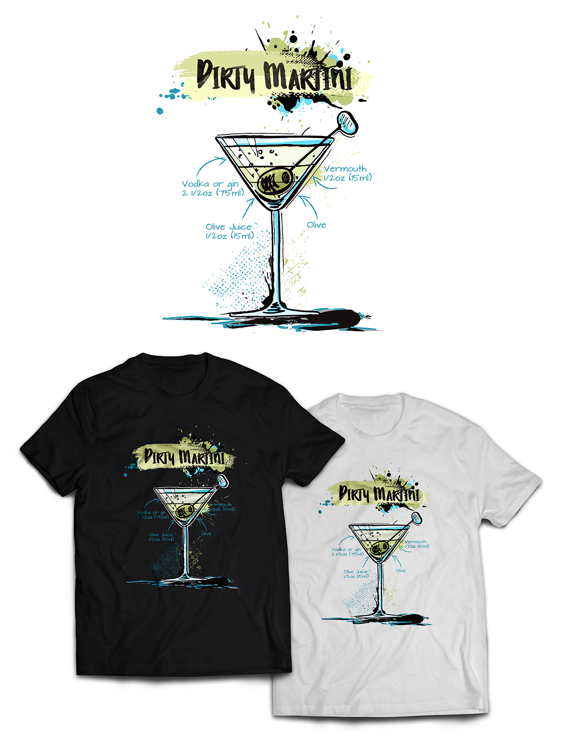
Sketched Dirty Martini Cocktail with ingredients
¿Quieres ganar un trabajo como este?
Este cliente recibió 67 diseños de camiseta de 22 diseñadores. Eligieron este diseño de camiseta de Pinky como el diseño ganador.
Únete gratis Encuentra trabajos de diseño-
 €90
€90
-
 67 diseños
-
 22 diseñadores
Resumen de Diseño de Camiseta
We need a shirt design for a new collection. This collection is all about sketched cocktails with their ingredients written and arrows pointed to their layers. As this design will be printed on both black, white, navy, grey and pink shirts, the text can't be completely black or white.
The design consists of 3 parts:
1. The sketched Dirty Martini cocktail. It has to look sketched and maybe a tiny bit cartoony, as if someone was inventing a new cocktail, with all of its layers, in the order in which the ingredients are put in the glass. The glass itself preferably has a blue-ish hue to it. The layers of the ingredients need to be sort of color that the ingredient itself has. If the ingredient does not really have a colour then give it a bright color that would fit with the other ingredients, but also makes it look colorful.
2. The written ingredients. The written ingredients can be all around the sketched cocktail and need an arrow pointed at the layer or ingredient that it is refering to. We do not want the arrow inside or go over the glass. We would like the ingredients to be clearly handwritten A font that looks very handwritten is also an option but not prefered, but NO calligraphy. The arrows also need to look a little sketched. The ingredients of a Dirty Martini are:
A. Vodka or gin 2 1/2 oz (75 ml)
B. Vermouth 1/2 oz (15 ml)
C. Olive Juice 1/2 oz (15 ml)
D. Olive on a stick (toothpick looking thing)
3. The name of the Cocktail in a fat and cartoony style. This needs to be above the design. This can also be done with a font, but not prefered. Also add some paint stains or other colorful things, that fit the rest of the cocktail (colors), behind the name to liven it up if it works.
I've added a picture of a sketch I made and added 1, 2, 3 in the sketch as refering points to the above mentioned points.
This is kind of how we'd like it to look, but we are open to your creativity, so add or change anything that you think would benefit the design! :)
Thank you and good luck!
Actualizaciones
Gathering more feedback
Estilos de fuente para usar
Mira y siente
Cada control deslizante ilustra las características de la marca del cliente y el estilo que debe comunicar el diseño de tu logotipo.
Elegante
Atrevido
Juguetón
Serio
Tradicional
Moderno
Atractivo
Profesional
Femenino
Masculino
Vistoso
Conservador
Económico
De Alta Gama
Requisitos
No debería tener
- Should not have completely black or white text. The design will be printed on white and black shirts.
- No Calligraphy for the text