

 Refresh
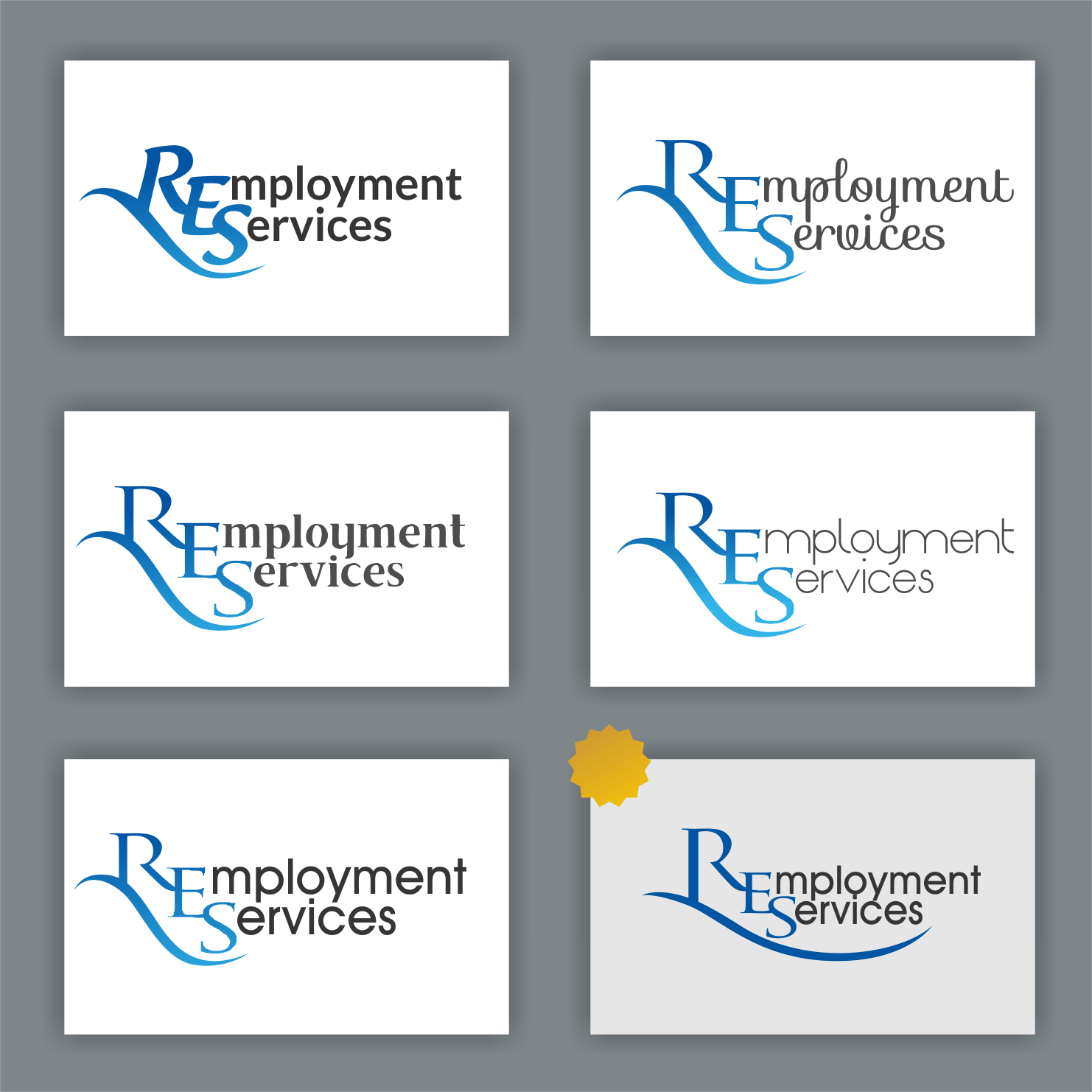
RES Employment Services Company Logo
¿Quieres ganar un trabajo como este?
Este cliente recibió 79 diseños de logo de 40 diseñadores. Eligieron este diseño de logo de Arham Hidayat como el diseño ganador.
Únete gratis Encuentra trabajos de diseño
-
 A$150
A$150
-
 79 diseños
-
 40 diseñadores
Resumen de Diseño de Logo
I would like a logo designed that is similar but better than what i did in word attached. I would like the R (and happy to look at different styles) to have a long tail like shown but i also need to be able to have the R stand alone for different marketing concepts. i would like the blue to be deep but bright and have only the RES in blue and the rest in black. I kinda need this yesterday as well.
I just wanted to be clear again ... The Name is RES orignally it was going to say ROSH Employment Services but that is not an option. Therefore it reads RES ... I would like the R emphasized with the long tail and the E and S to not be repeated but the words incorporated with it like (as in similar to) the attached
I like the flow of thR - i dont want something that LogoJoy will spit at me - is there anyone on here that actually designs - if i wanted something typed from word i could have done that myself
Objetivo del mercado(s)
Nurses, Carers,
Operating within Aged Care and Mental Health
Texto del logo
RES | Employment Services OR R Employment Services
Estilos de logo de interés
Logo de marca de nombre
Logotipo basado en palabra o nombre (solo texto)


Logo con siglas
Acrónimo o logo tipográfico (solo texto)



Estilos de fuente para usar
Colores
Colores seleccionados por el cliente para ser utilizados en el diseño del logotipo:
Mira y siente
Cada control deslizante ilustra las características de la marca del cliente y el estilo que debe comunicar el diseño de tu logotipo.
Elegante
Atrevido
Juguetón
Serio
Tradicional
Moderno
Atractivo
Profesional
Femenino
Masculino
Vistoso
Conservador
Económico
De Alta Gama
Requisitos
Debes tener
- A long Tail for the R and i would prefer that it is wide as shown as opposed to high
- I would like the blues to be Deep but bright
- The R needs to be as pretty as the one there - nothing masculine
