ISP needs to be dragged into the 21st century with new logo*
¿Quieres ganar un trabajo como este?
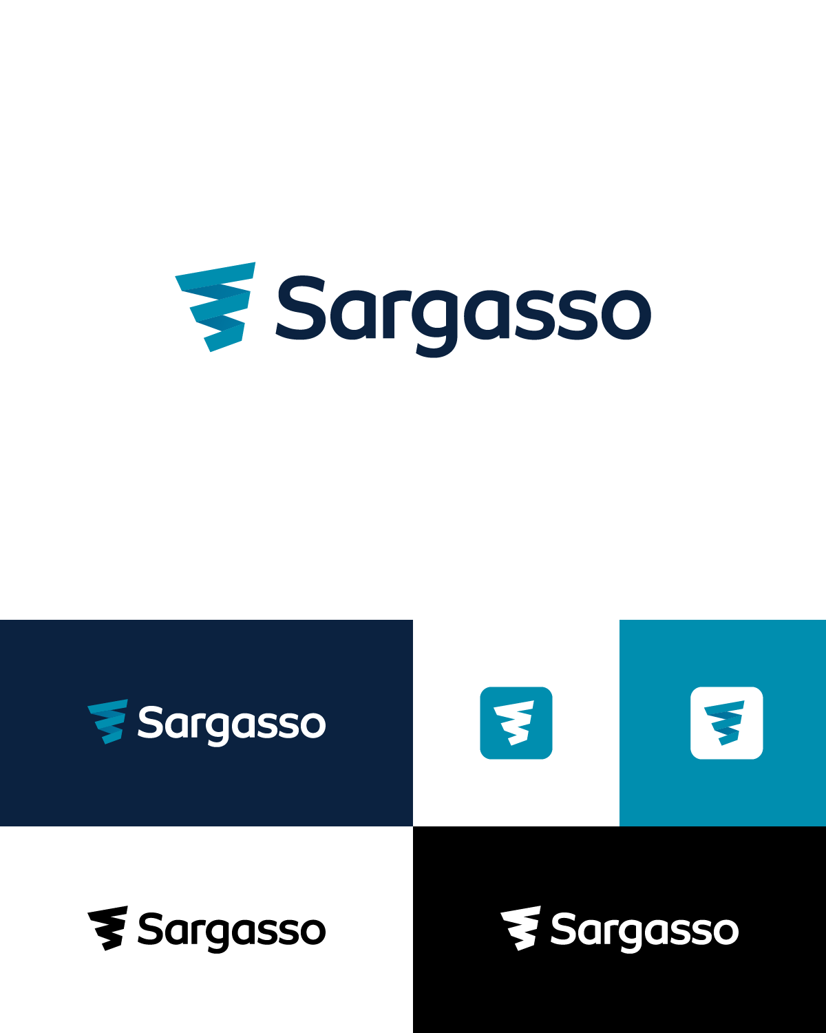
Este cliente recibió 261 diseños de logo de 113 diseñadores. Eligieron este diseño de logo de Adam Sleigh Graphic Design como el diseño ganador.
Únete gratis Encuentra trabajos de diseño- Garantía
- Proyecto agrupado 1
-
 £390
£390
-
 261 diseños
-
 113 diseñadores
Resumen de Diseño de Logo
We are looking for a new modern logo to replace the current one from the turn of the millenium.
We are an internet service provider and hosting company. Our current logo can be seen at www.sargasso.net. It looks ancient. The whole site will be redesigned around the new logo so you do not need to worry about it fitting into that clunky old design. The colour palette is also completely up to you.
We are looking for something in the style of modern tech companies with space, clean lines, limited colours, and clean text.
Our company name is "Sargasso Networks", however, for the purposes of the logo, it would be acceptable to just use "Sargasso" which may look cleaner.
It would be nice to maintain some aspect of the "whirlwind" motif (a nodding reference to the Sargasso Sea) even as a vague hint, however this is not essential and I would like to also see designs that do not have this. Other iconography relating to computers, interconnection, networking, or the Internet is possible.
Apart from looking archaic, the current logo does not scale well. The mismatched font sizes and the intricate features of the logo do not look good at small sizes.
The new logo should look good on a white background and a light gray background. It should also look good if converted to monochrome. It should be clear and look good at sizes from tiny branding icons in the screen corner up to t-shirt and office signs.
It is up to the designer whether the graphic element is integrated into the text or stands alone. If the logo is not integrated with the text, it should be identifiable as our logo even if the text is removed.
In order to be printed in spot colour as well as embroidered, the logo should be of a limited colour palette and avoid gradients. If gradients are used, it should look substantially the same if the gradient is converted to single colour, and an additional AI file without gradient should be supplied as part of the deliverables.
I am thinking that sans-serif text would look cleaner and more modern. Any font used should be either royalty free (with a link to the font and the license) or of only modest cost and unrestrcited use. AI files should be delivered in two versions - one with text as text, and another backup copy with the text converted to curves.
FOR BUSINESS CARD - We require DOUBLE-SIDED
Actualizaciones
Need extra days to review
Hi everyone
Thank you very much for your submissions so far.
Due to the high quality of your designs, I've happily guaranteed payment as some have requested. This doesn't at all imply we've selected a winner at all, just that I am confident that we will be able to work with you to get the perfect design.
I've also extended the deadline to allow more time for entries and for us to give individual feedback.
Tomorrow the submissions will start going up on our wall - I'll be printing out the version in 2D with white background for equal comparison (so if you have made one of those fancy 3D mockups, please make sure there's also a 2D version there as well).
A few common themes from the submissions so far:
- The logo should be "modern" but not necessarily "futuristic". It should be present-day (think the present versions of Slack, Youtube, VMware, Cisco, Trello, Twitter to name a few). In particular some of the fonts with many parts of the letters missing are a bit too "Bladerunner".
- In almost every case where the word "Sargasso" stands aside from the logo, it seems to look better in mixed case (i.e. Sargasso is better than SARGASSO). By "better" I mean it looks cleaner, simpler, and is more accessible and friendly.
- One of the requirements was that it should scale down and still be recognisable, so the details should not be too intricate. Imagine that you took the logo (without any text) and shrunk it to a 32x32 pixel icon - would it still be clear? If so, that is the clean and simple design we're looking for.
- There's no need to do any business card design at this stage - that's just an add-on once we've selected the winning logo.
Again, many thanks for all of your work, and I'll be in touch with as many people as possible soon.
David
Added Sunday, July 21, 2019
Need extra days to review
Hi everyone,
Thanks so much for your designs. I haven't managed to get back to everyone as we had 191 submissions, but almost every one was of a really high standard and I appreciate the work put into them all.
Having spent so long poring over 191 designs I am now in decision paralysis. So from these I have managed to choose my favourite 13, which are now up on our walls and have also been sent to friends, families, key partners and customers. I didn't want to put everyone through the extra work of revisions at this stage, so I've specifically asked the voters to focus on the overall design and concept, and not worry too much about things that can be tweaked later like the font and colours.
I will be in touch with the winner soon for the final revisions (or if it is close, I will guarantee a second place prize as well and ask for revisions from two people).
Many thanks,
David
Added Monday, July 29, 2019
Objetivo del mercado(s)
Small to medium businesses in all industries
Tipo de industria / entidad
Internet Service Provider
Información de contacto para la tarjeta del negocio
David Croft
Director
....@....net
www.sargasso.net
+44 845 034 .... x301
+1 212 400 .... x301
Texto del logo
Sargasso Networks
Estilos de logo de interés
Logo con emblema
Logo contenido dentro una forma / figura
Logo pictórico / combinado
Un objeto del mundo real (texto opcional)
Logo abstracto
Conceptual / simbólico (texto opcional)
Logo con personaje
Logo con ilustración o personaje
Logo de marca de nombre
Logotipo basado en palabra o nombre (solo texto)
Logo con siglas
Acrónimo o logo tipográfico (solo texto)
Estilos de fuente para usar
Colores
Diseñador para elegir los colores que se utilizarán en el diseño.
Mira y siente
Cada control deslizante ilustra las características de la marca del cliente y el estilo que debe comunicar el diseño de tu logotipo.
Elegante
Atrevido
Juguetón
Serio
Tradicional
Moderno
Atractivo
Profesional
Femenino
Masculino
Vistoso
Conservador
Económico
De Alta Gama
Requisitos
Debes tener
- If you're presenting 3D mockups of signs etc please make sure you include at least one image in 2D with no background so we can judge it.
- Please work on the logo only at this stage. The business card can be designed later by the winner. FOR BUSINESS CARD - We require DOUBLE-SIDED.
Pagos
Total
£390
Fecha límite del proyecto
03 ago. 2019 18:48:14 UTCUpgrades del proyecto
Proyecto(s) incluido(s)
- ofreciendo £29 por el diseño de tarjeta de presentación al ganador