

 Refresh
Design Landing Page and User Interface for Online Second Hand Merchandice Store in Web 2.0 type pa
¿Quieres ganar un trabajo como este?
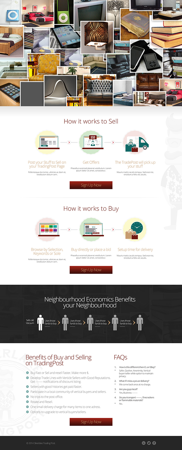
Este cliente recibió 21 diseños de página de aterrizaje de 11 diseñadores. Eligieron este diseño de página de aterrizaje de Jazzi Walker como el diseño ganador.
Únete gratis Encuentra trabajos de diseño
- Garantía
-
 US$690
-
 21 diseños
-
 11 diseñadores
Resumen de Diseño de Página de Aterrizaje
We are creating a company which delivers second hand merchandise locally. We'd like to have a landing page developed in the web 2.0 parallax scrolling web 2.0 style. We have a design style in mind. We need to have other pages within the website designed also. However, we need to get the landing page correct first.
In the center of the landing page, there will be the Second Hand Trading Post Trading Post logo. Underneath that logo, there will be an entry to enter your email and underneath that entry, there will be an entry to enter your password. Then there will be a login button. This will be the top layer of the landing page and it will be "transparent".
The second layer of the landing page, will be "behind" the logo and login. On this second layer, there will be boxes that will have pictures of items for sale such furniture, ipods, lamps, books, CD's, TV, couches, beds. The boxes will flip over randomly and then the price for the item will be shown on the flip side of the box. If a user clicks on the box to find the price.
Scrolling down the landing Page – When you scroll down the landing page, you will see a little info graphic, which will show you how the service works. This is kind of an emulation of the Betterment.com website which is pretty clean and looks nice.
At the bottom of the landing page you will have the menu that will have the same items as the Poshmark landing page. This will pretty much allow users to get anywhere they need to in the site. This will also serve as a guide to you to how to design architect and build everything onward from here.
NOTE: THE LANDING PAGE WILL ONLY BE SKETCH PAGES 1-4

Actualizaciones
Project Deadline Extended
Reason: Not enough quality designs that follow the directions of the brief.
Added Tuesday, January 21, 2014
Objetivo del mercado(s)
The customers will be hipsters who live in artsy neighborhoods in the United States. The customers are cost conscious and like to save money, but also appreciate style and are also very tech savvy. The ride bicycles and are into recycling and doing helping the environment.
Tipo de industria / entidad
Architect
Mira y siente
Cada control deslizante ilustra las características de la marca del cliente y el estilo que debe comunicar el diseño de tu logotipo.
Elegante
Atrevido
Juguetón
Serio
Tradicional
Moderno
Atractivo
Profesional
Femenino
Masculino
Vistoso
Conservador
Económico
De Alta Gama
Requisitos
Debes tener
- The website design must have the parallax scrolling style. The landing page must have our company logo on it. The logo of the company name is attached in this brief. The logo reads Second Hand Trading Post.
NOTE: THE LANDING PAGE WILL ONLY BE SKETCH PAGES 1-4
Agradable de tener
- A cool modern look. Imagine if Twitter opened up a Second Hand Goods store. That's what I want it to look like.
No debería tener
- An early 2000's or mid 2000's style of design.