Fresh and Modern Chiropractic Office Logo Design
¿Quieres ganar un trabajo como este?
Este cliente recibió 108 diseños de logo de 40 diseñadores. Eligieron este diseño de logo de logograph como el diseño ganador.
Únete gratis Encuentra trabajos de diseño-
 US$110
-
 108 diseños
-
 40 diseñadores
Resumen de Diseño de Logo
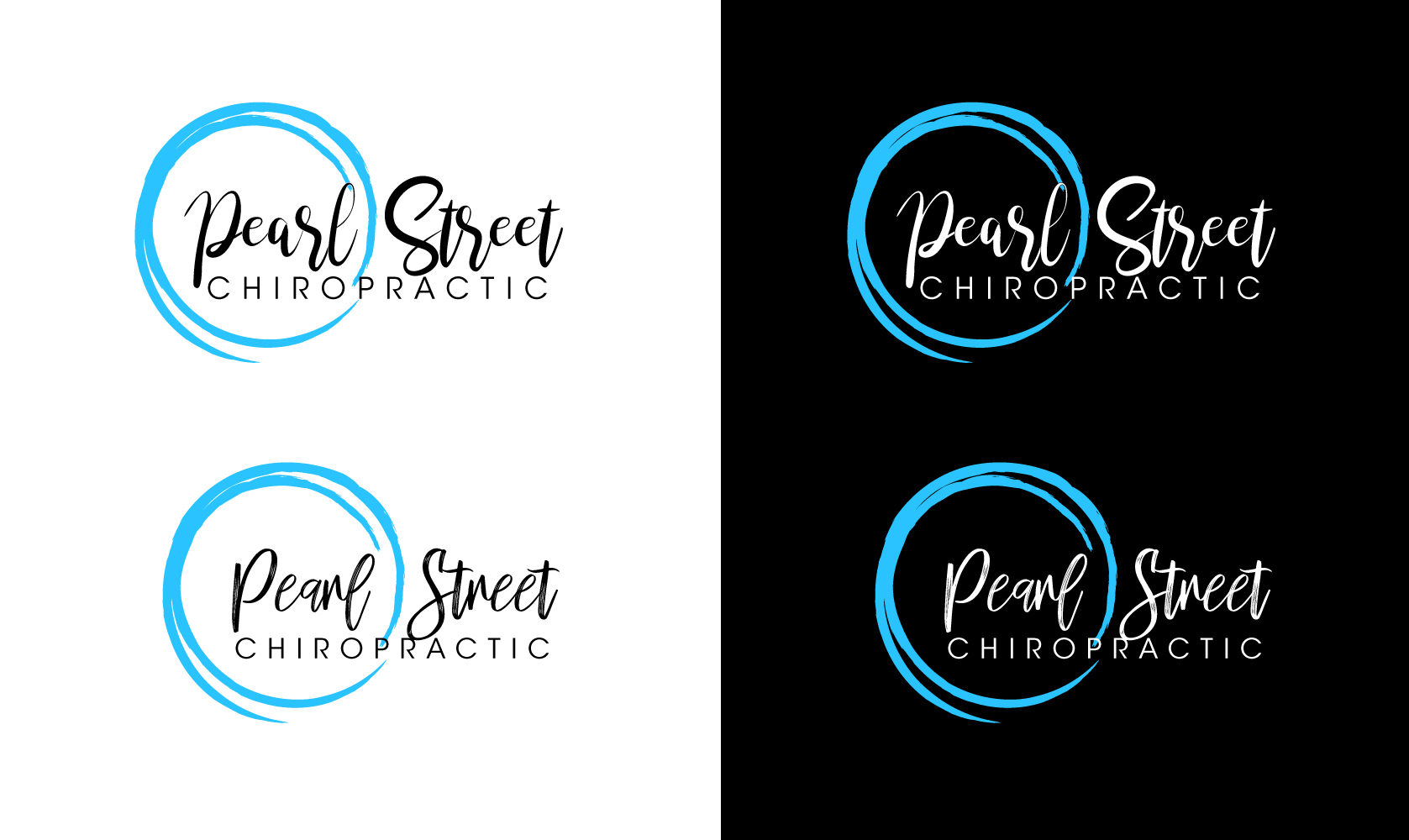
Hi there! I received a logo design and don't quite love it. I would like to keep the blue 'pearl' but remove the dot between 'pearl' and 'street' as well as experiment with the text. Our current logo is fully in a sans serif-style font. I would like to see either "Pearl Street" in a modern script with "Chiropractic" beneath it in a sans serif style font, or vice versa with sans serif-style on top and script on the bottom. I like the location of the 'pearl' tagged onto the left side, slightly overlapping (behind) the font, but I'd also like to see a design with it encompassed (I included an example of another logo that does that). Our primary color is #2AC3FF. Our target market is modern women ages 25-40 who are starting a family.
Texto del logo
Pearl Street Chiropractic