Hardy|Hobbs & Jackson business card contest
¿Quieres ganar un trabajo como este?
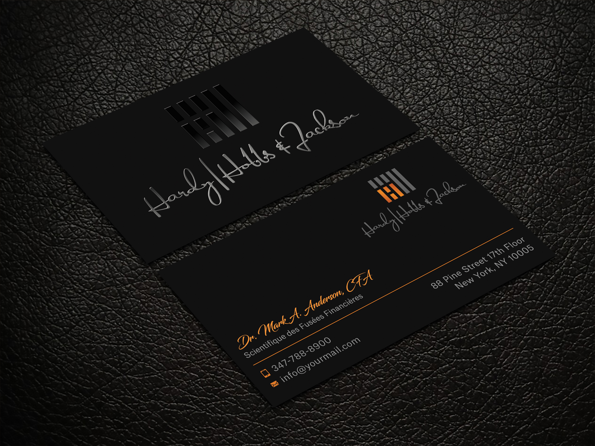
Este cliente recibió 165 diseños de tarjeta de presentación de 22 diseñadores. Eligieron este diseño de tarjeta de presentación de Krishno como el diseño ganador.
Únete gratis Encuentra trabajos de diseño-
 US$90
US$90
-
 165 diseños
-
 22 diseñadores
Resumen de Diseño de Tarjeta de Presentación
We need a logo for an upscale boutique diversified company involved in real estate, investments, cattle, and more. Our businesses DO NOT need to be reflected in the business card nor do we want them noted. This is our logo and colors and we love our logo and colors. Our logo looks best against a black background and we like to include the firm name in our logo usage. importantly, the names Hardy and Hobbs are separated by | not / and we use an ampersand not the word and.
On the front of the card, we want to include:
company logo and name (Hardy|Hobbs & Jackson)
on the back, we would definitely include:
address, email, cell #
logo and name (smaller size than front)
The variable will be location of individual name and title (mine for example is ) - whether on the front OR on the back. interested in variations from which to choose
Dr. Mark A. Anderson, CFA
Scientifique des Fusées Financières
we would like to use contemporary symbols for address, email address, cell # with an option for web site that we do not intend to use initially. we like two sided cards and believe this design should use four rounded corners with the standard size. we prefer thicker card stock and may look at metal.