Dynamic banner stand for Canadian music education charity
¿Quieres ganar un trabajo como este?
Este cliente recibió 25 diseños de anuncio de banner de 11 diseñadores. Eligieron este diseño de banner publicitario de Lauren como el diseño ganador.
Únete gratis Encuentra trabajos de diseño-
 C$90
C$90
-
 25 diseños
-
 11 diseñadores
Resumen de Diseño De Banner Publicitario
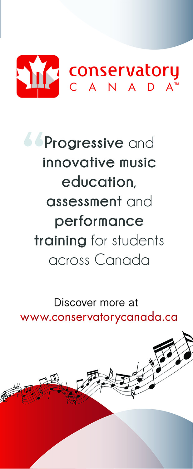
Conservatory Canada offers music exams and other programs to instrumental and vocal students across Canada. We are looking to offer flexible, progressive, and more modern programs than our more traditional competitors. We need a new banner stand for our office that concisely demonstrated and illustrates our current identity materials while messaging what we do, directing interested people to our website. We have a previous banner stand that was designed for a separate purpose that is uploaded for reference, as well as our logo. We are hoping to match the look and feel of the previous banner stand as closely as possible, with the same or similar fonts, some similar layout, with similar shapes, graphics and colours. The new banner stand does not copy information from the old banner (uploaded for reference) but instead includes the following detail: Logo (uploaded), the following descriptor: "Progressive and innovative music education, assessment and performance training for students across Canada". This should be in a font that is modern, engaging, similar to the old banner stand (uploaded), yet conveys some element of tradition and authority. The banner also includes "Discover more at www.conservatorycanada.ca" The banner should also include the same red/white/grey colour scheme as the old one, with similar background graphics that evoke fun and creativity in a modern way. Again, this design has new content as described here, and does not copy the content from the uploaded banner - it is only included for reference as to look and feel. The new banner should copy the original schemes to provide us with continuity in our marketing materials.
Objetivo del mercado(s)
General public that is passing by our office
Estilos de fuente para usar
Gustan otros estilos de fuente:
- See uploaded banner for reference
Colores
Colores seleccionados por el cliente para ser utilizados en el diseño del logotipo:
Mira y siente
Cada control deslizante ilustra las características de la marca del cliente y el estilo que debe comunicar el diseño de tu logotipo.
Elegante
Atrevido
Juguetón
Serio
Tradicional
Moderno
Atractivo
Profesional
Femenino
Masculino
Vistoso
Conservador
Económico
De Alta Gama
Requisitos
Debes tener
- Similar look and feel to previous banner (uploaded)
Agradable de tener
- Please see project description for more detail
No debería tener
- Radical departure from current look and feel.