I need a personal logo designed
¿Quieres ganar un trabajo como este?
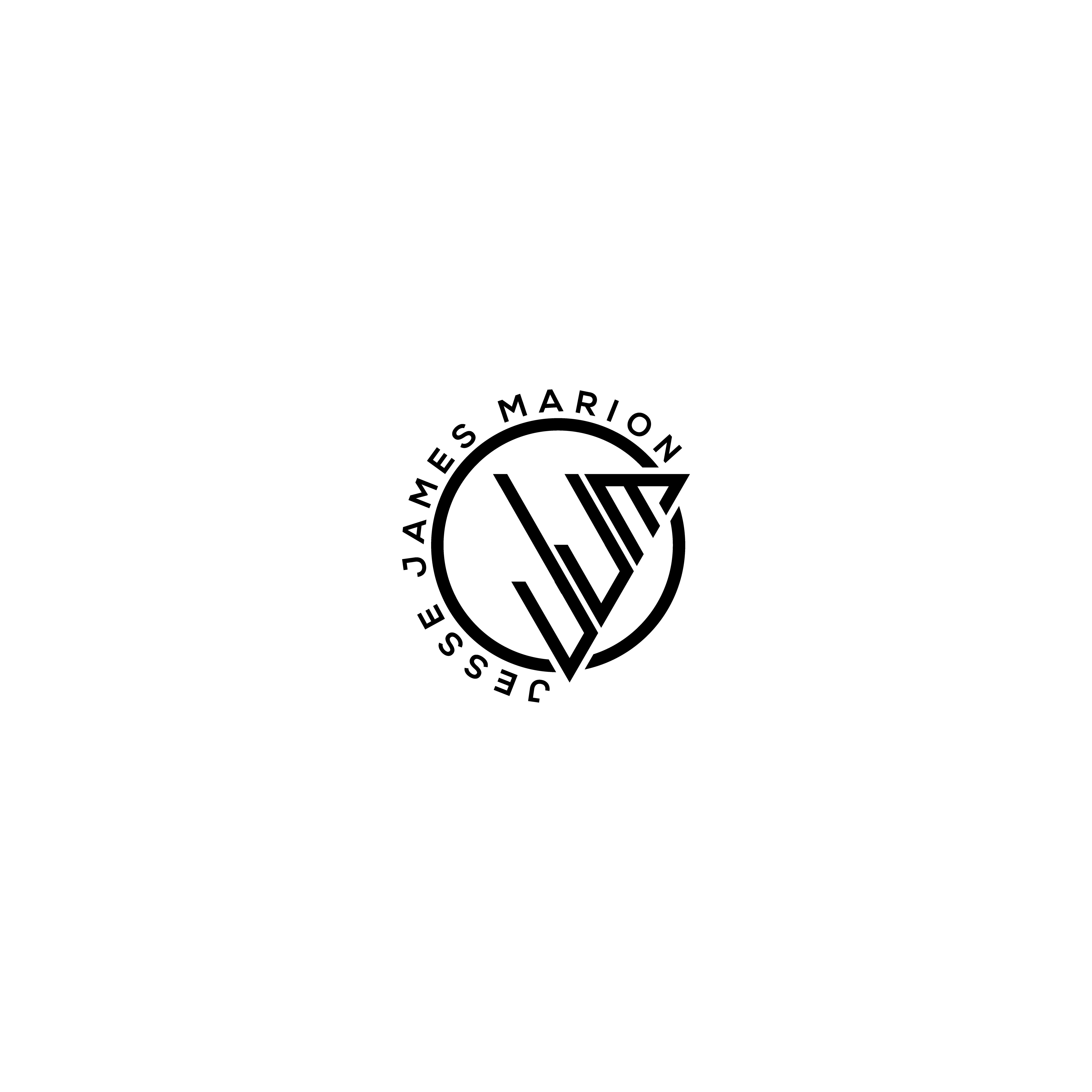
Este cliente recibió 257 diseños de logo de 121 diseñadores. Eligieron este diseño de logo de ATIKUR 6 como el diseño ganador.
Únete gratis Encuentra trabajos de diseño- Garantía
-
 US$150
-
 257 diseños
-
 121 diseñadores
Resumen de Diseño de Logo
I need a logo for my personal social media (YouTube, Instagram, etc.) and website, maybe even eventually some merch items like shirts or hats. My social accounts and website are all my full name (Jesse James Marion) and the focus of the social media and website is going to be entrepreneurship, following me through my daily experiences and helping others with their own issues. Lots of positive stuff! I have no color preferences at this point. The logo should convey positivism and professionalism. Something that is creative and has a flow to it.
UPDATE: It seems like what I like best are the logos where shapes and lines are used to create the JJM. You see the letters when you look for them but at the same time they aren't actual normal fonts, they are more of shapes and lines. Hopefully that makes sense.
Objetivo del mercado(s)
75% male 25% female. Ages 10-50 mostly but possibly older.
Texto del logo
JJM
Estilos de logo de interés
Logo con emblema
Logo contenido dentro una forma / figura
Logo con siglas
Acrónimo o logo tipográfico (solo texto)
Estilos de fuente para usar
Colores
Diseñador para elegir los colores que se utilizarán en el diseño.
Mira y siente
Cada control deslizante ilustra las características de la marca del cliente y el estilo que debe comunicar el diseño de tu logotipo.
Elegante
Atrevido
Juguetón
Serio
Tradicional
Moderno
Atractivo
Profesional
Femenino
Masculino
Vistoso
Conservador
Económico
De Alta Gama
Requisitos
Debes tener
- My initials JJM
Agradable de tener
- Because my full name (Jesse James Marion) is so long I think it will just have to be my initials (JJM) in the logo itself unless you see a way to make it work like my full name under or wrapped around a circle of the JJM that would be even better since my social and websites are actually my name and not initials.
- UPDATE: It seems like what I like best are the logos where shapes and lines are used to create the JJM. You see the letters when you look for them but at the same time they aren't actual normal fonts, they are more of shapes and lines. Hopefully that makes sense.
No debería tener
- nothing cheesy, no dollar signs or anything like that.