The Radix Pain & Rehabilitation Center
¿Quieres ganar un trabajo como este?
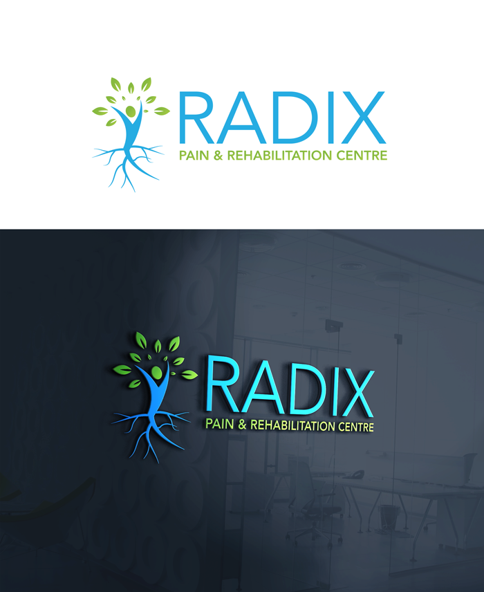
Este cliente recibió 230 diseños de logo de 90 diseñadores. Eligieron este diseño de logo de victor2 como el diseño ganador.
Únete gratis Encuentra trabajos de diseño-
 C$400
C$400
-
 230 diseños
-
 90 diseñadores
Resumen de Diseño de Logo
About us:
We are a Chiropractic and Neurorehabilitation clinic with extended services of massage and acupuncture, and we are located in Edmonton, Alberta (Canada).
We need:
A logo that is simplistic and intuitive, and immediately communicates its value proposition to core customer segments and the general public.
The design approach must be clinical and professional with a subtle hint of collaboration.
The key concept is:
"RADIX" - A root or point of origin - the source of all judgements and predictions.
We want an aesthetic that embraces a few “root” concepts within the business. The main service offered is chiropractic that deals with the spine. Spinal nerves exit and are called “nerve roots”. The clinic is located in the main clinician's hometown - his “roots”.
We look to understand the deeper reasons as to someone has pain and requires the services and therefore are very keen to get to the “root” of a patient’s health issues. The health of the plant often relies on the health of the roots which may not be visible.
Our clinic also collaborates with many other medical professions and thus the root concept in its expansive and in-depth health benefits.
Collaboration is a major point of difference in the way this clinic relates to its competition.
We are open to different concepts, but logo should be clear and crisp and professional - design opportunities include playing off the letter art or themed with a root concept.
Project Scope & Deliverables:
A logo that is Simplistic and intuitive
Clean, crisp and clinical
A subtle hint of collaboration
Immediately communicates its value proposition to its core customer segments and the general public
We like blue (#00aeef) with secondary earth tone colours but are open to graphic artist's interpretation.
We like typography Helvetica but are open to other fonts.
We like the Logo aesthetic model of Apple design - clean, crisp and modern.
Graphic must be easily understood and recognizable to core customer segments and the general public.
Formats for deliverables must include:
PSD/SVG/AI/EPS
Helvetica typography
Layout in horizontal and vertical options
Developed with logo variants in mind (colour and background usage)
Separated into logomark and wordmark
Developed with minimum size and defined clearspace in mind
Logo is to target:
New patients
Female (30-40 years-old)
Male (35-45 years-old)
Health Professionals
Female (30-40 years-old)
Male (35-45 years-old)
Medico-legal services (insurance)
Female (30-40 years-old)
Male (35-45 years-old)
Logo is to be used for:
Digital (site)
Analog (print)
Mobile (booking)
Thank you for your time and we look forward to reviewing the options you artists create for us! Please ask any questions if any of the above is unclear.
Texto del logo
Radix Pain & Rehabilitation Center