Update Existing Homepage
¿Quieres ganar un trabajo como este?
Este cliente recibió 13 diseños web de 5 diseñadores. Eligieron este diseño web de Dayiskuan como el diseño ganador.
Únete gratis Encuentra trabajos de diseño- Garantía
-
 US$470
-
 13 diseños
-
 5 diseñadores
Resumen de Diseño Web
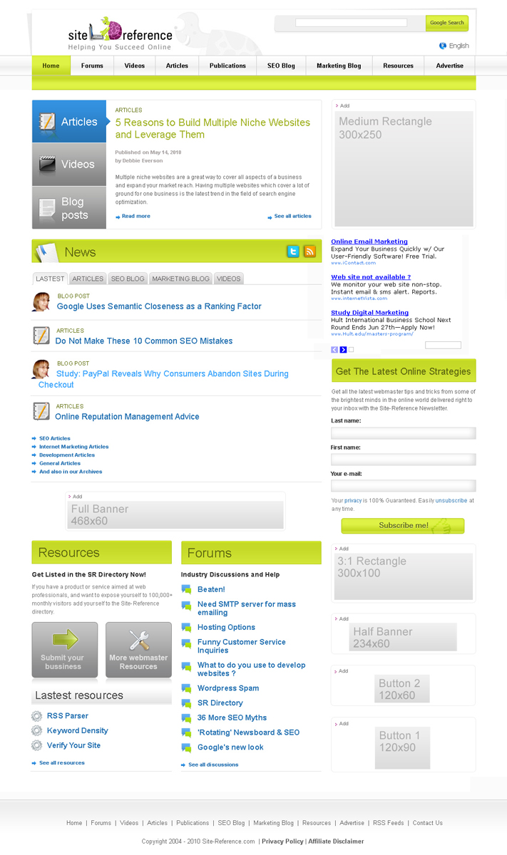
Here’s the scoop… we want to update our homepage here with a more modern look: wws.Site-Reference.com
I am NOT looking for a brand new design; as our site has many pages, and section. Instead I want a new more modern design based on the existing design (if that make sense)
Whatever new design…must match the rest of the site
I want the current header (menu and up) as well as the current footer to stay the same; it’s everything in between that has to change.
What I’m really looking for is:
- Better use of space
- Better emphasis on key components
- Addition of a new section (more about that below)
- More modern feel
By modern I mean the icons we use are getting a bit cheesy, the straight layout is also dated, etc
Here are the elements that I need to have on the page in ORDER OF IMPORTANCE:
1) ADVERTISING SPACE: while I don’t want huge flashing ads front and center, this being an information site, ads are our #1 source of revenue and as such are important. I would like to see several add slots of various sizes (standard sizes) throughout the page in eye catching spots (not hidden in the bottom right corner)
2) ARTICLES: articles are our main draw. If you look at the current design you will see there is a lead article at the top left of the page and then a series of other articles down the middle
3) NEWSLETTER SUBSCRIPTION BOX: need to have a section that is highly visible for people to subscribe to our newsletter (doesn’t have to be as big as the existing one)
4) BLOG POSTS (‘the experts say’ section): besides articles we also have blog posts. However I’m thinking we could combine the articles and the blog posts into 1 section titled “news” or something to save space. And the blog posts could just have an identifier at the beginning of the title such as “Blog: post title”
5) VIDEOS: don’t need to show a ton of vids, but would like room for 1 main video and a few suggestions of others.
What I have seen a bunch of new websites use is a type rotating ‘newsboard’, like the one on the yahoo homepage for example. Perhaps using an idea like that could be cool. You could feature 1 article, 1 blog post, 1 video, or something in it and have it rotate.
6) RESOURCES: This is something that is not ‘really’ currently on the homepage. By that I mean there is a “webmaster resources” section + a “webmaster tools” section but these are dated. Dated because we recently added a new directory to the site: http://resources.site-reference.com/ - so what I would like to do now is combine those 2 section; 1) invite people to check out the directory + submit there and 2) list a few of the newer entries (ie. new entries automatically get posted on the section of our homepage
7) FORUM DISCUSSIONS: if you look at the “Industry Discussions and Help” section, those are the latest discussions from our forums http://forums.site-reference.com/
That is it…good luck,
Nic
Objetivo del mercado(s)
web professionals
Tipo de industria / entidad
Industry
Mira y siente
Cada control deslizante ilustra las características de la marca del cliente y el estilo que debe comunicar el diseño de tu logotipo.
Elegante
Atrevido
Juguetón
Serio
Tradicional
Moderno
Atractivo
Profesional
Femenino
Masculino
Vistoso
Conservador
Económico
De Alta Gama
Requisitos
Debes tener
- see description
Agradable de tener
- see description
No debería tener
- see description