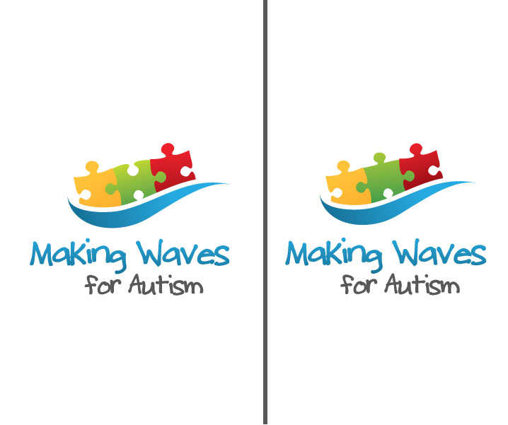
design a logo for a new autism charity Making Waves for Autism

¿Quieres ganar un trabajo como este?
Este cliente recibió 56 diseños de logo de 23 diseñadores. Eligieron este diseño de logo de Stephanie Soon como el diseño ganador.
Únete gratis Encuentra trabajos de diseño- Garantía
Resumen de Diseño de Logo
Making Waves for Autism is a new charity which needs an identity. We raise funds to purchase educational resources to support children with autism in schools. We have a new and innovative concept to bring together public services and private money for the benefit of children with complex needs. We are a rural Devon (UK) based charity, founded by parents of autistic children who got fed up with complaining in support groups and decided to do something about it!
Actualizaciones
please see our website www.makingwavesforautism.org.uk for more info.
Objetivo del mercado(s)
Mainly other parents, individuals with children/families. Mostly middle class and educated, socially aware, who value education. Also grant making organisations in the public sector.
Tipo de industria / entidad
Charity
Texto del logo
Making Waves for Autism
Estilos de logo de interés
Logo pictórico / combinado
Un objeto del mundo real (texto opcional)
Mira y siente
Cada control deslizante ilustra las características de la marca del cliente y el estilo que debe comunicar el diseño de tu logotipo.
Elegante
Atrevido
Juguetón
Serio
Tradicional
Moderno
Atractivo
Profesional
Femenino
Masculino
Vistoso
Conservador
Económico
De Alta Gama
Requisitos
Debes tener
- the logo must carry reference to 'waves' or 'a wave'. The name was inspired by local Devon coastline and beaches. We also want to be indentified as a children's charity, so it must have a clear reference to children. Must have a distinctive font. Not too abstract.
Agradable de tener
- primary colours. The classic autism symbol is a puzzle with primary coloured (red, blue, green, yellow) puzzle pieces linked together, it might be nice to have the puzzle in the design somehow. The font could be child-like (as in child's handwriting). We favour handwritten fonts in general, our website currently has our name in Child's Play which we like, but we are open to suggestions. Avoid cartoon-like fonts - we fundraise for a serious issue, and while we like to be fun in the way we get our message across, it is not a joke!
No debería tener
- must not be boring, corporate, and definitely not use plain fonts like arial or futura or similar, or serif fonts (look old). Previous attempts at this ended up with designs that looked like that of a washing machine, or management consultancy! Should not be too abstract, we want a symbol that is clearly identified.