AdventureDirect.com - The future biggest online adventure store needs clean logo
¿Quieres ganar un trabajo como este?
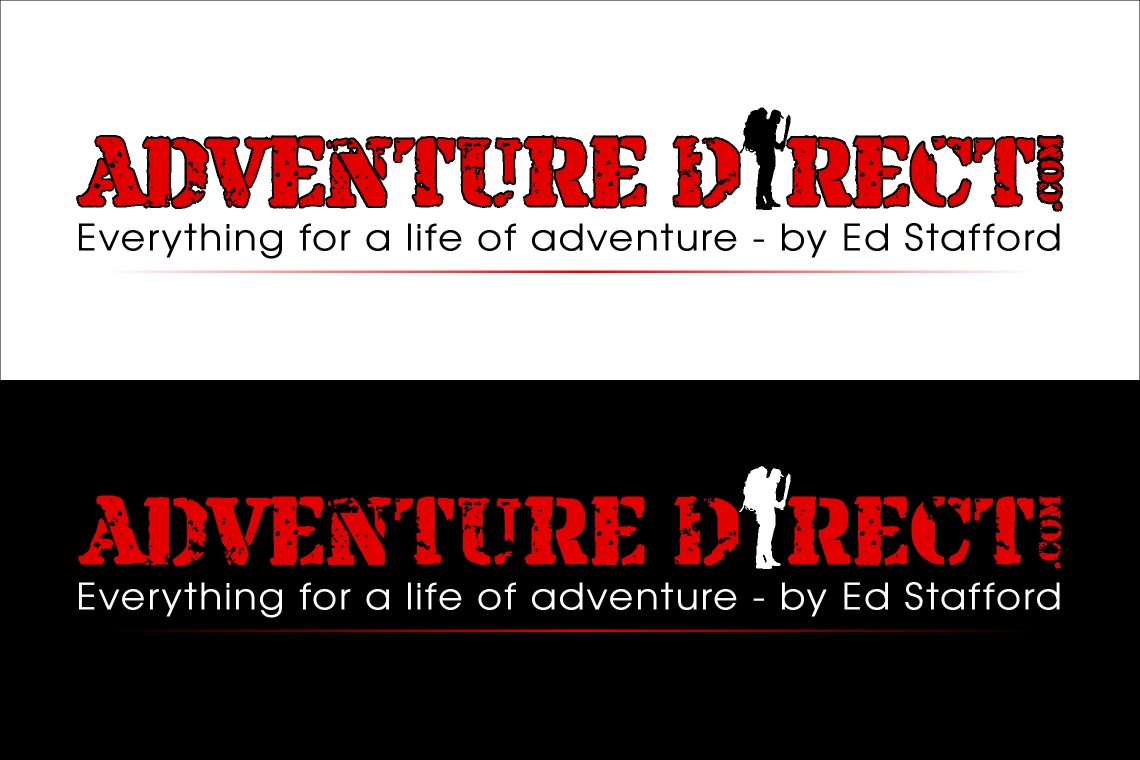
Este cliente recibió 132 diseños de logo de 25 diseñadores. Eligieron este diseño de logo de Moiz Najmi como el diseño ganador.
Únete gratis Encuentra trabajos de diseño- Garantía
-
 £450
£450
-
 132 diseños
-
 25 diseñadores
Resumen de Diseño de Logo
I need a logo for an online adventure kit and outdoor clothing store with a difference. Not a geeky outdoors store - one that is adventurous with a real explorer feel. I have a website edstafford.org and will use my own name in the promotion of this store.
We are not talking trekking poles and knapsacks, we are talking machetes, pack rafts, GoPro cameras and cool adventure clothes and equipment. But we will stock all basic outdoor gear too! The store will be the experts' destination. The store run by experts for experts. The shop which has already sifted through the rubbish and everything, at whatever price level, works well and is the best on the market for that price bracket.
The shopping experience should be fun and adventurous and I want the logo to be simple, refreshing and memorable.
Thanks.
Ed Stafford
*NB - added note half way through the time…
Hi everyone,
Thanks for all the amazing submissions so far.
Just a bit of a tweak to the brief at this stage is that although lower case sometimes looks smarter, I'm opting for ALL CAPITALS I think because it looks stronger, bigger and more confidant as a logo.
There have been some great silhouette graphics - but some that its not really clear what the image is - so please make sure the graphic is easily identifiable to anyone.
I'm pretty sure we are going for red as it works best on a white back ground. I know there have been loads of lime green submissions but it just doesn't work as well on white as it does on black.
Finally its the simple ones I like, the clean ones, Please don't distort the type too much or have too much going on. The simpler and cleaner and bolder and more fun and personal the better!
Many thanks,
Ed
Actualizaciones
So far I like 2967713 the best. Its nice and clean and works well on white and black backgrounds.
Added Friday, January 17, 2014
Hi,
Added Sunday, January 19, 2014
Hi everyone,
Added Wednesday, January 22, 2014
Objetivo del mercado(s)
Everyone who buys outdoor gear. So despite it being fresh and cool and new it can't be so modern as to put off retired hillwalkers who want to kit themselves out with a goretex jacket. Kid friendly too.
Tipo de industria / entidad
Clothing
Texto del logo
AdventureDirect.com
Estilos de logo de interés
Logo pictórico / combinado
Un objeto del mundo real (texto opcional)
Estilos de fuente para usar
Mira y siente
Cada control deslizante ilustra las características de la marca del cliente y el estilo que debe comunicar el diseño de tu logotipo.
Elegante
Atrevido
Juguetón
Serio
Tradicional
Moderno
Atractivo
Profesional
Femenino
Masculino
Vistoso
Conservador
Económico
De Alta Gama
Requisitos
Debes tener
- clarity. strength. professionalism. fun.
Agradable de tener
- a graphic or character. possibly using ideas from edstafford.org
No debería tener
- anything geeky and outdoors. Not a pair of walking boots or a mountain. Too obvious.