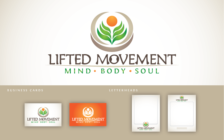
Lifted Movement Logo Design
¿Quieres ganar un trabajo como este?
Este cliente recibió 93 diseños de logo de 21 diseñadores. Eligieron este diseño de logo de Emanuele Pepi como el diseño ganador.
Únete gratis Encuentra trabajos de diseño- Garantía
-
 US$200
-
 93 diseños
-
 21 diseñadores
Resumen de Diseño de Logo
Looking for a logo design for a company called Lifted Movement. This company is going to be geared towards the fitness, health/wellness industry attracting those with or interested in a higher state of thinking and acting when it comes to being healthy mentally/physically with a touch of spirituality/meaning to life. When I say spirituality I mean that in a sense of those with a "we are all one" open minded mentality. The goal of the company is to motivate and inspire others to get healthy physcally/mentally while having, spreading and maintaining a constant positive outlook/attitude in life.
Actualizaciones
Although I previously stated that this could look like something that a yoga studio would use, its not actually for a yoga studio. I like the symbolism that alot of yoga studios use.
Added Tuesday, April 24, 2012
Project Deadline Extended
Reason: Hey everyone! I have many great designs right now that I am having a hard time choosing plus Im still waiting on a couple of designs to be updated. I just wanted to let all of you know. Thank you for your patience.
Added Thursday, April 26, 2012
Objetivo del mercado(s)
Those into fitness and health.
Examples: Those into yoga, self improvement, the gym, healthy eating, etc.
Tipo de industria / entidad
Industry
Texto del logo
Lifted Movement
Estilos de logo de interés
Logo abstracto
Conceptual / simbólico (texto opcional)
Mira y siente
Cada control deslizante ilustra las características de la marca del cliente y el estilo que debe comunicar el diseño de tu logotipo.
Elegante
Atrevido
Juguetón
Serio
Tradicional
Moderno
Atractivo
Profesional
Femenino
Masculino
Vistoso
Conservador
Económico
De Alta Gama
Requisitos
Debes tener
- Im pretty open minded to this so no must haves but definitely something with an edge. This should be a unisex logo.
Agradable de tener
- Something you would see a Yoga studio use as a logo but with a edge.
No debería tener
- Crosses. Logo geared more towards a male or female.
No human body forms.