At Home Bakery 'Sweetery' Logo Design
¿Quieres ganar un trabajo como este?
Este cliente recibió 311 diseños de logo de 107 diseñadores. Eligieron este diseño de logo de meow.designer como el diseño ganador.
Únete gratis Encuentra trabajos de diseño- Garantía
-
 US$150
-
 311 diseños
-
 107 diseñadores
Resumen de Diseño de Logo
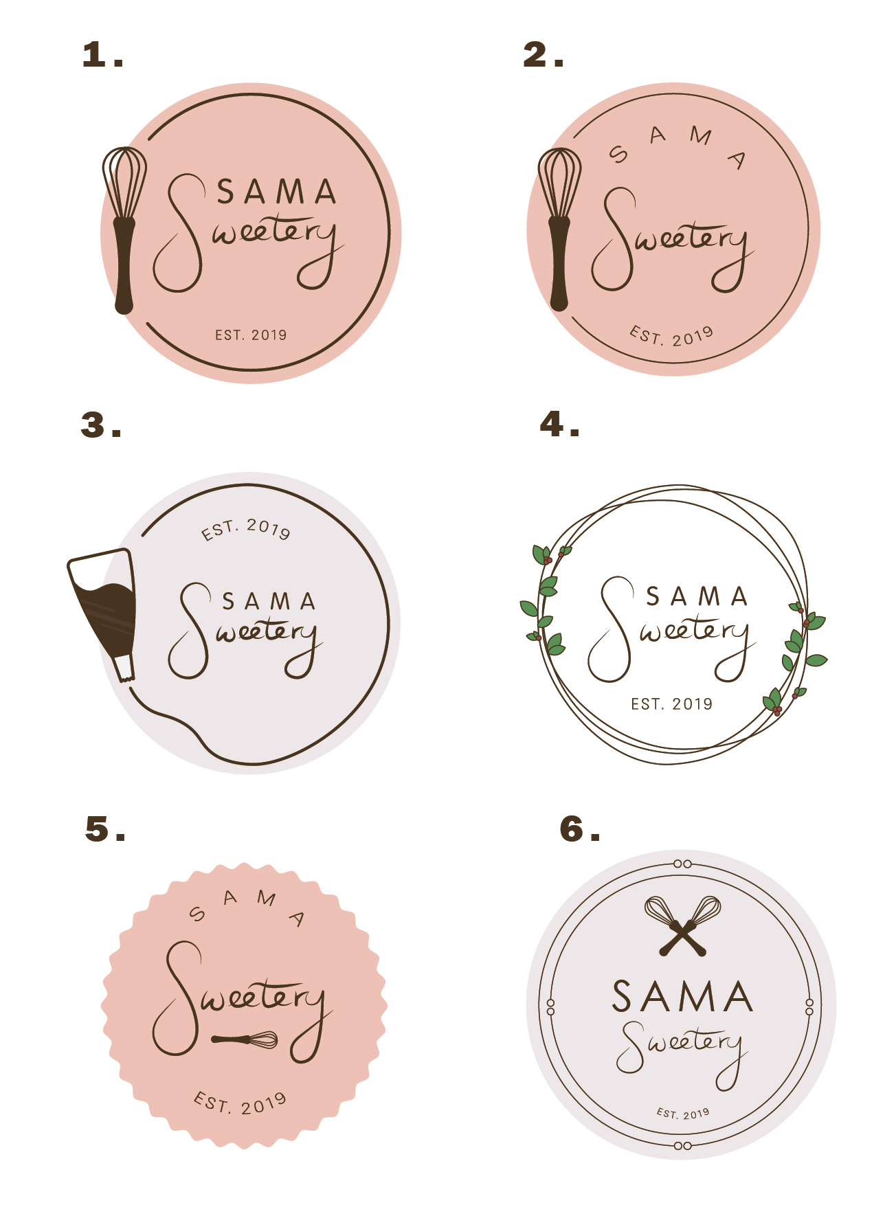
I need a logo for my at home bakery (sugar cookies, cupcakes, cake, bread). I’m looking for something feminine, modern, a little whimsical and unique that would be eye catching and attractive on stickers, labels, Facebook, Instagram etc. SAMA is the first initials of me, my husband and my two kids. I’d like some cursive in there. I’d also need to be able to use it as a watermark on pictures and videos. I'd like the cursive to be more of a hand written feel to it, or the design to look like something we pieced together rather than something corporate.
Objetivo del mercado(s)
Middle class, mostly moms or females. Fundraisers, Bachelorette, Baby Showers, Weddings, activities, school functions, sport teams, events etc. Holidays and family gatherings.
Texto del logo
SAMA Sweetery
Estilos de logo de interés
Logo con emblema
Logo contenido dentro una forma / figura
Logo pictórico / combinado
Un objeto del mundo real (texto opcional)
Logo de marca de nombre
Logotipo basado en palabra o nombre (solo texto)
Estilos de fuente para usar
Gustan otros estilos de fuente:
- Similar to picture
Colores
Diseñador para elegir los colores que se utilizarán en el diseño.
Mira y siente
Cada control deslizante ilustra las características de la marca del cliente y el estilo que debe comunicar el diseño de tu logotipo.
Elegante
Atrevido
Juguetón
Serio
Tradicional
Moderno
Atractivo
Profesional
Femenino
Masculino
Vistoso
Conservador
Económico
De Alta Gama
Requisitos
Debes tener
- Some cursive. I'd like to to be feminine and modern but cute and somewhat simple.
Agradable de tener
- It would be cool to be able to have SAMA be in all caps and then Sweetery be in a handwritten looking cursive depending on if it looked good. Not sure if it would be better to have everything on one line or if it would look better to have it stacked on top of eachother.
No debería tener
- S as a statement symbol since there's a local bakery already that has a cursive R as their logo with a circle around it. There’s also a local bakery that has a rolling pin as a main focal point already.