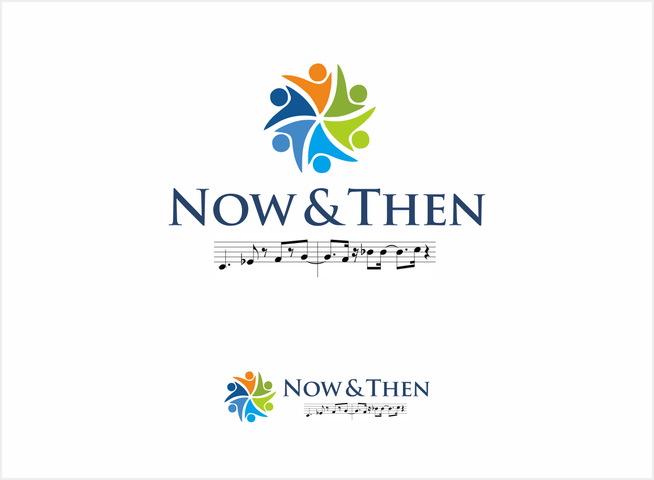
Poster and band logo Now & Then band logo

¿Quieres ganar un trabajo como este?
Este cliente recibió 46 diseños de logo de 23 diseñadores. Eligieron este diseño de logo de hargai como el diseño ganador.
Únete gratis Encuentra trabajos de diseño- Garantía
Resumen de Diseño de Logo
I am after a logo for our band. The band is called Now & Then. I would like the logo to have Now in the top left hand corner in modern font, the & in the middle of the page, and Then written in a older font ( like Times New Roman or similar) in the bottom right hand corner.
I would also like numbers for each decade, from 50s to now, scattered over the page but less pronounced. 50s in a 50 style font, 60s in a hippie 60s style font, 70 in disco, 80s in a cool 80s font, 90s in something suitable and then naughties (or 00s).
If possible can we also get a juke box in the bottom left hand corner and some sort of transition from the juke box in bottom left hand corner across the bottom of the page to a streaming type idea with music notes coming from something that denotes modern music streaming (internet / wifi / smart phone) something like that. Perhaps across the bottom, something like music notation in a ribbon that goes from the jukebox across the bottom of the page to the modern streaming...
Objetivo del mercado(s)
Music venues and people wanting to book a band for an event such as a wedding, corporate event etc...
Texto del logo
Now & Then
Estilos de logo de interés
Logo pictórico / combinado
Un objeto del mundo real (texto opcional)
Colores
Diseñador para elegir los colores que se utilizarán en el diseño.
Mira y siente
Cada control deslizante ilustra las características de la marca del cliente y el estilo que debe comunicar el diseño de tu logotipo.
Elegante
Atrevido
Juguetón
Serio
Tradicional
Moderno
Atractivo
Profesional
Femenino
Masculino
Vistoso
Conservador
Económico
De Alta Gama
Requisitos
Debes tener
- Logo should be easy to read from a distance. It should reflect the band name and what we do. We play big hits from the 50s right through to today.
- I selected pictorial/combination in the logo style section, but i really want words to be more prominent and the decade numbers less so.
Agradable de tener
- The focus should be on the name. Also, we would like numbers depicting each decade (50s 60s 70s 80s 90s 00s..) scattered around randomly in the background.
- Mayeb a mirror ball type effect of light coming ou from the centre behind the &
- If possible, and if it does not make the logo too busy and reduce too much space, we would like a jukebox on left side at bottom, and then going across the bottom of the page some way of morphing that into a modern music device on the right hand side... from a jukebox to a streaming device or simply something depicting music flying through the air to a phone... even across music notation.
No debería tener
- Not too busy, or with fonts that are difficult to read.