Professional update to logo concept for my podcast
¿Quieres ganar un trabajo como este?
Este cliente recibió 131 diseños de logo de 55 diseñadores. Eligieron este diseño de logo de Graphic Bricks como el diseño ganador.
Únete gratis Encuentra trabajos de diseño- Garantía
-
 US$300
-
 131 diseños
-
 55 diseñadores
Resumen de Diseño de Logo
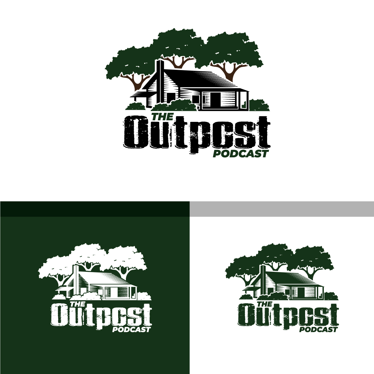
I have an idea of what I think I want for my logo to represent my podcast network, but this concept I put together with clipart I licensed from Adobe Stock. I like the concept . . . just not the execution as it looks like I just pasted some clipart together, and it does not come together properly.<br/><br/>My podcast network is called "The Outpost Radio Podcast Network" and will initially host my podcast called The Outpost Podcast . . . The Outpost concept I came up with calls back to the American founding, as settlers push west. With your nearest neighbor miles away, the outpost or general store became a hub for people to come together, trade information or goods . . . that is what I want The Outpost to be . . . place out on the vast internet . . . where people can come together to learn, trade, and pursue that same spirit of self-reliance, self determination that those early settlers were looking for .<br/><br/>I would like a logo for the main network and a second one for the individual podcast, that are basically the same, but with different titles.<br/><br/>I have attached a PDF of the logo concept i came up with . . . I have all of the original clipart files and font I used if you need them . . . just looking for something a little more put together for my brand.<br/><br/>A couple things I am not pleased with my version:<br/><br/>1) I could not find an old cabin or outpost graphic that I was happy with, so I may need something custom drawn for my purpose. The current cabin graphic is drawn very light and in a light grey . . . I darkened it as much as I could, but it still looks out of place with the other clipart images.<br/>2) The trees and bushes are in color, but the cabin is not . . . would like to see the images with the colors they would normally contain, ie: trees with green leaves & brown trunks / limbs, the cabin in the color of wood, the path in a more realistic stone color, maybe some grass to pull it together . . .<br/>3) the font I used was called Laredo Trail . . . it was as close to a old western style without all the frills, looked clean, but I am not married to it if you can come up with something better.<br/>4) Capturing the city & state, plus the year is something I would like, but my execution just does not look right.<br/>5) I would like a version of the logo with and without my tag line: "Educate, Demonstrate and Inspire the pursuit of Self-Reliance!<br/><br/>Finally, I would like a version of this that will work with the following social media applications for consistent branding:<br/>Facebook<br/>Instagram<br/>Twitter<br/>LinkedIN<br/>YouTube & Vimeo (something I can hand off in another project to create intros)<br/>Pinterest<br/><br/>
Actualizaciones
Gathering more feedback
Gathering more feedback
Objetivo del mercado(s)
Individuals & Families who desire to live a more stable, self-reliant lifestyle. Males 20-50, Females: 25-45, Families with children
Texto del logo
The Outpost Radio Podcast Network and The Outpost Podcast
Estilos de logo de interés
Logo con emblema
Logo contenido dentro una forma / figura
Logo pictórico / combinado
Un objeto del mundo real (texto opcional)
Estilos de fuente para usar
Gustan otros estilos de fuente:
- Laredo Trail or something similar
Colores
Diseñador para elegir los colores que se utilizarán en el diseño.
Mira y siente
Cada control deslizante ilustra las características de la marca del cliente y el estilo que debe comunicar el diseño de tu logotipo.
Elegante
Atrevido
Juguetón
Serio
Tradicional
Moderno
Atractivo
Profesional
Femenino
Masculino
Vistoso
Conservador
Económico
De Alta Gama
Requisitos
Debes tener
- Must help convey the concept of The Outpost . . . be the standard for the brand across all mediums (website, video & social)
- also, if you could help me with a brand book outlining the color palette that I can use with the website, that would be appreciated.
Agradable de tener
- I personally like the cabin, representing a place to go to for this type of information, but open minded to other concepts as long as they are rustic, vintage style.
No debería tener
- Should not be modern, fancy or abstract . . . should not take away from concept I am looking to promote.