

 Refresh
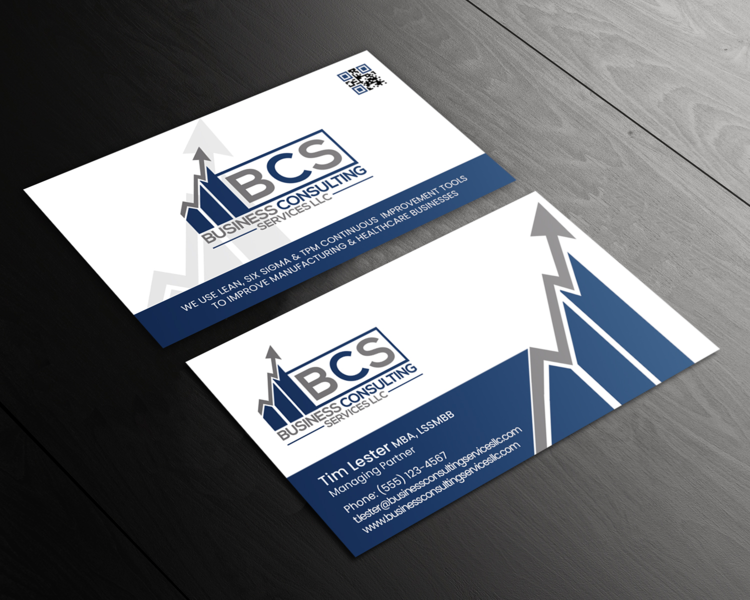
Business Card Project for 'Manufacturing and Healthcare Business Improvement company.
¿Quieres ganar un trabajo como este?
Este cliente recibió 263 diseños de tarjeta de presentación de 16 diseñadores. Eligieron este diseño de tarjeta de presentación de chandrayaan.creative como el diseño ganador.
Únete gratis Encuentra trabajos de diseño
-
 US$90
US$90
-
 263 diseños
-
 16 diseñadores
Resumen de Diseño de Tarjeta de Presentación
I need a business card for a consulting company that does process improvement for manufacturing and healthcare companies. I had a contest for a logo, and I liked what we came up with for the logo.
I wasn't blown away by what I got for the business card. The designer tried and it was a decent design, but I was looking for a little more. I want something that looks professional, but is eye-catching enough that people say "that looks cool, where did you get it?"
I've uploaded some business card examples I found that I liked. Even though some of the examples have red and orange on them, I think I would stick with blues, grays and blacks since that matches the logo theme. As awesome as some of them look, I don't think that a single color card, like an all-black card, will work for me; but feel free to change my mind.
It might also be possible to incorporate elements from the logo into the card. I also like some of the elements that use circles or rectangles etc to separate the phone number, website etc.
I like it when people have used geometric shapes to break up the card into sections or to add borders to the card to complement the logo, not compete with it for attention. For example, the red and gray example that has a curve that separates the card into two parts. I've wondered, how it would look if the red area were blue and had an arrow separating the top and bottom, like the arrow on the logo. Maybe on the back there could be an element that mirrors the bar graph and arrow. Would those look interesting, or would they compete with the other elements too much?
I also uploaded some examples of cards I made up, either based on ideas I saw elsewhere or based on design elements that the logo had in his designs. If you wonder why the ones with "lorem ipsum" look like an amateur did them, it's because they did.
I also think that I may add a QR code at some point, so I would need a location for that, along with something that says what the QR links to, such as, "scan here to upload contact information" or something similar. I don't know if I want cards that require having special designs cut, but if you have the idea, go with it.
I don't want to limit anyone's creativity, so I'll leave it at that.

Actualizaciones
Need extra days to review
Objetivo del mercado(s)
Healthcare and Manufacturing
Tipo de industria / entidad
Manufacturing
Información de contacto para la tarjeta del negocio
Business Consulting Services LLC.
Tim Lester MBA, LSSMBB
Managing Partner
t.lester@businessconsultingservicesllc.com
(555) 123-4567
Estilos de fuente para usar


Colores
Diseñador para elegir solo colores en escala de grises para usar en el diseño.
Mira y siente
Cada control deslizante ilustra las características de la marca del cliente y el estilo que debe comunicar el diseño de tu logotipo.
Elegante
Atrevido
Juguetón
Serio
Tradicional
Moderno
Atractivo
Profesional
Femenino
Masculino
Vistoso
Conservador
Económico
De Alta Gama
Requisitos
Debes tener
- The logo.
Agradable de tener
- Even though some of the examples I uploaded have red and orange on them, I think I would stick with blues, grays and blacks since that matches the logo theme.
I also like some of the elements that use circles or rectangles etc to separate the phone number, website etc.
I like it when people have used geometric shapes to break up the card into sections or to add borders to the card to complement the logo, not compete with it for attention.
For example, the red and gray example that has a curve that separates the card into two parts. I've wondered, how it would look if the red area were blue and had an arrow separating the top and bottom, like the arrow on the logo. Maybe on the back there could be an element that mirrors the bar graph and arrow. Would those look interesting, or would they compete with the other elements too much?
It might also be possible to incorporate elements from the logo into the card.
I also think that I may add a QR code at some point, so I would need a location for that, along with something that says what the QR links to, such as, "scan here to upload contact information" or something similar.
It could have something somewhere saying "We use Lean, Six Sigma and TPM continuous improvement tools to improve manufacturing and healthcare businesses."
No debería tener
- So many colors and elements that it is distracting. Should not be generic.
As awesome as some of them look, I don't think that a single color card, like an all-black card, will work for me; but feel free to change my mind.
I don't know if I want cards that require having special designs cut, but if you have the idea, go with it.


