haydentechnology.com Logo, Providing innovative and strategic consulting to banks and credit unions
¿Quieres ganar un trabajo como este?
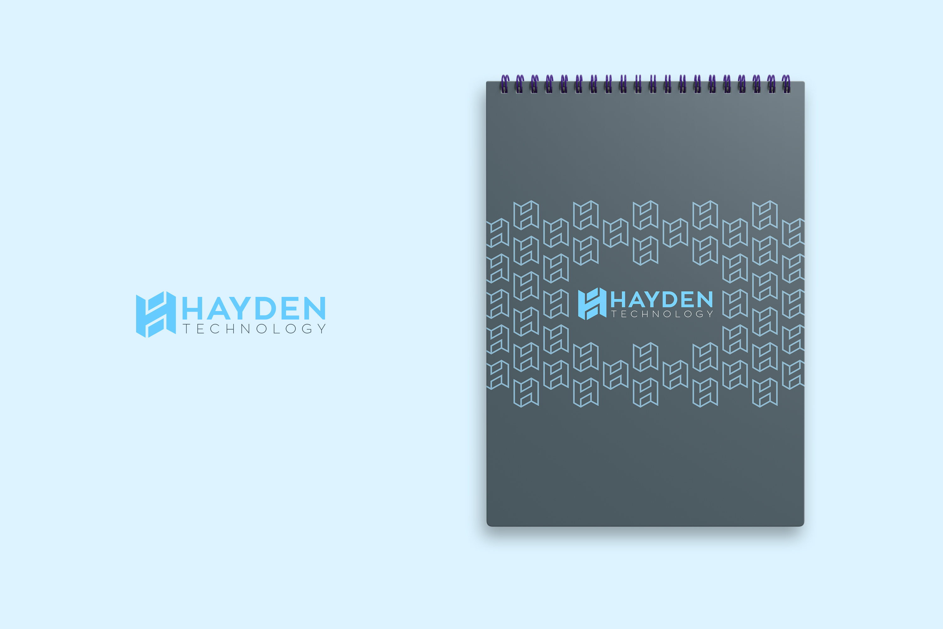
Este cliente recibió 262 diseños de logo de 112 diseñadores. Eligieron este diseño de logo de JohnM. como el diseño ganador.
Únete gratis Encuentra trabajos de diseño-
 US$160
-
 262 diseños
-
 112 diseñadores
Resumen de Diseño de Logo
Looking for a new logo... see website haydentechnology.com. We like simple. We like HT. We are interested in NEW logo + new font for "Hayden Technology" ... We like Hayden stacked on top of Technology.
Update:
1. I don't think I like Orange color... now that I see it... I would like to stick with my website's version of blue / gray / white / black combinations. Perhaps a very small accent of orange... but generally 2-color combinations... blue / dark-gray on white, blue / light-gray on black. white / dark gray on blue.
2. need to have square logo and full logo versions. I like the idea of HT in form that is easy to recognize on linked-in, twitter, instagram... but then matches well with the full Hayden Technology version.
3. I want an "evolution" of my current logo... not a grand change... and the evolution is FORWARD progress... clean. classy. recognizable.
Objetivo del mercado(s)
Banking, Credit Unions, Consulting
Texto del logo
Hayden Technology
Estilos de fuente para usar
Colores
Colores seleccionados por el cliente para ser utilizados en el diseño del logotipo:
Mira y siente
Cada control deslizante ilustra las características de la marca del cliente y el estilo que debe comunicar el diseño de tu logotipo.
Elegante
Atrevido
Juguetón
Serio
Tradicional
Moderno
Atractivo
Profesional
Femenino
Masculino
Vistoso
Conservador
Económico
De Alta Gama
Requisitos
Debes tener
- cool, simple, interesting, classy. Use my current color pallette on haydentechnology.com website (banner: blue, gray, black, white)
need to have square logo and full logo versions. I like the idea of HT in form that is easy to recognize on linked-in, twitter, instagram... but then matches well with the full Hayden Technology version.
Agradable de tener
- an "evolution" of my current logo... not a grand change... and the evolution is FORWARD progress... clean. classy. recognizable.